Using Consumer Psychology to Grow Your Mobile Conversion Rate
 ,
,
Mobile traffic accounts for over half of all global traffic, and this trend is only going to rise. It takes a web visitor only a few seconds to get a first impression on your site, and it’s even quicker on a mobile device. So, it’s more important than ever for you to focus on improving your mobile conversion rate
When you bear in mind the shocking statistic, that 98% of the traffic to e-commerce websites DOESN’T convert even a slight improvement will have a major impact on revenues.
The bigger an eCommerce site is, the harder it falls. No wonder Amazon says that an ‘additional second of browsing’ could cost $1.6 billion in sales. So, just think how much you revenue you could be missing out on if your design isn’t optimised!
So we’ll get down and dirty with some simple strategies to grow your mobile conversion rate.
Using Neurodesign to Your Advantage in Mobile CRO
Coined in 2012, neurodesign allows us to determine what makes a customer experience good or bad based on aesthetic alone, and it’s probably one of the most important things you’ve never heard of.
After all, order is all around us, and in everything that we see. It’s no wonder that neurologically pleasing design is an integral element to an effective mobile browsing experience.
Our brains are designed in such a way that they crave order. They are programmed to solve problems, trained to recognize patterns and add them to what we already know.
Therefore, sites must be intuitive and familiar. Menus must make sense.
If a customer wants to shop for men’s socks, it’s most logical to expect the flow of the website to follow a path from home>clothing>men’s>socks. Here is a notable example from Nordstrom to keep in mind:
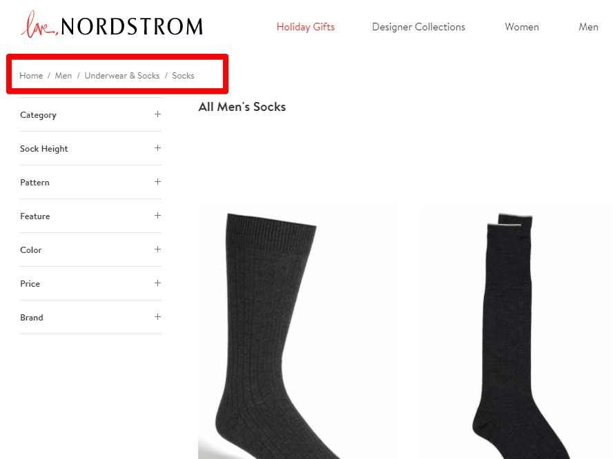
Source: shop.nordstrom.com
Generally, this is the order that the typical mobile shopper is used to. Don’t over complicate it, and always keep it simple and intuitive for your website visitor.
This doesn’t just stop at a sitemap. Mobile phone screens have extremely limited real estate, and visitors want to see something familiar.
If your customers live in London, try showing them something they are familiar with, like the London skyline. This would reaffirm that they found the right site or online store.
If I am visiting Airbnb in search of a nice cozy place to rent in London, for example, then showing me a pre-populated “Search for the Best Place in London” on the home page icon would be perfect. I will most likely click on that, stay on the site longer, and ultimately make a reservation.
Familiarity and simplicity is everything for any online shopper, no matter how simple that seems. This is especially important on a mobile app, where every second counts.
If a visitor is confused in the slightest by the setup of your mobile site, or if something is not intuitive, they can easily postpone this to a later time when they can jump on their desktop. But this doesn’t happen over 75% of the time.
The screen is much smaller on a mobile device so you need to focus on making your headers smaller and removing as many destructions as possible. On mobile it is more about taking away rather than adding. This especially important on your mobile ecommerce checkout page.
So if you don’t make this a priority, your mobile conversion rate will suffer.
Let’s take a deeper look at the pricing page.
The Keys to Developing Your Mobile Pricing Page
Your design could very well be perfect, but if your browsers aren’t customer and shopper friendly, then further planning is needed.
That’s where the pricing page comes in, and this is where it’s most important to use the psychology of the brain to your advantage.
One fascinating thing about our decision making is that we often tend to pick the middle choice in question. This is known as the “center stage effect.”
Dr. Paul Rodway conducted several studies where he asked people to choose a few pictures out of a series of them. Repeatedly, the subjects chose the middle pictures and the middle socks.
In e-commerce, the middle choice is usually not the cheapest nor the most expensive. This is why customers opt-in to choose this one most often.
However, if you want the customer to choose a different plan, simply place that plan in the middle of the pricing page and you should see that most of your customers will, in fact, click on that plan often.
Fascinating, isn’t it?
This STILL translates on mobile, even without the ‘side-by-side’ desktop experience.
If the mobile customer is often flipping through a website hastily and sees each plan separately on their screen, they are even more likely to choose the one in the middle.
The tactics DON’T just stop there. Another common trick that we have all seen is adding the .99 at the end of each price offering.
Most of stores out there (both physical and online) add .99 to the end of each price point. Almost no one displays round numbers anymore ($15, $30, $80).
 Source: sumo.com
But does that work?
Turns out, it does!
An experiment was conducted by MIT and the University of Chicago in which they tested the pricing of a standard women’s clothing item. They chose to use $34, $39 and $44. It turned out that $39 did the best even though there was the cheaper version of $34 available.
The True At-Home Buying Experience of Your Users and What to Do About It
A lot of people are mobile browsers and desktop shoppers.
What does this mean? It simply means that the customer starts browsing your site on their phone, and when they are ready to make a buying decision, they will likely to switch to their desktop to buy your product.
According to the Google Mobile Playbook, 68% of all mobile shopping occurs at home where there are other devices available. So, instead of missing out on that big chunk of mobile shoppers, your strategy should be asking the visitor if they want to switch devices.
This is easily done by prompting the customer if they would like to be sent a copy of their shopping cart directly to their email.
To make this strategy even more effective mention the reason they might want to get this email – to buy the products after work, or discuss it with their partner first.
But what if you are angling for the customer to buy now?
Use Urgency to Grow Your Mobile Conversion Rate
Urgency is a great tool and it works especially well on mobile shoppers.
Decisions are made very quickly, and when someone is shopping on the go they are almost always about to switch to another task – so time is of the essence.
One of the best ways to create urgency is through Nudges that capture the visitor’s’ attention.
Here are a few types of notifications you could use:
- Speedy Shipping offers – offer the product to arrive by tomorrow if the visitor buys it in the next few hours.
- Time-bound Special Discounts – offer a discount if the visitor places an order in the next 10 minutes.
- The Holiday Promotion – offer a holiday discount or special holiday shipping options.
- Whilst Stocks Last – Persuade your clients with the oldest trick in the game – scarcity.
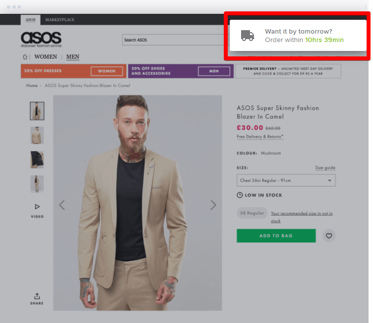
Here is a fitting example from Asos:
Another great word that our brains are designed to react to is scarcity.
Societies were built on scarcity, our eating habits were morphed by it, and the most basic economic forces of supply and demand are proven upon this principle.
In the context of e-commerce, it seems obvious but it works.
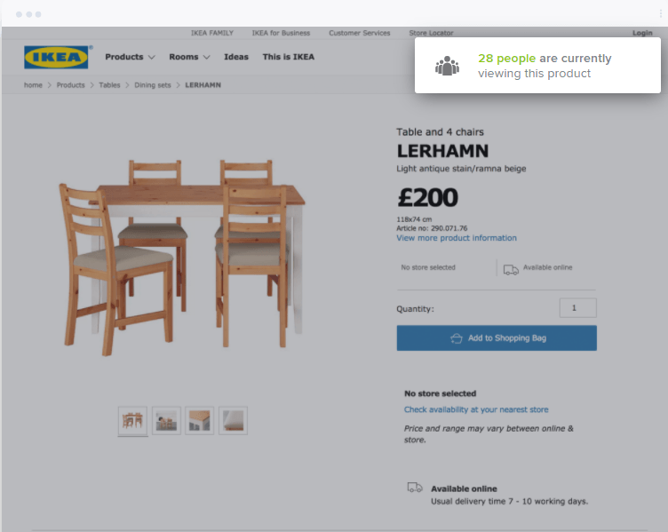
You can even go one step further and use Live visitor counts to display the number of people viewing a certain product, or the number of products that are still available. This will increase the perceived value of the product and encourage the visitor to decide quickly.
That will make a BIG difference when you start retargeting these folks.
TL;DR
If you use psychology and neurodesign correctly then your viewer’s mobile experience becomes so much more enticing, which means you’ll increase your conversions.
Focus on making the website’s mobile flow more intuitive and familiar to your viewers.
Use dynamic headers whenever possible to include specific locations or terms that are familiar to your user on your mobile site. If the mobile shopper lives in a specific city put that city in the header. If they clicked on a Facebook ad, put “Facebook” in the header.
Next, focus on your pricing page and optimize it for better mobile conversions. Place the product that you want the user to purchase in the center of the page. Also, use the number nine in every price option.
Offer an option for your user to switch devices and send them a personalized email with their shopping cart with the items they were browsing. Also, use dynamic notifications that emphasize urgency and scarcity to increase purchases.
If you are creating new products or changing the flow of your sales funnel always focus on the psychology of your potential customer and their individual buying habits.
If you incorporate all of these elements into your mobile conversion strategy you will increase your conversions, boost revenue, and help residents of small to medium size metropolitan areas spend more time staring at screens and buying your products.
What has been the number one change that you’ve implemented that has led to dramatic uplift in conversions for your ecommerce store?
by Benjamin Ligier
Benjamin is a CRO Expert at Convertize. He is passionate about design, web marketing and consumer psychology.


Fantastic article. This is completely a different perspective…