How could Thread.com encourage people to subscribe?
Tactics used: Tactics 99, 94 and 134
Time to apply: 17 minutes
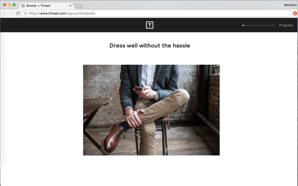
Before Optimisation

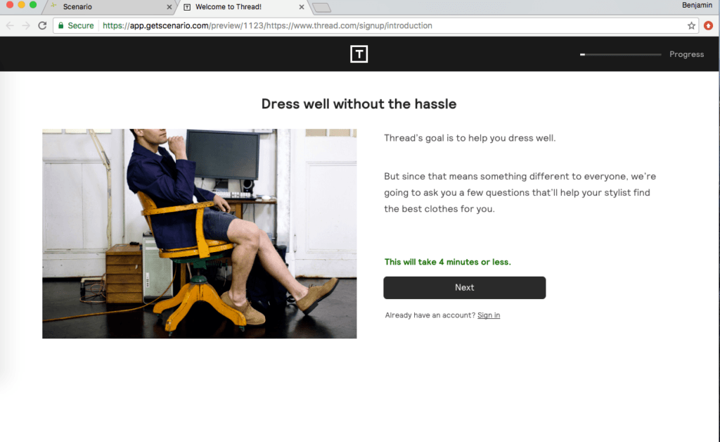
After Optimisation
In this case study we show you how easy it is to implement subscription page improvements that are proven to increase the number of subscribers, using Thread.com as an example.
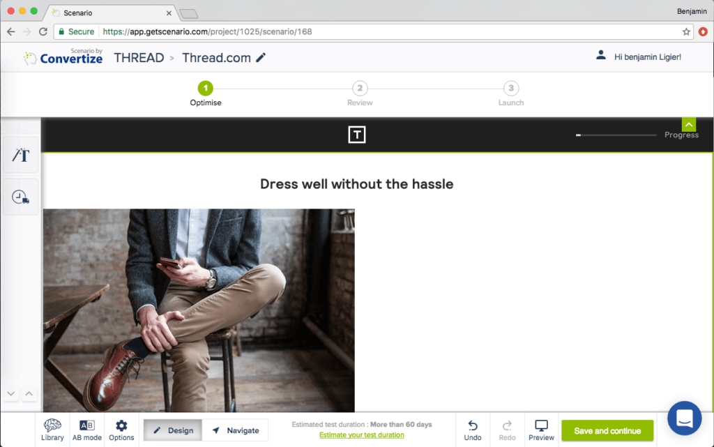
Original page:
Tactic 134: Position images and graphics on the left. Visual elements positioned on the left are processed by the right hemisphere of the brain, which is better suited for image processing. Therefore, people will “digest” the page more quickly and easily, and it will have a more satisfying effect on them.
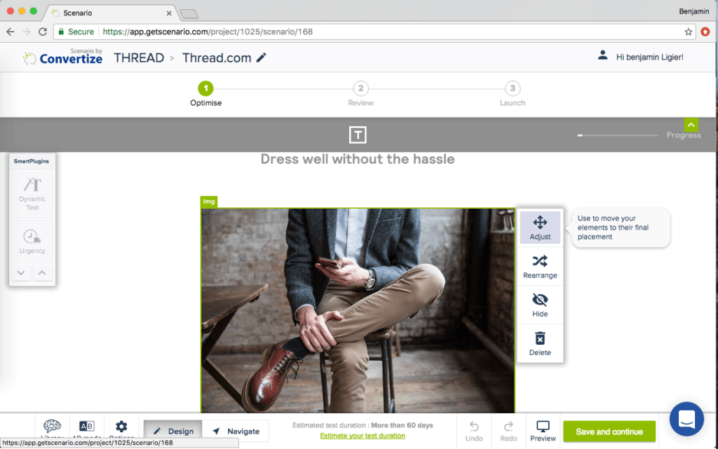
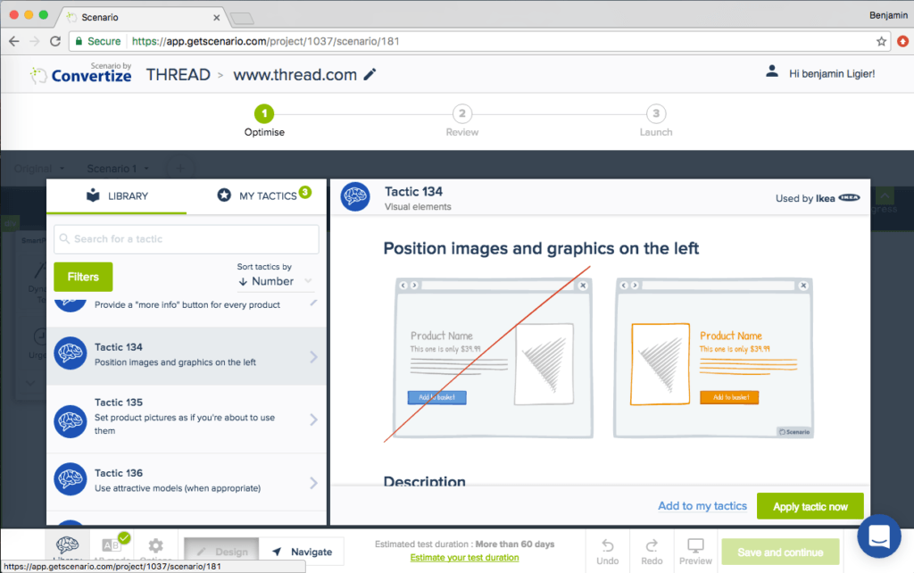 Editor (Tactic 134): To reposition the image on the page, you simply have to use the “Adjust” function and move the image wherever you want on the page, as shown on the images below.
 Tactic 94: Always place your Call-to-Action above the fold. Your Call-To-Action (CTA) button should always be placed above the fold so that it is immediately visible when people arrive on your page.
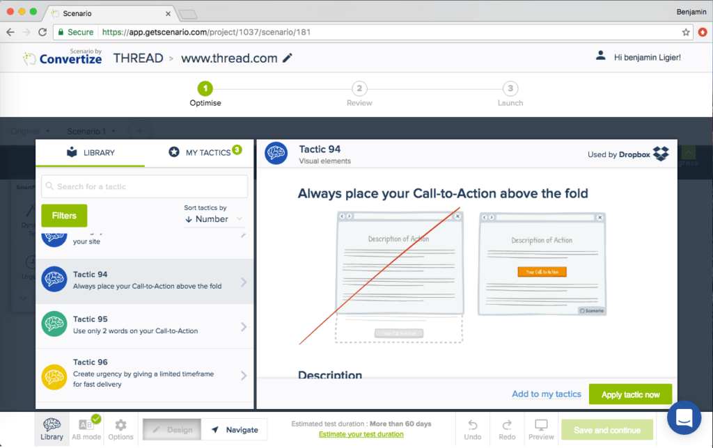 Editor (Tactic 94): As the Call-to-action was far below the fold line as well as the content, it would be better to move it higher. As with the image, all you have to do is use the “Adjust” option in the toolbar. We have also aligned the content on the left instead of it being centred.
 Tactic 99: Use clear imagery to draw attention to your Call-to-Action. Adding an additional simple visual stimulus that stands out through colour or another visual difference (shape, size etc.) will help ensure the customer’s eye is drawn to the desired place.
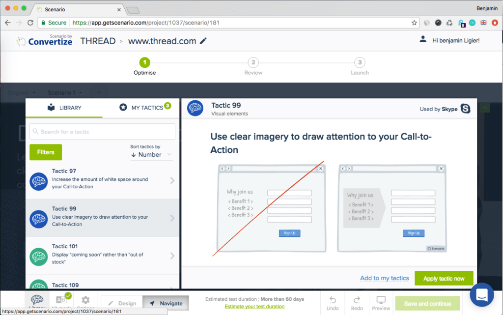 Editor (Tactic 99): We have simply changed the URL of the current image to a new one (from their website) that draws attention to the Call-to-action “Next”.
Tactic 134: Position images and graphics on the left. Visual elements positioned on the left are processed by the right hemisphere of the brain, which is better suited for image processing. Therefore, people will “digest” the page more quickly and easily, and it will have a more satisfying effect on them.
Editor (Tactic 134): To reposition the image on the page, you simply have to use the “Adjust” function and move the image wherever you want on the page, as shown on the images below.
Tactic 94: Always place your Call-to-Action above the fold. Your Call-To-Action (CTA) button should always be placed above the fold so that it is immediately visible when people arrive on your page.
Editor (Tactic 94): As the Call-to-action was far below the fold line as well as the content, it would be better to move it higher. As with the image, all you have to do is use the “Adjust” option in the toolbar. We have also aligned the content on the left instead of it being centred.
Tactic 99: Use clear imagery to draw attention to your Call-to-Action. Adding an additional simple visual stimulus that stands out through colour or another visual difference (shape, size etc.) will help ensure the customer’s eye is drawn to the desired place.
Editor (Tactic 99): We have simply changed the URL of the current image to a new one (from their website) that draws attention to the Call-to-action “Next”.
A quick summary of the changes:
- Hierarchised elements to make sure all elements are above the line
- Driven user attention to the call-to-action by using a better image
- Emphasis on how short it is to fill to register
Try it yourself with a free 14-day trial
Now you've seen how easy it is to use Convertize,
why not give it a try with our free trial?