How Zoopla could get more sales requests
Tactics used: Tactics 7 and 261
Time to apply: 27 minutes
Before Optimisation

After Optimisation
In this case study we show you how easy it is to implement product page improvements that are proven to increase sales, using Zoopla as an example.
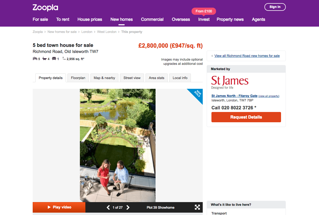
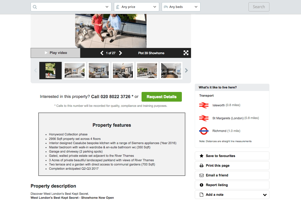
Original page:
Tactic 7: Choose a contrasting button colour and size for your Call-to-Action
Choosing a contrasting button colour and size will make it more prominent and noticeable on your page so that your visitors are more likely to click on it.
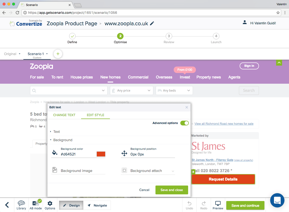
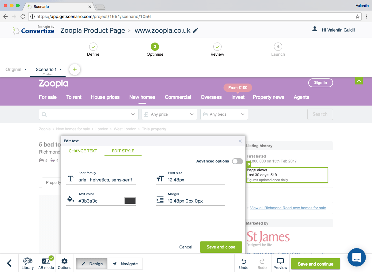
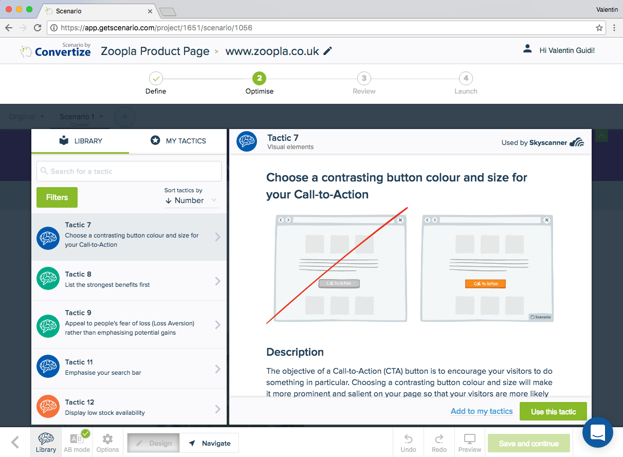 Editor (Tactic 7): There are multiple calls-to-action in orange on this page. In order to emphasise the main goal of the page, which is “Request details”, it would be better to change its colour. As green is considered to be a positive colour (and a noticeable one) and as there is currently no green on the page, we would recommend using it for this call-to-action. You can easily do it by changing the colour in the “edit style” menus.
 Tactic 261: Be specific with your arguments instead of trying to be a salesman
Using concrete words, especially featuring facts or figures, will have much more impact.
Tactic 261: Be specific with your arguments instead of trying to be a salesman
Using concrete words, especially featuring facts or figures, will have much more impact.
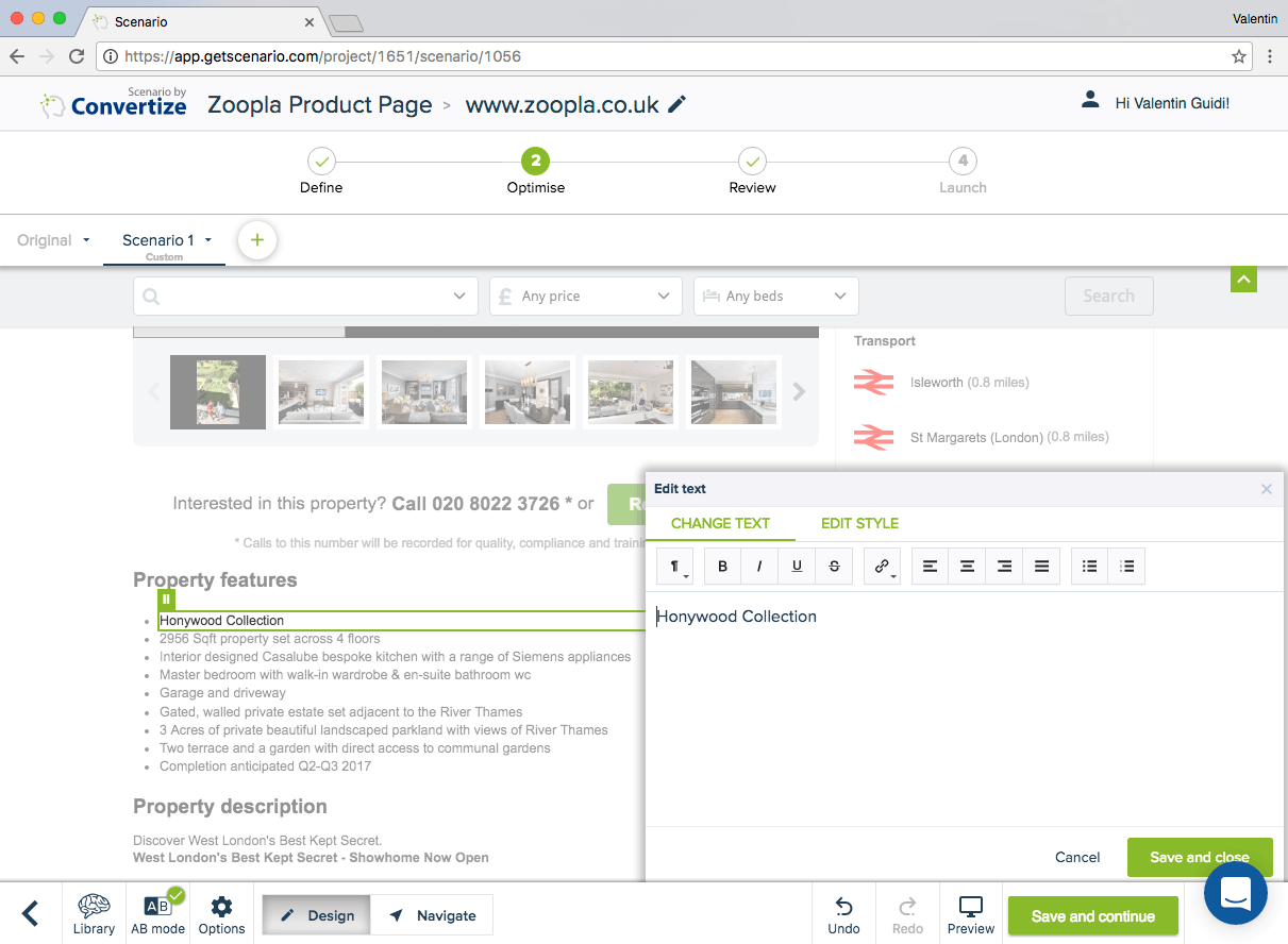
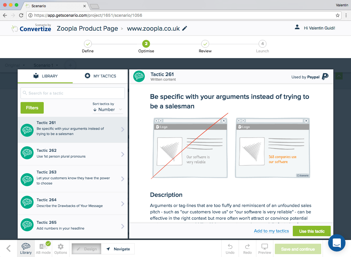 Editor (Tactic 261): The product characteristics are very generic. In order to make them more concrete, you can edit the text and update it with more specific content.
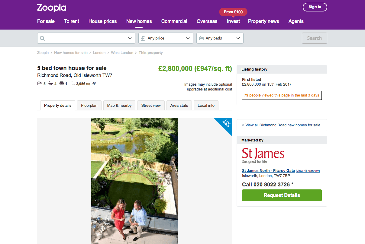
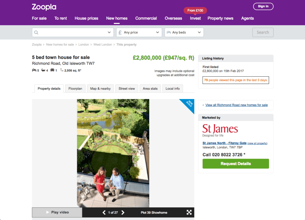
 Apply Scarcity: We noticed that Zoopla is trying to use Scarcity by showing the number of page views in the last 30 days. To make it more powerful, we have changed the current sentence to this one: “79 people viewed this page in the last 30 days”. This is easily done by editing the text in a few clicks, as shown below.
 Modified page (top part):
The updated version clearly emphasises the main call-to-action as well as making the scarcity more visible. This should result in a clear increase in the number of users requesting details.
Modified page (top part):
The updated version clearly emphasises the main call-to-action as well as making the scarcity more visible. This should result in a clear increase in the number of users requesting details.
 Modified page (bottom part):
Tactic 7: Choose a contrasting button colour and size for your Call-to-Action
Choosing a contrasting button colour and size will make it more prominent and noticeable on your page so that your visitors are more likely to click on it.
Editor (Tactic 7): There are multiple calls-to-action in orange on this page. In order to emphasise the main goal of the page, which is “Request details”, it would be better to change its colour. As green is considered to be a positive colour (and a noticeable one) and as there is currently no green on the page, we would recommend using it for this call-to-action. You can easily do it by changing the colour in the “edit style” menus.
Tactic 261: Be specific with your arguments instead of trying to be a salesman
Using concrete words, especially featuring facts or figures, will have much more impact.
Editor (Tactic 261): The product characteristics are very generic. In order to make them more concrete, you can edit the text and update it with more specific content.
Apply Scarcity: We noticed that Zoopla is trying to use Scarcity by showing the number of page views in the last 30 days. To make it more powerful, we have changed the current sentence to this one: “79 people viewed this page in the last 30 days”. This is easily done by editing the text in a few clicks, as shown below.
Modified page (top part):
The updated version clearly emphasises the main call-to-action as well as making the scarcity more visible. This should result in a clear increase in the number of users requesting details.
Modified page (bottom part):
A quick summary of the changes:
- Emphasised the scarcity effect by highlighting the page view count
- Modified the CTAs to highlight the primary button
- Added more information to the features and made them more visible
Try it yourself with a free 14-day trial
Now you've seen how easy it is to use Convertize,
why not give it a try with our free trial?