How eBay could improve their product page’s clarity
A Convertize case study with eBay
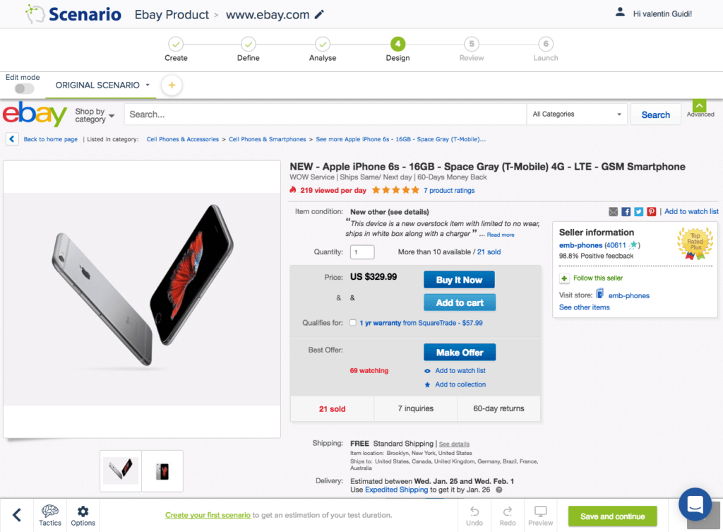

In this case study we show you two effective ways to increase your product page conversions using the example of Ebay. You will also see how quick and easy it is to implement them to your own website using Convertize.
Tactic 7: Choose a contrasting button colour and size for your Call-to-Action
Ensure your CTA button stands out and draws your users’ attention. This will increase the likelihood that they click on it and convert.
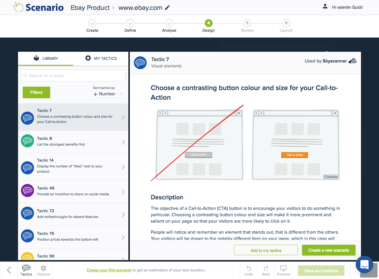
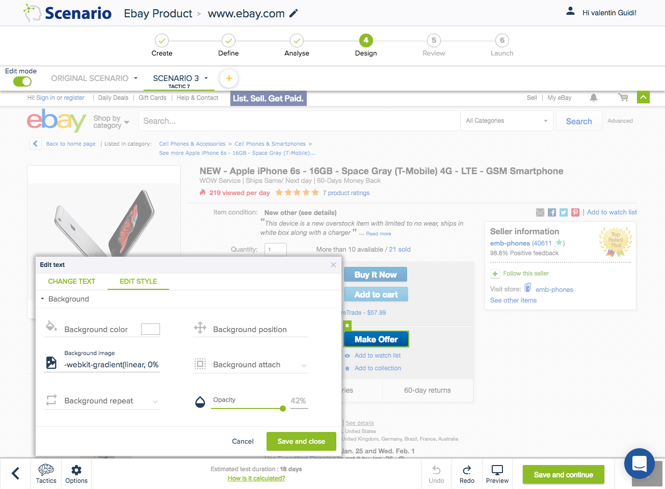
Editor (Tactic 7): With Convertize it takes just a few seconds to change the background colour of an element. Simply click on the element and select the background option to make your desired change.
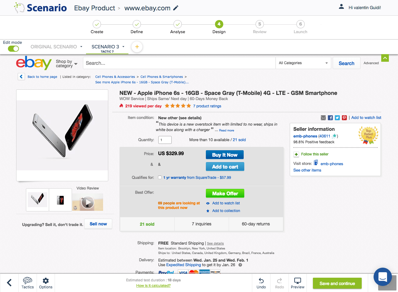
Tactic 289: Avoid trapping negative space in the composition
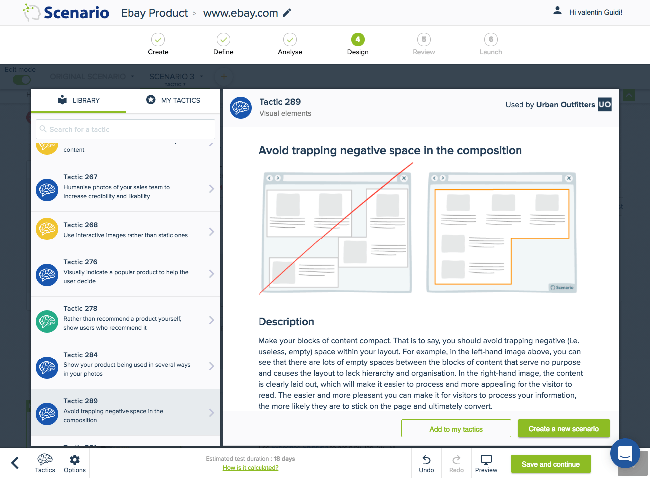
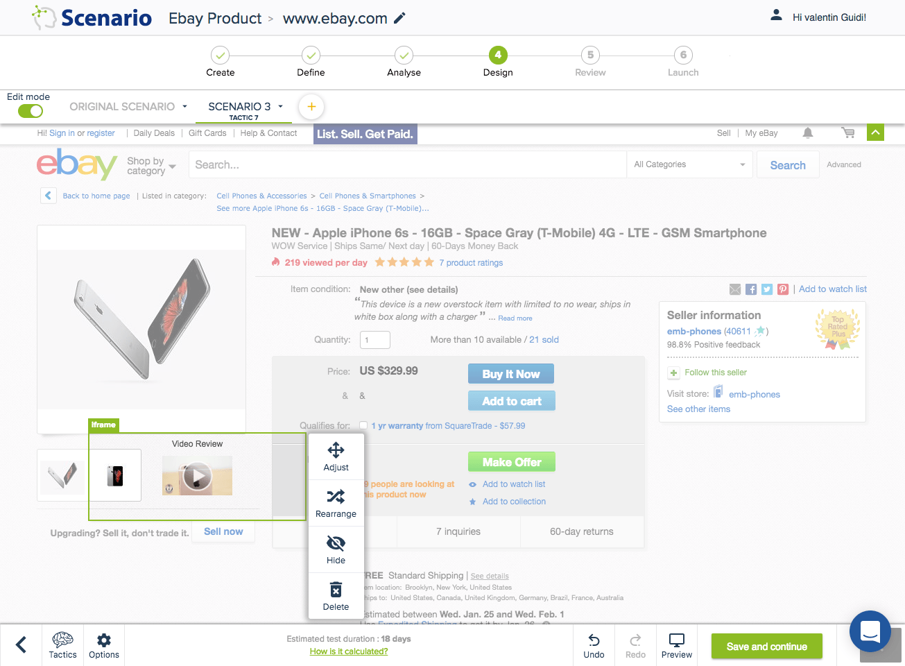
Editor (Tactic 289): In this case, the video review is moved next to the images of the product by simply clicking on the element and adjusting its position.
Updated version: The main CTA colour was changed to green to differentiate it from the rest. The red colour was removed and less aggressive colours were applied (green for the number of similar product sold, and orange for the number of people looking at the same page now). The sentence was modified from “69 watching” to “69 people are looking at this product now” to make it more clear and emphasise the sense of urgency. The video was moved next to the images of the product to avoid empty space and improve processing fluency.
Try it yourself with a free 14-day trial
Now you've seen how easy it is to use Convertize,
why not give it a try with our free trial?