How could Graze increase engagement ?

Above you can see the current version of Graze’s US Homepage, together with a new version optimised using Convertize.
How did we get from A to B?
It took only 38 minutes and required no knowledge of coding or website optimisation!
Here’s how we did it:
The first step was to open Convertize and enter the URL link and details of the website. Once that was done, we were taken to the dashboard where a bank of proven persuasion tactics relevant to this specific type of page were displayed. Convertize suggested 37 possible tactics (105 would be shown for those using our Agency or Team plans).
For this experiment, we picked out three tactics to implement:
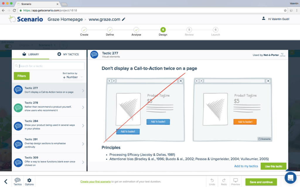
Tactic 277 : Don’t Display a Call-t0-Action twice on a page
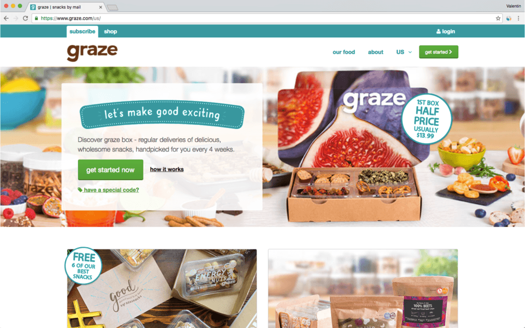
The first tactic we chose was 277, which advises not to display a Call-to-Action twice on a page so that the user doesn’t get confused by a busy and unclear page. In the current version of the Graze Homepage, there are two “get started” Call-to-Action buttons as well as a promotion label that looks like it could be another CTA, although it isn’t actually clickable.
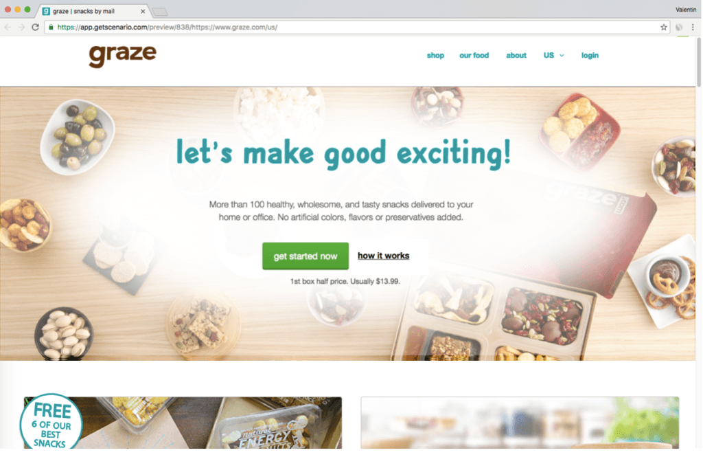
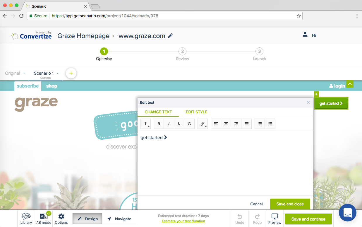
In the SmartEditor™, we clicked on the secondary “get started” Call-to-Action (CTA) to make changes. We changed the text to “login”, the colour of the CTA to match the turquoise blue of the website to deemphasise it, and finally – using the advanced option – we changed the URL to redirect people to the login page.
Tactic 174: Display Unique Selling Points (USPs)
The next tactic chosen is Tactic 174 which advises to display specific Unique Selling Points (USPs) based on your target customer. This is beneficial for conversion rates as users are then able to identify more strongly with your products and feel more connected to your brand/website.
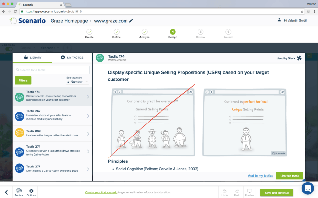
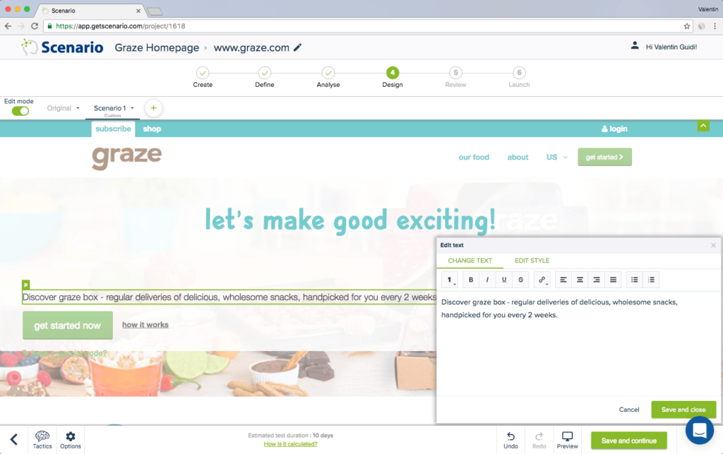
To implement this tactic, it’s as simple as going into the SmartEditor, clicking on the text you want to change and making your edits. For Graze we added in more key USPs to engage their target customers.
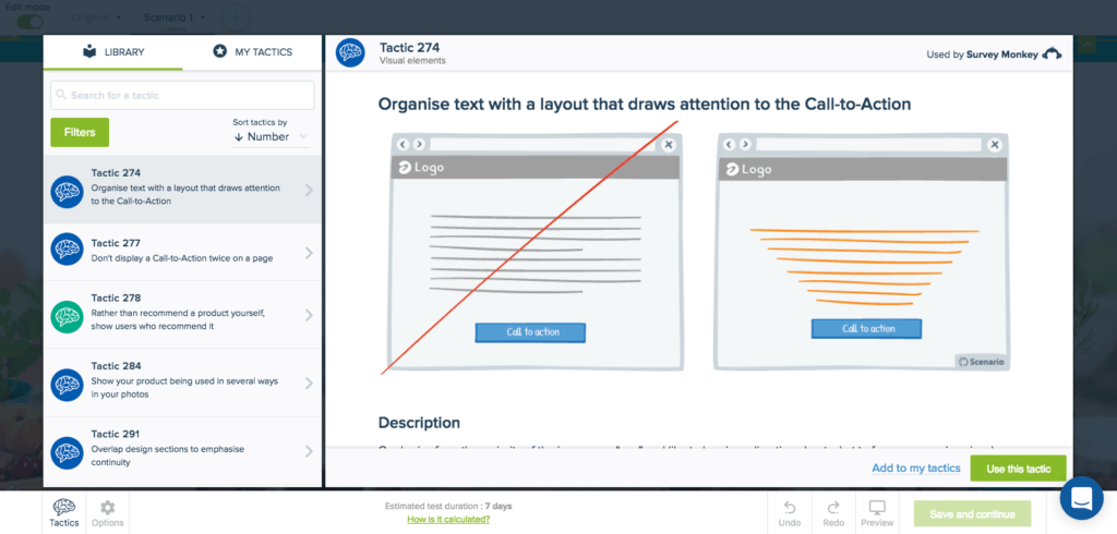
Tactic 274: Draw Attention to your CTA
The final tactic chosen was 274, which advises to organise text with a layout that will draw attention to your CTA. In the current version of the page, the main CTA is in amongst a lot of content, images, and colours and isn’t placed on the best part of the page. Nothing is drawing attention towards the CTA.
A good point is that it is green, which is an effective colour for a CTA (it’s related to positivity, balance, and safety) but in this case there are already a lot of different colours on the page, in particular on the background image, which is very busy and too emphasised.
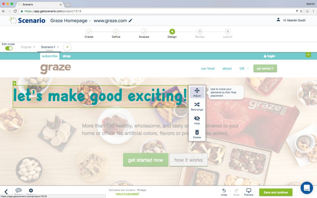
We used the SmartEditor to reorganise the content (titles, content, CTA) to make the focus elements stand out, and used some visual cueing to draw attention to the CTA by changing the layout of the text.
At this stage, if you were implementing the changes for real, Convertize allows you to easily set up an AB test to measure the performance difference between the original and the new optimised version.
Original Homepage :
Modified Homepage:
A quick summary of the changes:
- Removed the secondary Call-to-action “Get Started”
- Changed the content of the value proposition
- Reorganised to drive attention to the Call-to-Action
Try it yourself with a free 14-day trial
Now you've seen how easy it is to use Convertize,
why not give it a try with our free trial?