One quick way Moo could improve its Landing page conversion rate

In this case study we show you how easy it is to implement product page improvements that are proven to increase sales, using Moo as an example.
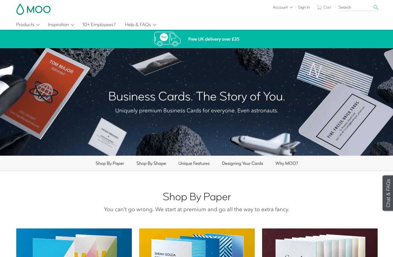
Original landing page:
Tactic 94: Always place your Call-to-Action above the fold
You primary CTA should always be placed above the fold (the visible part of your webpage without scrolling) to highlight the actions users from the moment they first see your page.
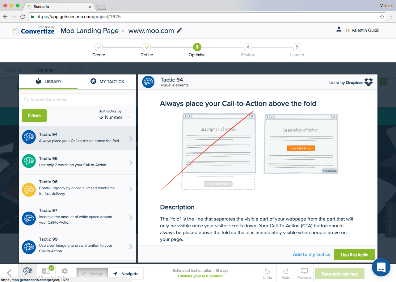
Editor (tactic 94): It’s easy to implement: you just have to add text where you want to insert the CTA. You can then customise the visual appearance of the element and ultimately add the hyperlink to the next page the visitor is to be directed to.
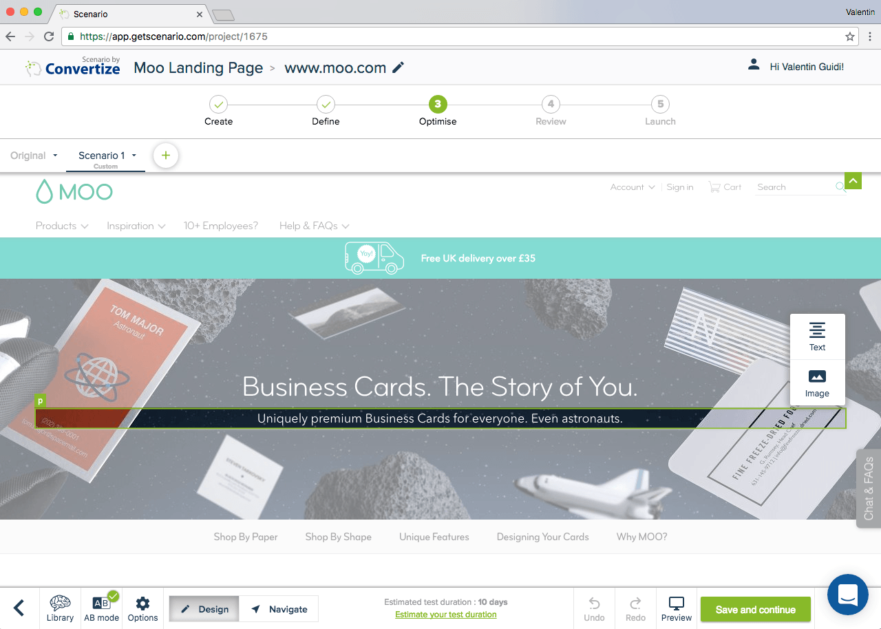
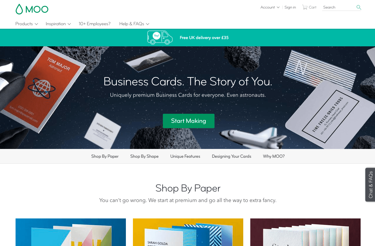
Modified page: The green CTA has been added and the landing page is now pointing at this element to tell the user to click on it. The “free bonus” in this page is that the rocket is visually directing at the button which in theory is supposed to attract the visitor’s attention.
Try it yourself with a free 14-day trial
Now you've seen how easy it is to use Convertize,
why not give it a try with our free trial?