How to increase the engagement of your form
A Convertize case study with British Airways
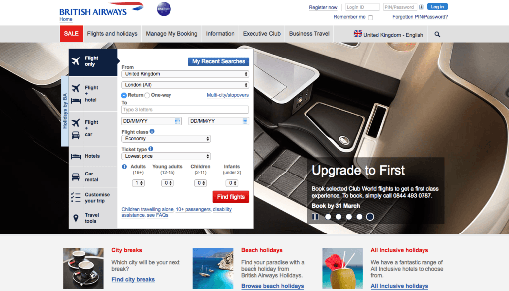

Above you can see the current version of British Airways’ UK landing page, together with a new version optimised with Convertize.
How did we get from A to B?
It took 28 minutes and required no knowledge of coding or website optimisation.
The first step is to open Convertize and enter the details of the website. Once this is done, you’re taken to the dashboard where you’ll find a bank of proven persuasion tactics relevant to this specific type of page.
In the case of the British Airways homepage, Convertize suggests 45 possible tactics (105 for those on our Agency or Team plans). For this experiment, we picked out two to implement.
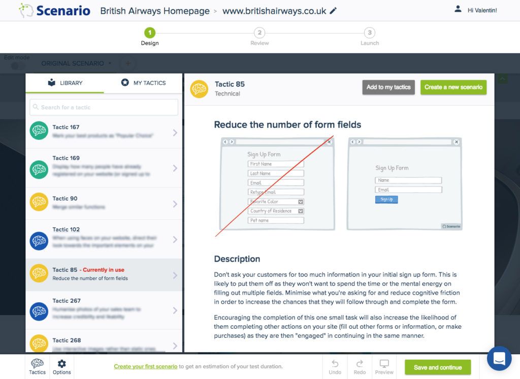
The first was tactic 85, which advises reducing the number of form fields and keeping only the most important ones in order to increase the number of users moving to the next step. In the current version of the British Airways form there are too many fields, with some less important than others.
Original Homepage:
Step-1 : Create a scenario using Tactic 85
Once you understand the tactic click on the button create a new scenario at the very right corner of the page.
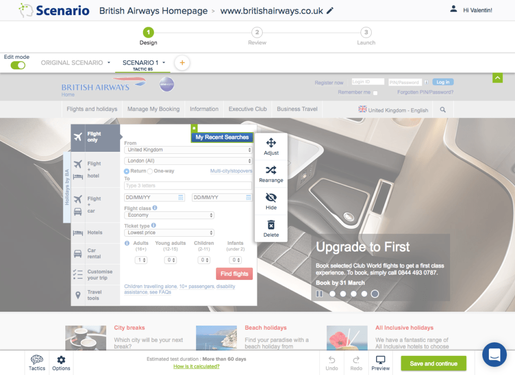
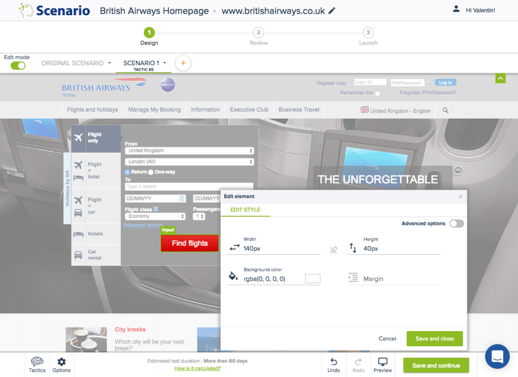
Step-2 : Apply tactic using SmartEditor
The Convertize drag and drop editor allows you to easily move things around and in this case reduce the number of fields in the form.
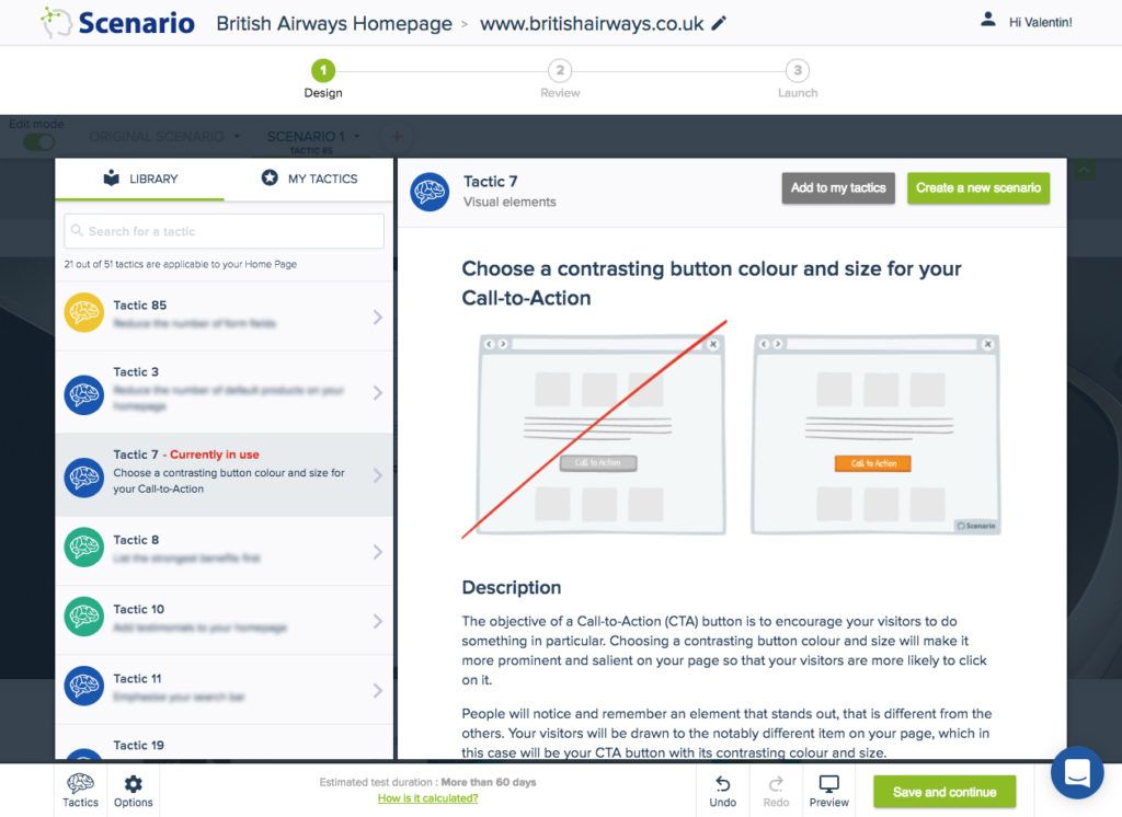
Step-3 : Implementing Tactic 7
The next tactic chosen is Tactic 7 which advises choosing a contrasting CTA button colour and size. This is beneficial for the conversion of the page because it attracts the user’s attention.
Step-4 : Updating Primary and Secondary CTA
In the current version of the page, the main CTA is too small to be eye-catching and isn’t located in the best part of the form. It is also red, which is normally not an effective colour fore CTA (it’s considered too aggressive) but in this case it appears to have been a branding decision — red being one of the two colours of British Airways’ branding.
Additionally, the secondary CTA (“Book by 31 March” in the slider box) is not obvious. Again, using the Convertize editor it’s easy to change both of these elements.
At this stage, if you were implementing the changes for real, Convertize allows you to easily set up an AB test to measure the change in performance between the original and the new optimised version.
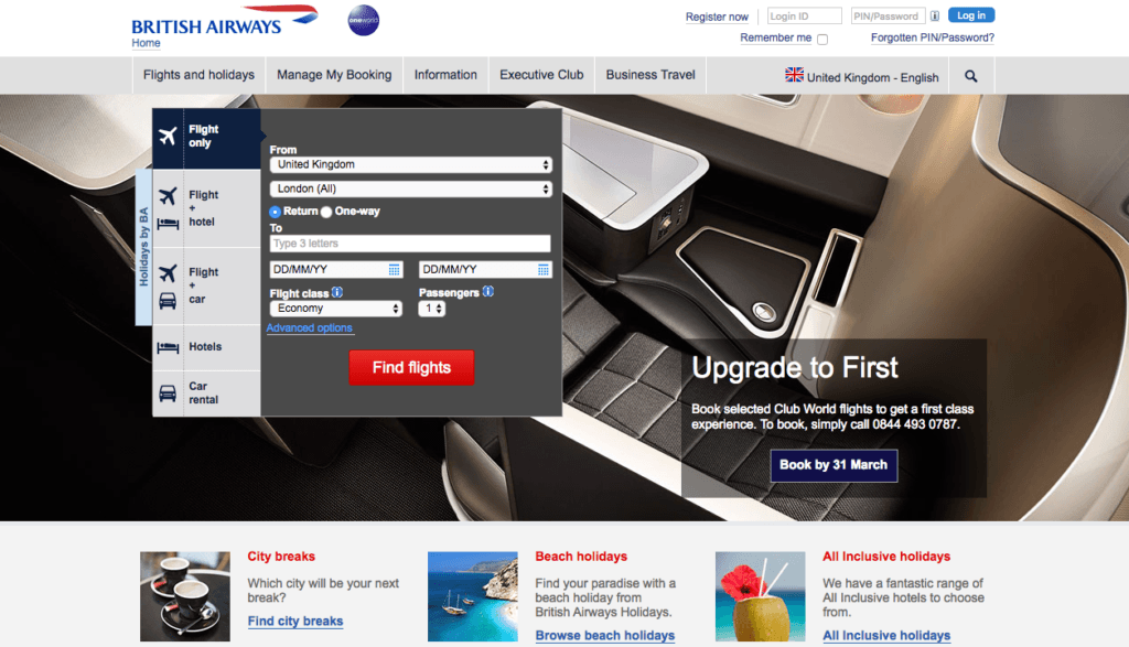
Modified Homepage:
A quick summary of the changes:
- Reduced the number of fields in the form, keeping only the most important ones
- Changed the size and location of the main CTA to make it stand out
- Changed secondary CTA (“Book by 31 March”) to a button to make it much more visible.
Try it yourself with a free 14-day trial
Now you've seen how easy it is to use Convertize,
why not give it a try with our free trial?