Choose The Best Colour For Your “Add To Cart” Button
Colour is an essential part of design, and it is not only developers who worry about it. No other question has captured the imagination of marketers like the best colour to use for a CTA or webpage. However, for eCommerce, attention has focused on the Add To Cart button.

The Best Colour For Your “Add To Cart” Button
- What a Blue Button Says About You
- The Big Red Button
- Getting the Green Light
- Keeping Your Button in the Black
Experiments have shown how colours affect both heart rate and blood pressure. This is one reason why the world’s largest technology companies spend huge sums testing different brand and design colours. However, no experiment is able to remove the impact of context or conditioning. In 1995, the Journal of General Psychology published a study identifying strong links between “favourite” colours and physiological responses. So, even if a colour can give some consumers a subtle nudge in one direction, it won’t have the same effect on everyone.
In the early days of Conversion Rate Optimization (CRO), experts promised their clients huge returns from simple website edits. They don’t make these claims anymore, and CRO has become a more rigorous practice. Even so, marketers have often wondered if there might be an optimal colour for the Add To Cart button.
Keeping Your Button In Tune
Your “Add To Cart” button should integrate seamlessly within your website’s existing colour scheme. To make sure it does, there are some basic principles to follow. Taking a colour wheel, the scheme you develop can be:
- Complementary: Colours are opposite each other on the colour wheel
- Analogous: Colours are next to each other on the colour wheel
- Triadic: Three colours evenly spaced throughout the colour wheel
- Square: Four colours, evenly spaced throughout the colour wheel
The most common approach used for “Add To Cart” buttons is to incorporate them into a Complementary or Triadic colour scheme.
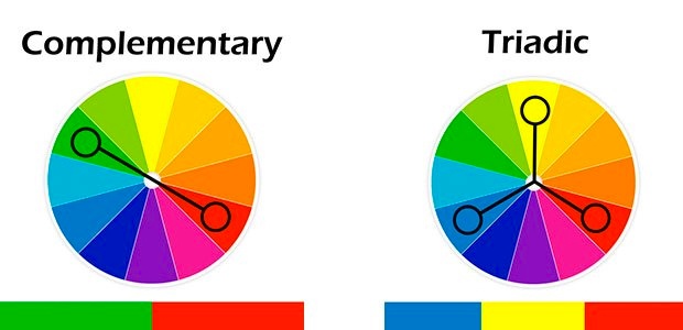
Complementary colours (those opposite each other on the colour wheel) give the greatest contrast. Using them for an “Add To Cart” button allows you to draw attention to it.
In 1933 the German psychologist Hedwig Von Restorff published the research she had been compiling for her PhD. Her research described a principle known as the Isolation Effect, in which subjects remembered distinctive items (those isolated from a series) more than similar ones. By using contrasting colours for a Call To Action button, you can make it stick out in a visitor’s memory.
Triadic colours (those spaced evenly throughout the colour wheel) give a different effect. When balanced carefully, the colours you use can combine to create a “chord”. The tones are distinct, but combine to establish a harmony. Not only does beautiful design improve your branding, it also increases the usability of your product.
What a Blue Button Says About You
Used by: Facebook, IBM, Microsoft
Blue is the third most common colour used for an “Add To Cart” button. However, among B2B websites and communications agencies, it is by far the most popular. 6 of the top 10 B2B companies have blue as a primary or secondary colour in their branding. They choose it for one simple reason: it signals trust.

Age of the Blues
French historian Michel Pastoureau has traced popular perceptions of the colour blue through history. Once associated with heat, and considered ugly by the Ancient Greeks, blue is now the most common “favourite colour” in Europe and America. In the European Middle Ages, blue was associated with royalty and the Church (particularly the Virgin Mary). In the modern era, it is more often associated with internationalism and the Earth (when seen from space).
When to choose blue
For an e-commerce site, blue colour schemes can be a useful way of conveying trustworthiness. Countless surveys have demonstrated its association with natural images and tranquility. However, if your website is already blue, it might be best to pick an alternative colour for your “Add To Cart” button.
The Big Red Button
Used By: Netflix, Target, Coca-Cola
In May 2005, researchers at Durham University released a study that confirmed a well-known fact: red teams win more often. The study was based on the Olympic Games of the previous year, considering events in which the competitors were randomly assigned different coloured outfits.
The association between red and particular emotions (passion, rage) is well established, but these associations vary in subtle ways with cultural context. For example, in areas of China, red coloured packets are associated with gifts of money and brides often wear red dresses.

What Does Red Say About You?
In 2007, a survey of “Add To Cart” Buttons by Getelastic found that red was the most common choice. The most common copy was simply “Add to Cart”. Whilst the world of eCommerce seems to have become more varied since the survey was conducted, this formula is still very popular.
A famous A/B test, the results of which were published in 2011, highlighted the value of using red as a button colour. The marketing automation platform Performable ran a test on their “Get Started Now!” button, introducing a red version of the usual green button. The results of their test were convincing: the red button gave a 21% increase in conversions.
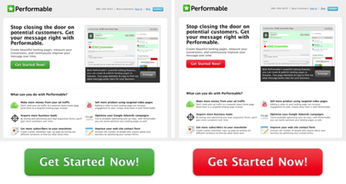
Whilst the results were conclusive, interpreting them was more complicated. The red button performed better than the green one, but this might not reflect a general advantage. When seen alongside the green website, Performable’s red button created a complementary colour scheme, enhancing its visual impact.
Green Light Means “Add”
Used By: IBM, Argos, SportsDirect, Microsoft
Green has a unique place among “Add To Cart” buttons. In the past, companies have used it because of its association with action and forward movement.
More recently, the public interest in environmentalism and ecological concerns has seen a number of major brands embracing the colour green. However, green buttons rarely appear in high-end or luxury stores.

Why Go Green?
In the early days of eCommerce, green was by far the most common colour for an “Add To Cart” button. The use of green in everyday architecture (traffic lights, safety signs, tick icons) is overwhelmingly positive, and popular anxiety surrounding online payment made it important for websites to reassure their visitors.
However, the association of big green buttons with supermarkets and discount eCommerce stores has caused luxury brands to abandon the design.
A notable exception to this rule is the world of SaaS, where green is a common colour for all buttons. In our survey of 20 top SaaS websites, the following colours were most frequently used:

One reason for the prevalence of green in SaaS buttons is that the most common brand colour for SaaS companies is blue. This also explains why blue is the second most common colour chosen in the software industry.
Keeping Your Button in the Black
Used By: Topshop, Net-a-Porter, The Body Shop
Black is surprisingly popular for “Add To Cart” buttons. Brands like Zara, Dorothy Perkins and Boohoo favour a black button for one reason: it suggests luxury.
For this reason, black buttons are the most common choice for fashion and clothing websites.

A Luxurious Call To Action
The association between the colour black and luxury fashion developed in the mid-twentieth century. Fashion designers such as Coco Chanel, Gianni Versace and Yves Saint Lauren favoured black for its simplicity and the depth it gave to their outfits. In our survey of the 20 most popular fashion websites, the colours used were:

The popularity of the colour for buttons may also come from the fact that computer backgrounds are often white. The use of black provides a stark and elegant contrast, particularly in pages with few distracting features.
Some “Add To Cart” Buttons You May Recognise
Whilst the claims made by Coversion Rate experts have been moderated in recent years, the design of “Add To Cart” buttons has a big role to play in conversion rate optimization. Companies like Amazon incorporate their buttons within a carefully crafted CRO strategy.
A Button for the “Everything Store”: Orange
Despite the changes that Amazon’s Add To Cart button has gone through over the years, the colour has remained remarkably consistent. There is a phrase among CRO practitioners that describes the design: the Big Orange Button.

Amazon’s core brand colours are black, white and orange. Black and white compliment each other perfectly, while the orange accents stand out and draw the eye towards important features.
Credit Report Websites: Blue and Green
Requesting a credit report involves giving a large amount of personal data to a third-party, so it is important for the websites to appear trustworthy. Blue and green are excellent choices, as they both have associations with natural and calming images.

This button, taken from a well-known credit report website, is designed to reassure the consumer that they can trust the service being offered. The effect is enhanced by the pastel tone and rounded font.
Add To Cart Buttons and A/B Testing
These two images are both add to cart buttons. However, they look very different.

The first is from a UK retail website and the second is from a French website that sells the same kind of things. In fact, these two “Add To Cart” buttons are used for the same product on different versions of the Ikea website. Ikea offers its furniture to French and British consumers in different ways, due to the results of A/B testing.
A Ghost in the Machine: See-Through Marketing
In the last few years, a new type of button has become popular. Usually reserved for secondary CTAs, the ghost button is an elegant way of de-emphasising an option. The button is transparent, with a thin border that matches the text inside.

Whilst these buttons break the time-tested 1-1-1 rule (one value proposition, one clear message, one action), they offer a way to structure multiple options without drawing attention away from the primary goal.
A Cart Of Many Colours
The variety of colours chosen by successful eCommerce websites demonstrates an important point: there is no “best” colour for a button. Instead, the most successful websites incorporate the following considerations into their design:
- Brand colours – the colour you choose should complement those already on the page
- Contrast – your button should stand out
- Tone – buttons should match the tone of your page, and the offer it describes
- Industry – your design should not deviate too far from your customers’ expectations
In other words, the most important factor is context.
Design decisions are only one part of a successful Conversion Rate Optimization strategy. In order to ensure your eCommerce conversion rate stays high, you should continue to define your Value Proposition and incorporate design elements within persuasive content.
by Jochen Grünbeck
Jochen is co-author of "Smart Persuasion - How Elite Marketers Influence Consumers (and Persuade Them to Take Action)". After an MBA at INSEAD, he began his career at Airbus. Then, he moved on into Management Consulting, focusing on purchasing and negotiation strategy as well as cost optimisation projects for bluechip and midsize companies in France and Germany. His experiences led him to specialise in persuasion psychology, behavioural economics and conversion rate optimisation.