6 Website Optimization Tactics: Increase Conversions Using Neuroscience Principles
Did you know that 90% of consumer decisions are emotional? We like to think we take a considered, logical approach to our purchases, but psychological research tells us that the majority of the time it’s actually our subconscious making the decision. It’s once we’ve actually made the purchase that our logical brain works hard to provide justification. Is your website optimization designed with this in mind? Have you heard of conversion rate optimization?
The truth is, marketing is a huge and complex profession full of possible avenues to take and places to invest your budget, but if you understand what drives customers to make decisions, a few simple changes to your store can work with their cognitive biases and increase your conversion rate. It doesn’t have to be complicated!
Improve Conversion Rates with Website Optimization
How much time have you spent driving traffic to your store? How much time have you spent ensuring those visitors actually buy something? People tend to focus on the former, to the detriment of the latter, preferring to increase the number of visitors to their website rather than the percentage of those visitors that become customers.
This percentage is known as the conversion rate, and increasing it by just a few percentage points can be extremely lucrative.
But conversion rate optimization is a field full of complex terminology: Statistical significance? Frequentist or Bayesian method? Should I be split testing, AB testing or multivariate testing? Even if you do settle on a testing service that you want to use (ideally one that makes all of the statistical decisions for you like Convertize), where do you start deciding what to change?
Tried and Tested Web Optimization Tactics To Increase Conversions
The following tactics are all based on neuroscience principles. I will briefly explain the psychological principle behind each one, and then offer a few simple changes you can make TODAY to nudge your visitors towards becoming paying customers.
Whilst I do recommend signing up to an AB testing platform to test these changes for yourself (many offer free trials), these are techniques that have worked for our experts at Convertize for years.
The great thing about these methods is their constant relevance. Whilst the platforms we use to sell products have changed dramatically, the cognitive behaviours customers use when buying products are unchanged.
6 Website Optimization Tactics: Increase Conversions Using Neuroscience Principles
We will send you an email so you can grab the download later!

6 Website Optimization Tactics: Increase Conversions Using Neuroscience Principles
Click here to download a PDF copy of this article Save to read later or share with a colleague.Website Optimization Tactic #1: The Von Restorff Effect
The Von Restorff Effect (named after the psychiatrist who first studied it, Hedwig von Restorff) is the phenomenon whereby individuals take note of and remember unusual or unique items more rapidly than other more uniform items.
There are both simple and more innovative ways of applying this to your online store:
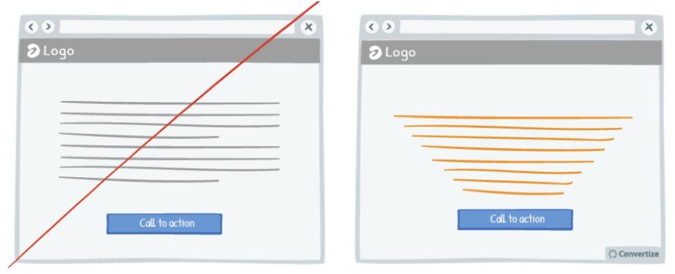
Increase the prominence of your Call-to-Action (CTA)
Your CTA – “Buy Now” or “Add to Cart” – should stand in stark contrast to the rest of your page.
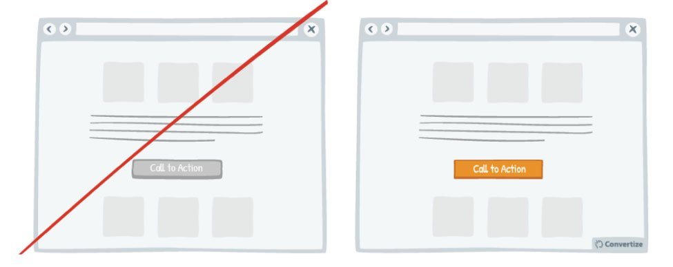
Similarly, you should set it apart from other content on your page.
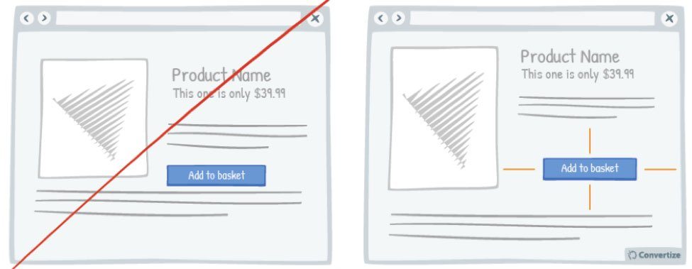
Use subtle visual cues to draw the eye to your CTA
Strategically placed shapes can subtly draw your visitor’s eye across the page and towards the action you want them to take.
Similarly, you can get creative with the layout of your text to nudge visitors towards the desired action.
Website Optimization Tactic #2: Create Cognitive Ease
Nobel-prize winning economist Daniel Kahneman’s Thinking, Fast and Slow (2011) explains that our brain has two modes of thinking:
- System 1 is our involuntary, automatic impression and understanding of something
- System 2 is the conscious mental effort we devote to a complex task
For example: When we read 2+2, our System 1 mode automatically gives us 4, whereas, if we read 37 x 63 we have to engage our System 2 mode and make a concerted mental effort to work it out.
Cognitive Ease is the idea that people who are forced to switch into their System 2 mode experience increased cognitive strain and, as a consequence, become suspicious.
The last thing you want is a customer on your website to encounter something confusing or unclear. Remember, 90% of consumer decisions are based on emotion, but as soon as something is slightly difficult to understand System 2’s logic takes over.
This is one of the most important neuroscience principles. You want to minimise the mental effort customers expend in selecting and purchasing a product.
One simple way to identify confusing or unintuitive aspects of your website optimization is to get someone unfamiliar with it to try to find and buy a specific product. Any instances where the visitor hesitates or becomes lost are likely to be points where customers are leaving your website.
These are good aspects to test variations of with AB testing software but before that, you can alter your pricing in a way that makes the purchasing process as simple as possible.
Here are some ways to do that:
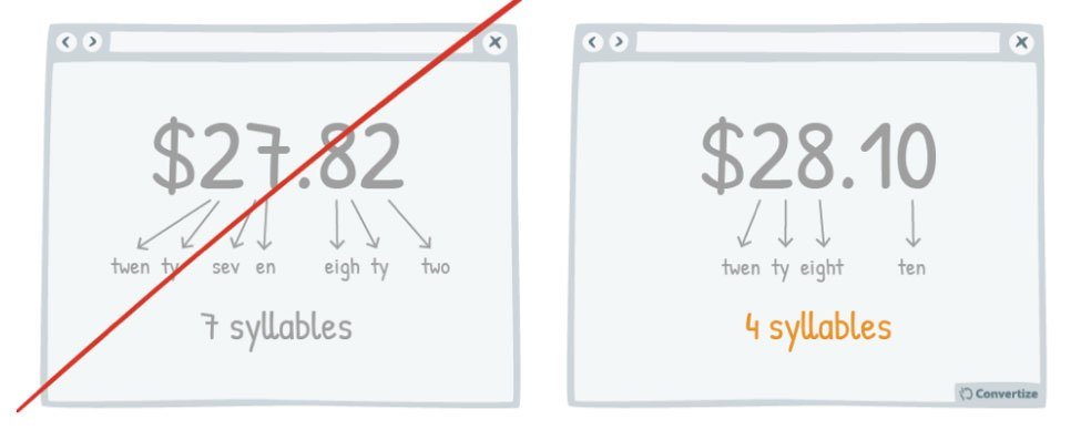
Make prices as simple as possible
Choosing a price with fewer syllables minimizes the cognitive strain for your customer, making them feel subconsciously more comfortable with making a purchase.
Price emotional & rational product types accordingly
Our brains process prices differently depending on whether a purchase is guided by rationality (non luxury, essential goods) or by emotions (products we buy solely to make us happy).
When someone is making an emotional purchase, round prices work best because they are processed quickly in a way that corresponds to the emotional, impulsive System 1 mode of thought.
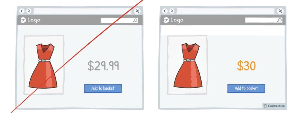
Conversely, rational purchases are based on the logic of their necessity. We use more mental effort to process non-rounded prices and so these align well with the System 2 thought processes.
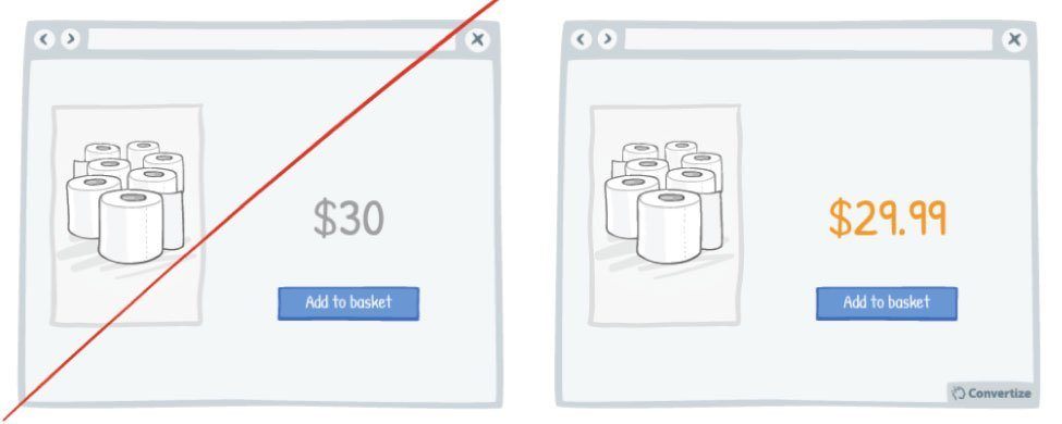
Furthermore, value is often a foremost concern with necessary goods and decimal values have been shown to make a price appear significantly lower. This is because we are prone to focus primarily on the first digits we read, so $29.99 appears much closer to $29 than $30.
Website Optimization #3: The Anchoring Effect
This is a useful principle to be aware of in all areas of life. It’s the phenomenon by which people rely too heavily on the first piece of information they receive when making subsequent judgements.
There have been many studies on this, but perhaps the most shocking was a study in which experienced German judges were read a description of a woman caught shoplifting. They then rolled a pair of loaded die, so each was shown either a 3 or a 9.
They were then asked whether the sentence they would pass would be greater or lesser in months than the number on the dice. Finally, the judges were asked what specific sentence they would give. On average those who rolled a 9 said they would sentence her to 8 months; whilst those who rolled a 3 gave on average 5 months.
In marketing, the Anchoring Effect subconsciously influences the prices customers consider to be acceptable and thus the quality or value we perceive goods to hold.
Here are some ways you can use the Anchoring Effect to boost your website optimization:
Display a higher price first
If the first price customers see is high, it becomes an anchor from which they evaluate other prices. Consequently, cheaper products appear to be better value even if they aren’t the cheapest on offer.
Expose your users to large numbers
If the first number a visitor to your website sees is a high one, subsequent values (such as product prices) will be seen as being much lower and more affordable, comparatively.
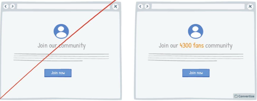
Interestingly, any large number will work, with no link to pricing necessarily required: You could use number of members, satisfied customers, visitors per month, etc.
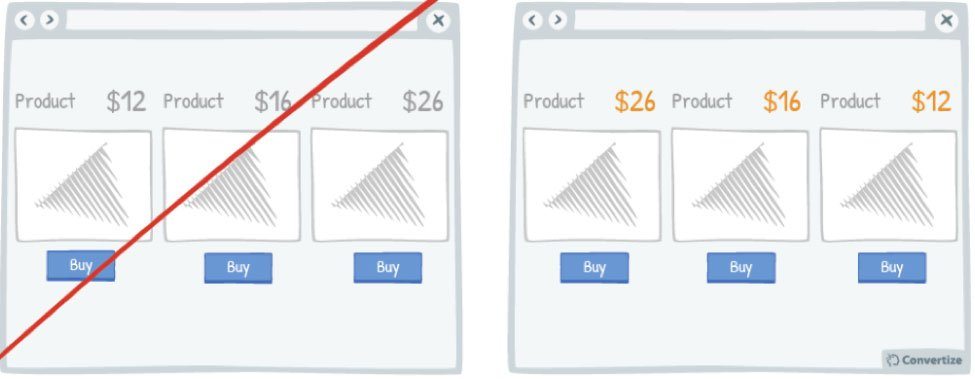
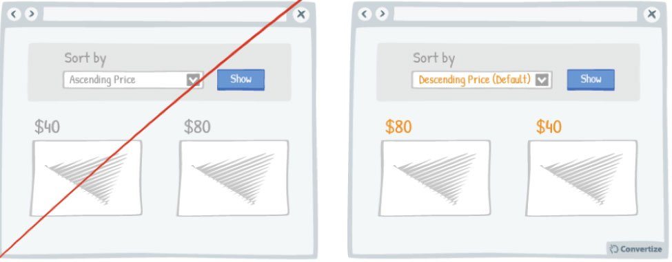
Use “descending price” as your default sorting option
This way, people will see your highest priced items first, and all subsequent items will seem to be much better value by comparison.
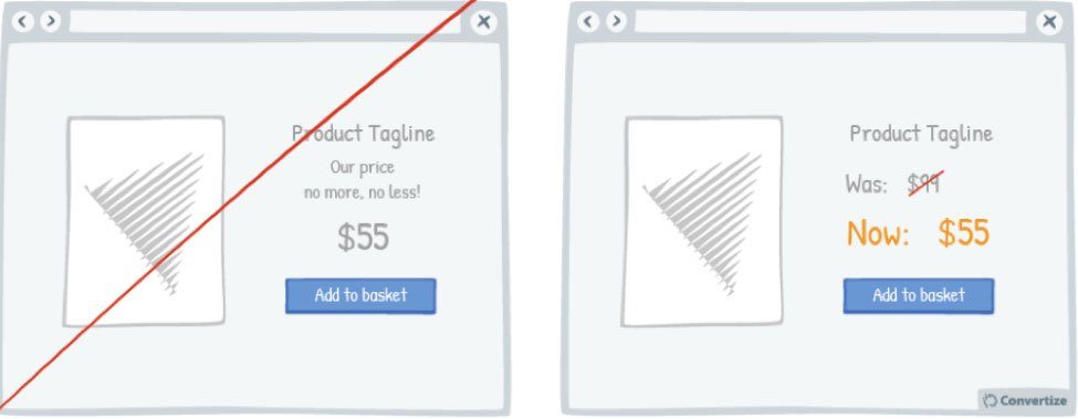
Show the previous price of discounted items
When a product is discounted, always include the original price (crossed out to avoid confusion), as it will then serve as an anchoring point and emphasize the value of the product’s sale price.
Website Optimization Tactic #4: The Pain of Paying
Pain of Paying was first discussed by Prelec & Loewenstein in 1998, and it describes the psychological link between payment and lack of pleasure or pain. It has been proven that spending money actually activates the areas in our brain that are associated with physical pain and feelings of disgust!
What’s more, studies have shown certain forms of payment “hurt” more than others. The more evident, tangible, or transparent the payment is, the less we are able to enjoy the process.
This means that pain is reduced when paying by credit card or receiving something some time after we have purchased it.
The following strategies are all designed to reduce the Pain of Paying Effect by making the process of adding a product to a basket and submitting payment details as streamlined as possible.
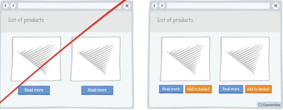
Allow the option to “Add To Basket” in click
This reduces the effort a customer has to put into navigating through to completing a purchase.
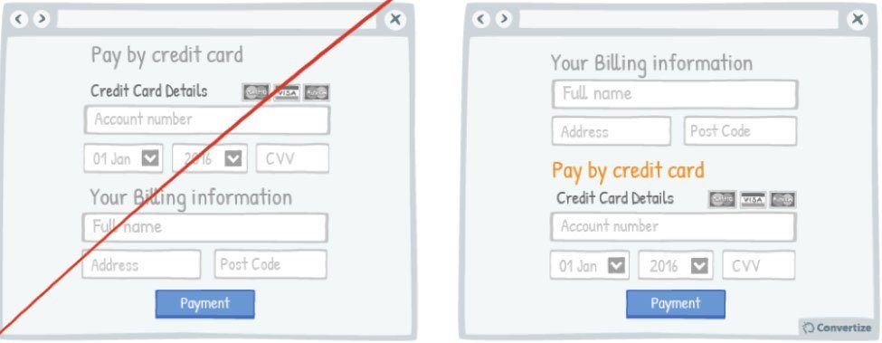
Ask for credit card details last
You should leave the credit card details to the end of your payment form. It is better to first ask them for easier, less disagreeable information as studies have shown the act of entering payment details can cause such a negative reaction that the customer decides not to complete the purchase.
This also draws on the Foot-in-the-Door (FITD) Technique: The idea that it is more effective to first ask for something small, which builds a small bond between the requester and recipient and makes them more likely to provide something bigger (in this case, payment details) later.
Avoid showing currency symbols
This reduces the tangibility of paying for an item, thereby avoiding part of the negative feelings associated with paying.
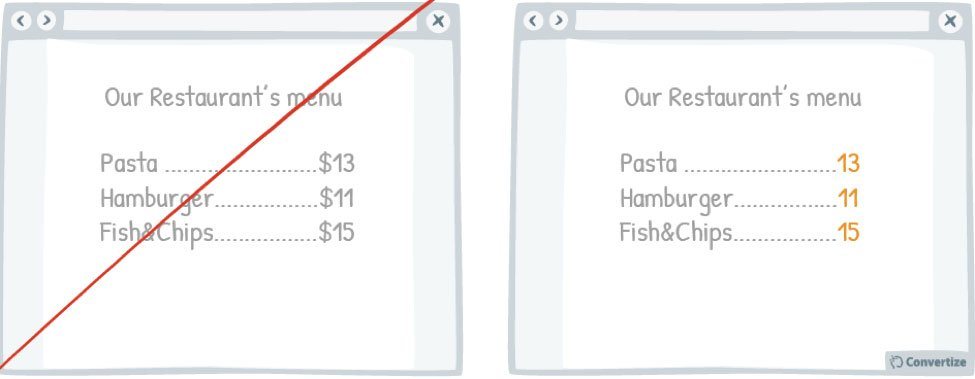
However, if you offer products in a range of currencies, this may be confusing and cause more harm than good. In this case, making the currency symbol smaller than the numerical value can reduce the Pain of Paying Effect whilst still providing all the necessary information.
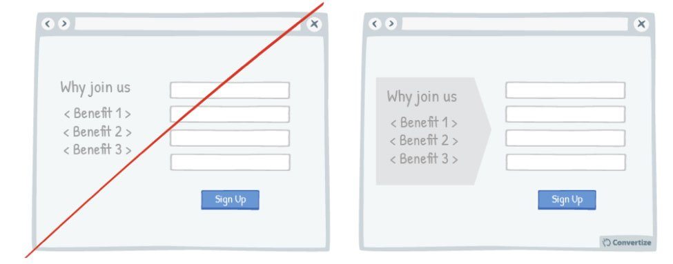
Website Optimization Tactic #5: The Split-Attention Effect
This is the idea that when you need more than one piece of information to understand something, it’s much harder to process when it’s presented separately. For example: If you try to assemble a flat pack wardrobe and the diagrams are on a separate piece of paper to the instructions, having to divide your attention between each page would make the task more difficult.
When you’re designing your website and have multiple pieces of information to convey to your customer, presenting this clearly and in one location will make the decision to buy easier to arrive at.
Likewise, too many exit points or menus can distract visitors from the actions you want them to take.
What does a store designed to avoid the Split-Attention Effect look like?
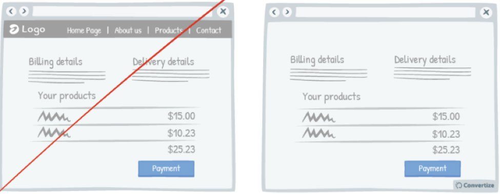
Removing all distractions from your checkout page will allow users to focus on the main goal: Payment. Many elements are superficial and unnecessary to the checkout process, so get rid of them.
Nike’s website is a great example of an effective, distraction-free landing page:
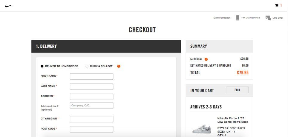
Here you can see all category menus from the store have been removed. Instead, there’s a minimalist clickable logo in the top left to navigate back to the homepage, and four unobtrusive links in the top right: The cart view, live chat support, a phone number, and a feedback link.
Note how feedback and live chat are pop-ups that don’t navigate away from the checkout page.
Avoid placing advertising above product lists
You want your customers to be fully focused on the products that they initially came to your website looking for, that’s why it’s important that any advertisements they click on take them directly to landing pages designed for that ad.
The same applies to when they specify what they want to buy. When a category is clicked on, or a product searched for, the relevant products shown are the “Product List”. Again, you want to make sure that what they are looking for is clearly shown.
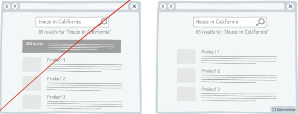
Advertisements that appear above this list can cause confusion when they aren’t part of the same category or search that your customers were looking for. Anything that distracts from their original purpose of being on your site will reduce their likelihood of completing a purchase.
As a user completes a form, unlock the next section
You will almost always need a customer to fill out a form for payment, and this is a dull, time-consuming process that reminds them of the “Pain of Paying”.
To make it as simple and distraction-free as possible, don’t give access to the whole form in one block. Rather, split it into separate steps that gradually unlock as the previous stage of the form is filled in.
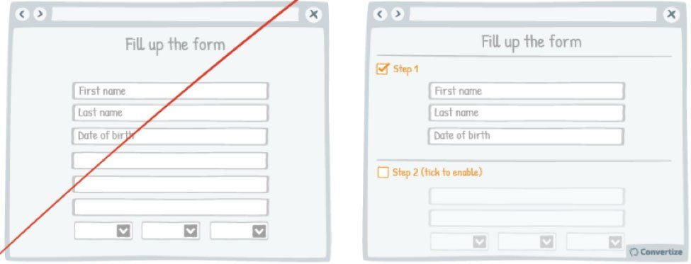
Filling out simpler pieces of information initially will make the user feel more inclined to proceed with subsequent steps (like the Foot-in-the-Door Effect). In fact, they will even feel a positive sensation of completion and progression with each stage.
This also means you can block off sections that don’t apply to certain customers, improving the intuitiveness of the whole process.
Website Optimization Tactic #6: Use Social Proof
This is a relatively well-known phenomenon: It’s the idea that we are driven to engage in behaviour when others have done it before us. This is especially true when we are hesitating, as we assume others have more knowledge of a situation and have acted correctly.
This is where our reluctance to be the first to leave work comes from, or to take the first step towards the untouched buffet. It’s why it’s a good idea for bartenders to make sure there is always a bit of change in a tip jar, as it shows other people have deemed the service worthy of tipping.
Include more than just a name & review
Clearly, testimonials are an effective way to harness social proof on your store, but do yours include a name and photo? How about the customer’s location?
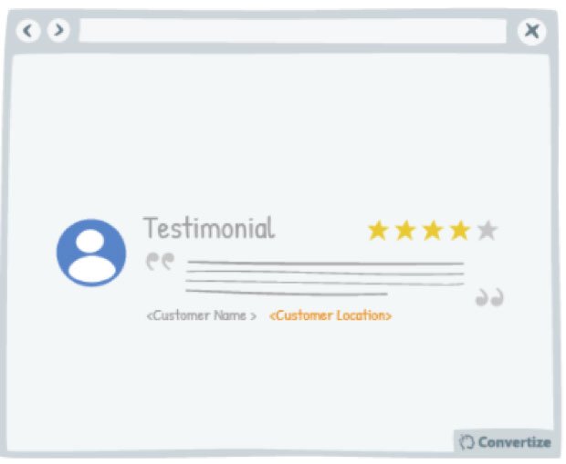
Testimonials are more credible if your visitors can identify with the reviewers as real people, and providing as much detail as possible about each reviewer will strengthen the effect of social proof.
Include sales figures & viewing history
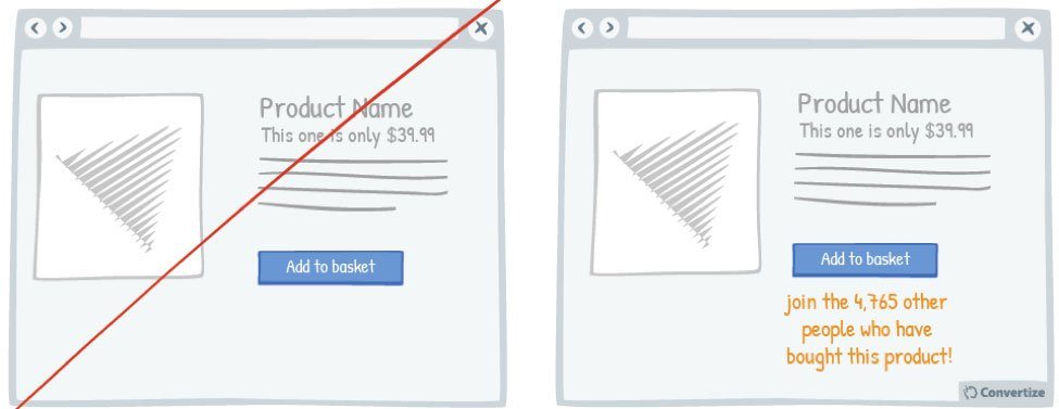
Clearly, showing sales figures isn’t the best strategy for a newly-launched product but once you have racked up a decent number of sales, you can set up a dynamic text element that is linked to the sales for a product. The best thing about this tactic is that the longer you have the product listed, the stronger the Social Proof Effect will become!
You can also use persuasive notifications that trigger after someone has looked at a product for a few seconds or purchased a product. Some copy saying, “3 people have recently purchased this product” and the rating by Parker are examples of social proof.
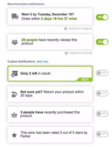
Some of these notifications can also touch on the Scarcity Theory: This is the notion that we place a greater value on something if it is scarce or hard to get hold of. Copy such as, “Only 2 left in stock!” leverages the Scarcity Effect, especially when used in conjunction with the notification, “28 people have recently viewed this product”. The other notifications shown above are designed to offer reassurance to a customer, providing the final nudge they need towards deciding to make the purchase.
What Are You Waiting For?
These small website optimization tactics will make choosing and purchasing products as simple as possible for your customers. Many of them require no coding, provided that you use a platform (such as Shopify) with simple editing features, and their basis in neuroscience means they work with customer’s hard-wired cognitive biases to increase conversion rates.
Originally posted on BetterLemonadeStand.
by Benjamin Ligier
Benjamin is a CRO Expert at Convertize. He is passionate about design, web marketing and consumer psychology.


Good article an excellent way to articulate. Keep it up
Thanks for the comment, and glad you enjoyed the post! We are always looking for new ways to optimize business websites with neuromarketing principles.