8 Neuromarketing Principles Used by Airbnb to Optimise their Sign-up Form
Whether you’re a startup or an established business, lead generation is key for continued success and growth. So, if you do well enough to get people to the point where they’ve arrived on your sign-up form then the last thing you want is the form itself sending them bouncing away!
We took a look at some well-known online businesses to see just how successful their sign-up forms were from a UX perspective.
And the overall winner is….Airbnb! Congrats guys, your medal is in the post ;).
The Airbnb sign-up form up is an excellent example of well-thought-out and effective UX design. A large part of its success comes down to Processing Fluency and Cognitive Ease – the cornerstones of effective UX design! – but there are several other simple neuromarketing principles that are also useful for consideration when designing any kind of sign-up form (or equally any other element on your website).
×
8 Neuromarketing Principles Used by Airbnb to Optimise their Sign-up Form
We will send you an email so you can grab the download later!
![]()

![]()
8 Neuromarketing Principles Used by Airbnb to Optimise their Sign-up Form
Click here to download a PDF copy of this article Save to read later or share with a colleague.
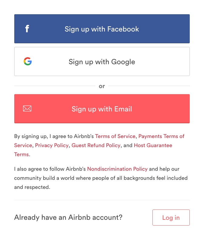
Social media access
Everyone loves to feel in control (thanks to the Autonomy Bias). Providing the option to sign up with Social Media or Google allows people to choose the option that suits them best and to feel that satisfying autonomy. Signing up through social media may often also be a much speedier process which is always an attraction and, even better for you, it can allow you access to certain parts of their profile and details so can be an excellent source of invaluable data.
Progressive disclosure
Instead of displaying the whole form on the first page, Airbnb uses progressive disclosure, only opening up the full form once the user clicks on “Sign up with Email” which keeps things clean, simple and doesn’t intimidate the user as they are being slowly introduced into the sign-up process. It also helps to keep the Attention Ratio on the right side – ensuring that there are no distractions from the initial question, which is simply the way in which the visitor wants to sign up.
Column layout
There’s nothing messy about this column layout – because there’s only one! One clean line with each field listed one underneath the other to keep the form looking very simple and clear with ample space allowed for filling out the fields (this aids Processing Fluency).
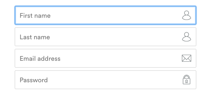
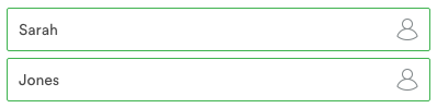
Icons used inside the fields
The icons bring a nice design element to it and also just add that extra ease of comprehension – you see the mail icon and you know that’s where your email address goes. The easier and quicker people understand what you’re asking them to do, the more like they will actually do it. This also reflects the Picture Superiority Effect, which relates to the way that images have much more impact and lasting impression than text alone.
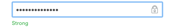
Password strength validation
This is always a reassuring tool to provide your customers. Security online (or lack thereof) can be a big factor in putting people off following through with a sign-up or purchase and so giving an indication of how strong their password is will give a sense of safety and satisfaction. This is linked to Risk Compensation – a cognitive bias that explores how we are happier to do things when we feel we are in a protected environment.
Overall field validation
When a field has been successfully completed, it is clearly highlighted with a green outline. The Zeigarnik Effect is a cognitive bias that demonstrates how individuals feel dissonance and unease if they only half complete tasks – so by highlighting the progress made during the sign-up process you can remind visitors of how far through the process they are and encourage them to see it through until the end. It’s also a nice way of giving the customer a sense of completion and closure which is equally important for happiness and satisfaction.
Clear indication of errors
On the flipside, it’s just as important to clearly notify customers when there is an issue with one of their completed fields. There’s nothing more frustrating or annoying than being told your form won’t submit but with no hint of where any errors might be. Make it quick, obvious and easy for them to see (thereby appealing to the Cognitive Ease bias) and rectify any errors to ensure frustration doesn’t lead to a swift exit.

So, take a leaf out of Airbnb’s book (aka form design), and appeal to your customers’ desire for clarity, guidance and autonomy, and watch those sign-ups roll in!
If you want to learn more about how cognitive biases can help you to effectively engage and encourage your visitors to convert then check out our new service Convertize to find out!
by Aleksander Gora
Aleksander is a Product Developer with a background in market research and strategy. His research focuses on User Experience, graphic design, and advertising.