BlaBlaCar – How Do They Use Neuromarketing To Boost the Conversion Rate of Their HomePage?
Whether you’re a startup or an established company, your site’s homepage deserves your attention as it is the first thing your customers will see when they arrive on your site! It’s effectively your shop window and, if you pass by a shop window that’s in disarray with all types of clothing – from goth t-shirts to ties – all thrown in together, you’re probably not going to feel that inclined to stop and shop. In digital marketing, quitting upon arrival at a homepage before taking the time to look around is called the Bounce Rate, and the higher this rate is, the more it says about the success of your user experience (otherwise known as UX) – or lack of.
×
BlaBlaCar – How Do They Use Neuromarketing To Boost the Conversion Rate of Their HomePage?
We will send you an email so you can grab the download later!
![]()
![]()
BlaBlaCar – How Do They Use Neuromarketing To Boost the Conversion Rate of Their HomePage?
Click here to download a PDF copy of this article Save to read later or share with a colleague.
It goes without saying then that it is absolutely vital to make sure your homepage is on point. Therefore, we are going to explore just how to achieve this.
Today, we’re going to look at one of our favourite startups, BlaBlaCar, and discuss which elements of their homepage are particularly successful in terms of the Neuroscience principles that are at play.
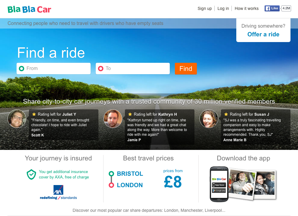
A search bar that stands out
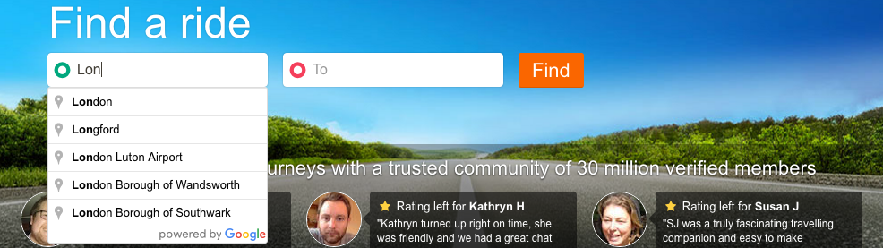
Perhaps the most important element of a homepage is its search bar or functionality. No matter what you’re “selling”, the search bar is an important conversion tool, helping your customers navigate through your site efficiently. It’s important, therefore, to make use of the Von Restorff Effect – by ensuring that the search bar distinguishes itself from other elements on the page through use of colour, size, position, etc. – in order to ensure your customers’ attention will be immediately attracted to it.
 The search bar is an important conversion tool,
helping your customers navigate efficiently Click to tweet
In the case of BlaBlaCar, where the main activity is online booking, it is essential that the search bar is as clear as possible. It is effectively the first element that we notice when landing on the Homepage – as it is centralised, very large and relatively distinguished by colour from the background image. One small suggestion here could be to center the search bar over an opaquer background, as the image included could be potentially distracting.
Not only does the search bar need to be clear and attention-grabbing, in order to perfectly correspond with good UX practice, it should also make use of the Cognitive Ease principle. This means that the easier our brain can process information, the more positive the impact will be on behaviour. On the BlaBlaCar site, when you begin to type in the search fields, it will give you suggestions. For example, if you start to type “Lo…”, it might suggest “London” as a corresponding popular choice.
One little tip in order to make the search bar even more visible (as it is in front of an image), you should add a transparent frame around it.
Background Image
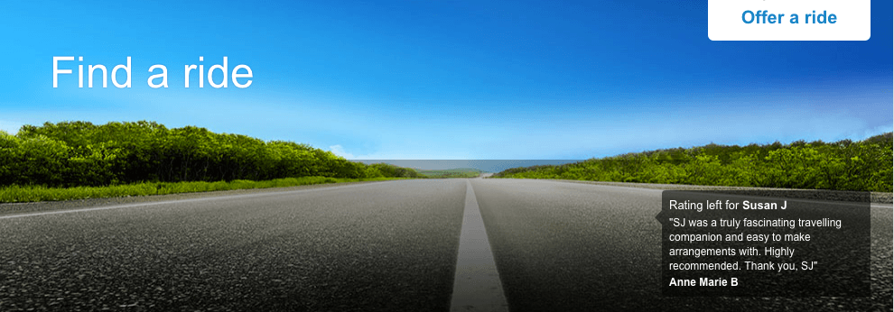
The Homepage image is the most important component of your “shop window”. ‘A picture speaks a thousand words’, so be careful that your image fits perfectly with the message you want to convey.
Two important things that you must know to find a background image (or images if you have multiple) for your Homepage: First, don’t neglect the Visual Depiction Effect – People are more inclined to buy a product when it is shown in a way which helps them to visualise themselves using it – Secondly, don’t forget to apply the Attentional bias that explains the way in which human beings notice and pay much more attention to things that touch us emotionally.
To sum up, you have to call on your visitors’ emotions !
We give BlaBlaCar a negative point here … the image of an empty road will not cause the right emotions for your visitors!
All the ads are about sharing and exchange, not about loneliness !
We want to see people in a car laughing, singing, … enjoying the moment! Why not have an animation as the background image (by darkening the animation to make sure that it will not disturb the use of the search bar … yes we never neglect one element at the expense of another.)
Trust symbol
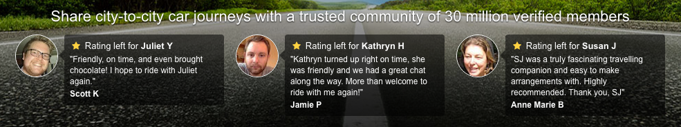 Rent your apartment to strangers, travel with a stranger, pay online with your credit card, … all those actions can be daunting. It shouldn’t be a surprise if I tell you that you must reassure your customers!
Using the Risk Compensation will help you to avoid scaring your customers away. Indeed, this cognitive bias explains that we are happier when we feel safe.
Therefore, saying “Share city-to-city car journeys with a trusted community of 30 million verified members”, BlaBlaCar is applying this principle perfectly. They reassure you thanks to the figure (30 million), they show you positive reviews left by users and they use strong words as “trusted” and “verified” to make you feel safe.
30 million …. if you take the time to think about it, it means that almost half the population of the UK uses BlaBlaCar and are “verified members”! And here is the Social Proof! It is the idea that we are intrinsically driven to conform and so will often be influenced to copy other people’s’ decisions and actions … Do you know the expression “act like sheep” ?
If Scott, Jamie and Anne Marie tell you that it’s amazing and that half of the UK population use it, then it’s worth trying and there is nothing to worry about.
One last tip : Showing just one star on reviews can disturb your customers. Actually, at first glance, we can think that the reviews are negative (our brain is programmed to think that one star is bad and three or five stars is good). Be careful to avoid this kind of mistake because visual components stand out first.
Let’s sum up … the most important Homepage components are : the background image, the search bar and the trust symbol.
Obviously it’s not the only one, you also have the value propositions, the headlines, the special offers, etc. that are important but we can’t reveal all our secrets at once!
Want to optimise your website by implementing Neuromarketing principles? You can do it easily using Convertize, the first Neuromarketing platform for Digital and UX teams.
by Benjamin Ligier
Benjamin is a CRO Expert at Convertize. He is passionate about design, web marketing and consumer psychology.