Your Web Form Design Is Costing You Sales (This is How to Fix It)
The forms you use on your website to collect information such as contact or purchasing data are a critical point in your sales funnel. They turn a casual browser into a lead or even a customer. So why does web form design receive so little attention compared to other e-marketing skills, such as copywriting?
Consider that it’s at this stage that you requires your customers to act and make some effort. Are you missing conversions by making users work harder than necessary?
Many of the most common mistakes are easy to correct. Don’t risk losing a potential customer when slight changes to your web form design could produce big results. We’ll look at some of these things here so you can start putting things right.
Labels, Length and Pop-Ups – How To Simplify Your Web Form Design
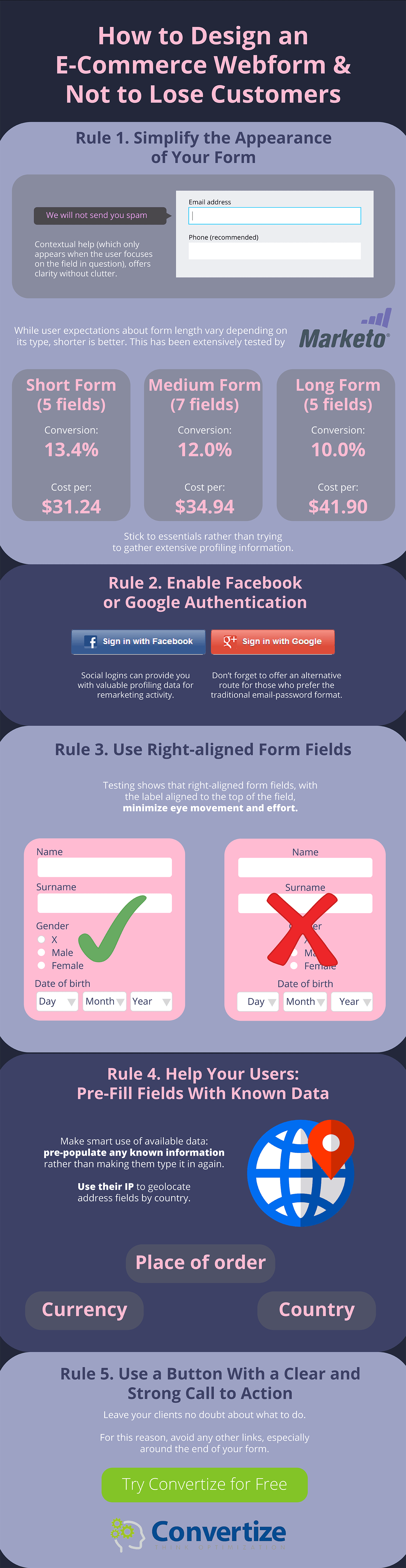
Does your form look easy and welcoming, or complicated and cluttered? First impressions set the mood in mere fractions of a second. How much can you remove from the appearance and still have a functional form? This highly-trafficked webform has a single field in it:
Yours probably needs a few more than that, but there’s a lot you can do to simplify the appearance.
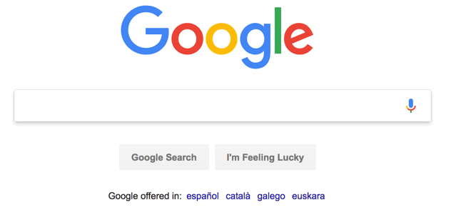
Contextual help (which only appears when the user focuses on the field in question), offers clarity without clutter.
This example from Intuit not only offers in-the-moment advice, but notice the way the current field automatically highlights too? This is also a good, subtle cue to help you pay attention and not put your name in the email field by mistake.The labels are visible outside the form field, so they don’t disappear with the cursor click.
By using an email address as an identifier, Intuit avoids asking users to think up a username. This removes one of the major pain-points in any web form design.
While user expectations about form length vary depending on its type, shorter is generally better. Stick to essentials rather than trying to gather extensive profiling information. Better yet, why not consider using the power of social logins, enabling Facebook or Google authentication as Pinterest had done?
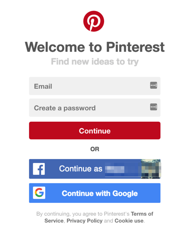
Social logins can also provide you with valuable profiling data for remarketing activity, but don’t forget to offer an alternative route for those who prefer to use the traditional email and password format.
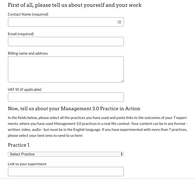
If your form really does need to be longer, then be sure to group similar items together to make the flow logical and consistent.
To design longer E-commerce forms, you can learn a lot from best practice in survey design to maximize completions. Simple rules like logical hierarchy, progress indications, and grouping comparable items together help smooth the path for your prospect:
And even on a desktop, single column layouts work best:
Testing with eye-trackers shows that right-aligned form fields, with the label aligned to the top of the field, minimise eye movement and effort.
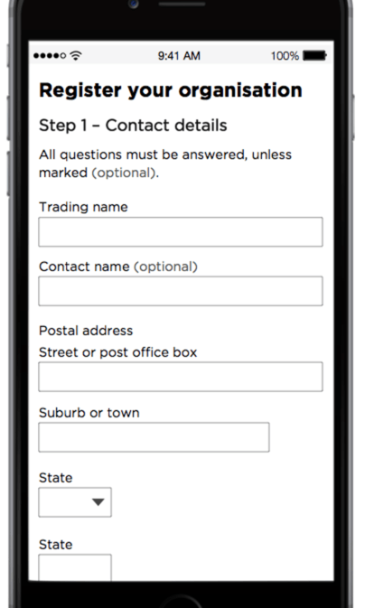
When it comes to mobile responsiveness, there’s always a trade-off between usability and ‘nice-to-have’ information. In that case, consider a simplified version of the form, stripped to the essentials for a smaller screen.
And while the meaning of the red asterisk is broadly understood nowadays, flagging questions as optional – rather than compulsory – is a subtle way of being non-coercive, respectfully:
When it comes to respect, you can show it other ways as well by building trust, minimizing data, and being clear about how it will be used.
Helpful Web Form Design: Pre-Fill Fields Using Extrapolated Data
The more work you can do on the back-end using jQueries and known information, the less effort and cognitive load for your prospect.
So, make smart use of available data: pre-populate any known information rather than making them type it in again, and use their IP to geolocate address fields by country.
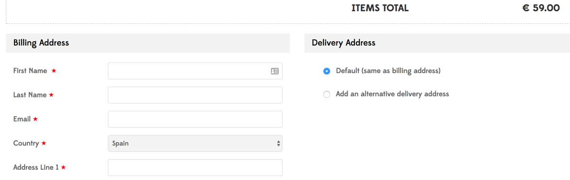
They can always amend any incorrect guesses, of course, but for most people it will reduce completion time if you do make smart assumptions (such as the shipping address is the same as the billing address).
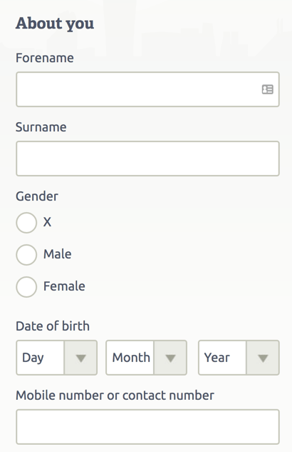
Just don’t make politically insensitive assumptions about things like gender, or any other generalisations that can create errors. Avoid generalising, such as trying to force non-US audiences to enter a State in an address field, or assuming everyone even has (never mind wishes to share) a ‘home phone number’.
Remember that anything which makes people pause or jolts them out of the flow of completion creates friction, and this could be the distraction that leads to abandonment. Having to think too long about an ambiguous question creates a cognitive dissonance: the sense of possibly ‘doing it wrong’ creates unconscious discomfort and could trigger avoidance.
Many form building applications are now very fully-featured, designed especially for complex questionnaire designs, offering a vast range of questions. For simple E-commerce data capture, however, keep it simple! For example, endless- drop-down lists are confusing, so don’t even go there.
Captchas and Passwords In Web Form Design: Remove Landmines From The Final Fields!
Of course, some parts of a form simply must be done in a certain way for a valid submission, but error messages are one of the greatest potential sources of friction.
Make sure you validate in-line and use friendly language to intervene contextually. A good example is something like, “That email address doesn’t look quite right, can you please check it once more?”
Nothing is worse than completing a lengthy form which then fails to submit for some reason, making it difficult for the user to find, let alone correct.
Think long and hard about the use of Captchas. Other options exist, and most require only a click to confirm; many form applications have simple widgets for this. Once you have gotten someone right to the end of your form, do you really want them to give up in despair?
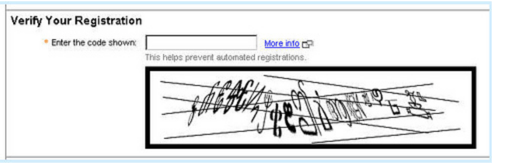
Image source: itmanagementandcloudblog.com
Rather than trying to identify obscure graphics, you want the final click to be easy and obvious. So, use a button with a clear and strong call to action, leaving them no doubt about what to do. For this reason, avoid any other links, especially around the end of your form.

Image source: twitter.com
Afterwards, take them to a page that confirms submission and reassures about privacy. You’ll want to make it clear exactly what will happen next; do they need to look out for a validation link? Can they log back in straightaway? Will they receive an email…?
Conclusion And Action Points: Start Fixing Your Forms Today
The good news is that most problems with webforms are easy to diagnose using your analytics and user feedback.
- Check whether specific questions yield larger numbers of errors, and fix them first.
- Try to look at your form with ‘fresh’ eyes. Better yet, do real testing with naive users.
- Remove any non-essential items, visual clutter, and unclear questions.
- Be sure your CTA is clear and accessible.
Other priorities will be harder to quantify up-front, but by split-testing changes and seeing what your audience responds to best, you’ll continue to optimize and iterate towards the lowest CPA by converting as many visitors as possible.
So, start today with a critical look at your form and its current results, and develop an action plan for improvements. Implement, test, review, and evaluate.
What is the first thing you are going to change?
by Benjamin Ligier
Benjamin is a CRO Expert at Convertize. He is passionate about design, web marketing and consumer psychology.