How To Optimize Your Checkout Page
We get hundreds of emails every month that start the same way: “My website’s getting solid traffic, but I just can’t get people to buy.” Checkout page optimization is often the first step because it can increase your sales immediately by cutting down on abandoned baskets. This page will show you:
- What makes a checkout page work
- 3 simple steps required for checkout page optimization
- 24 tactics to help you optimize you checkout page
How To Optimize Your Checkout Page (2020)
There are hundreds of reasons for someone to leave your website without making a purchase. They might be too busy, they might not be ready to buy, or they might have found a better offer elsewhere.
Conversion rate optimization is about reducing the lost sales you can avoid and making it easier for people to click “Buy.” There are some simple steps that can improve the conversion rate of any website, and the best place to start is often your checkout page.
How Does Checkout Page Optimization Work?
You don’t persuade a customer to buy at the checkout. By the time your customer arrives at the payment page, they have already decided to buy. Checkout page optimization is about making the next steps quick and easy.
With this in mind, it’s probably easier to ask “What do most checkout pages get wrong?”
What Do Most Checkout Pages Get Wrong?
A recent consumer survey by eCommerce consultants Baymard placed the average abandonement rate for a checkout page at 69%. The survey also showed the most common reasons for a customer abandoning their purchase at the checkout.
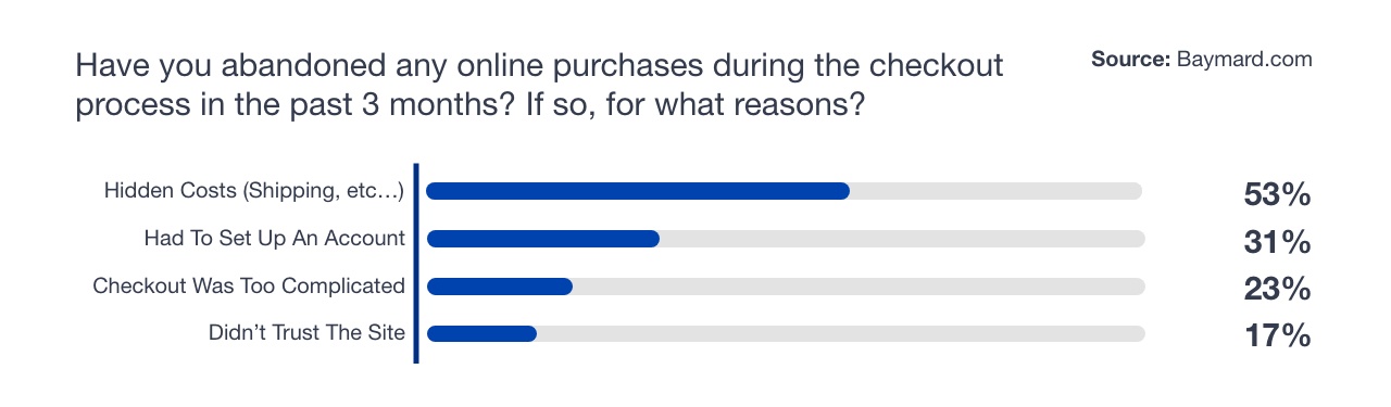
The survey identified 3 key issues that affect customers during the checkout process:
- Hidden costs that are introduced at the last minute
- Difficult or complicated processes (which often involve setting up an account)
- A lack of trust in the website itself
There are three steps to checkout page optimization, and they answer each of these three issues. Once you’ve optimized your checkout page for Speed, Simplicity and Value, you should start to see your conversion rate climbing.
1. Optimize Your Checkout Speed
Checkout page optimization is all about speeding up the payment process. To do that, you need to think about two separate issues.
- How fast are you pages loading? Even minor delays can put off a potential customer.
- Does your customer have to do too much? Unnecessary form fields add time and effort to the process.
Loading Speed and Checkout Page Optimization
The impact of loading speed on user experience is huge. According to studies by the web development agency Skilled, a 1-second delay on page loading equates to over 10% fewer page views.
- The BBC website found that 10% of users disappeared for every second their site took to load
- Pinterest managed to increase sign-ups by 15% simply by speeding up their website.
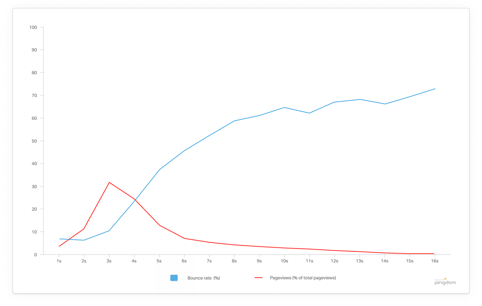
- Pingdom found that bounce rates double when a page loads in 4 seconds rather than 3.
However, this is nothing compared to the impact that loading speed has on conversion rates.
- The data collected by skilled also showed that 47% of online shoppers expect a page to load in less than two seconds
- A 2019 survey by Unbounce showed that 45.5% of people would abandon a site that loaded slower than expected.
How To Optimize Your Checkout Page Loading Speed
The first thing to do is to start testing. Both Google Page Insights and Pingdom offer free tests for a single page. If you want to track continuously, you can subscribe to a paid plan. Once you have started to test your pages, you should try these technical fixes:
- Use a Content Delivery Network like StackPath, CacheFly , or Cloudflare. This is more of an option for larger eCommerce sites, as it requires you to source your own hosting independently. WordPress, Magento and Shopify have CDN plugins, but these have mixed reviews. However, the gains are clear, which is why 66% of the top 10,000 websites use this system.
- Compress any images that appear on your checkout page. For example, if you want to show the item that your customer is buying, you should use a small image file. Most eCommerce platforms use plugins that can compress your images for you.
- Switch off any unnecessary plugins that could be affecting your site.
Friction And Checkout Page Optimization
Optimizing your checkout is not just about technical solutions; it is about making the process as smooth as possible for your users. That means reducing the number of steps involved in a purchase.
Most websites ask for a lot of information during the checkout so that they can do customer research and remarketing later on. The problem is, this makes the process longer. But, there are a few ways you can speed up the process AND collect the information you need:
- Encourage customers to create an account before they add an item to their cart
- Use Social Media or Google logins to collect the information automatically
- Collect the information after the purchase is made. You can do this by inviting your customer to leave a review or suggesting that they track the shipping of their purchase.
2. Simplify Your Checkout Page
Not so long ago, one of the most popular discussions among CROs was about which performs better — a single-page checkout or multi-page checkout.
Single Page checkouts have one obvious advantage. They involve fewer clicks, which means they require less effort to navigate. On the other hand, a single-page checkout is annoying in a different way: it requires lots (and lots) of scrolling.
The aim of checkout page optimization is to reduce something called Friction. It is a concept developed by consumer behaviour experts like Richard Thaler, Robert Cialdini and Roger Dooley. If you want people to do something, Thaler tells us, the best way is to make it easier. One of the easiest ways to go about optimizing your checkout is to think of your customer like a baby. Here is what I mean…
Treating Your Customer Like A Baby
If making a purchase on your website is so simple a child could do it, you’re doing something right! A great example of this is the way in-app purchases are designed.
On 4th April, 2017, Amazon was forced to pay $70 million to parents. Why? Because children had made thousands and thousands of in-app purchases. And why did that happen in the first place? Because it was so easy a child could do it.
As a customer, the last thing you want to do is decode a strange or complicated checkout page. So, anything you ask on the checkout page should be vital for completing the order. All you need is the shipping address and a few details about the customer — nothing more.
Among other things, you might suggest that Google autofill forms to make it easier for your “baby” customers. It speeds up the checkout process and is supported by the most popular browser: Chrome.
The order in which you ask for information is also important. People are usually cautious about credit card security, so asking for payment information too early on the page is a mistake.
Single Page VS Multi-Page Checkouts
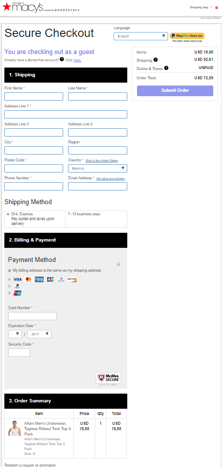
We have previously described all of the benefits that come with a single-page checkout. However, take a look at this screenshot of the Macy’s website. It will make you wonder if putting all your Checkout Page fields on a single screen is really such a great idea.
We managed to find a similar item of clothing at another online website (which wasn’t very difficult): GymShark. This is a store on the Shopify platform. The predefined checkout page looks like this:
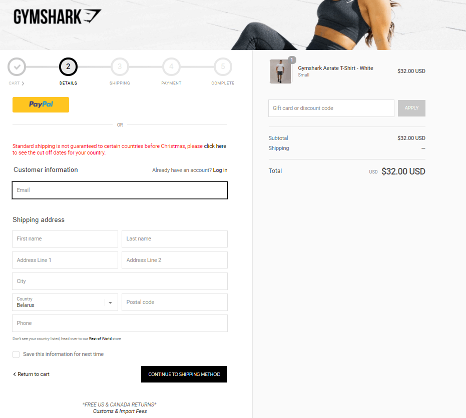
An experienced eye might still see plenty of areas for improvement here (we’ll talk about that in the next section). Even so, the general impression is that this checkout page is much more user-friendly than Macy’s. Which leads me to the next point – testing your checkout.
Checkout Page Optimization and A/B Testing
One of the most famous studies into the best format for a checkout page is Elastic Path’s A/B testing case study. The company A/B tested its two-page and single-page options for checkout and found that the single-page option converted 21.8% more than the multi-page option.
It’s not unusual to find these kinds of gains with A/B testing; in December 2019, a client with Convertize increased their mobile conversion rate by 37.5%, simply by adding simple notifications to the checkout process.
However, these kinds of experiments do not necessarily prove that one approach is better than another. To optimize your checkout, you need to make it as straightforward as possible for your customers on your website. To find out what that means, you HAVE to test different ideas.
3. Provide Customers With Extra Benefits At Checkout
The number one reason for customers abandoning a checkout page is hidden costs. In fact, of people who had abandoned a purchase in the 3 months before the Baymard survey, over half had done so for this reason. So, what if you turned the tables? Instead of adding a hidden charge, why not offer an unexpected bonus.
David Bell, professor of marketing at Wharton Business School, found in a survey of online retailers that 60% concluded free shipping was one of their most successful marketing tools.
For some reason, a Free Shipping offer worth $6.99 is more appealing to a customer than a $10 discount on the same product. Other studies have highlighted the same effect. For example, a Forrester study showed that 61% of customers prefer free shipping to equivalent discounts.
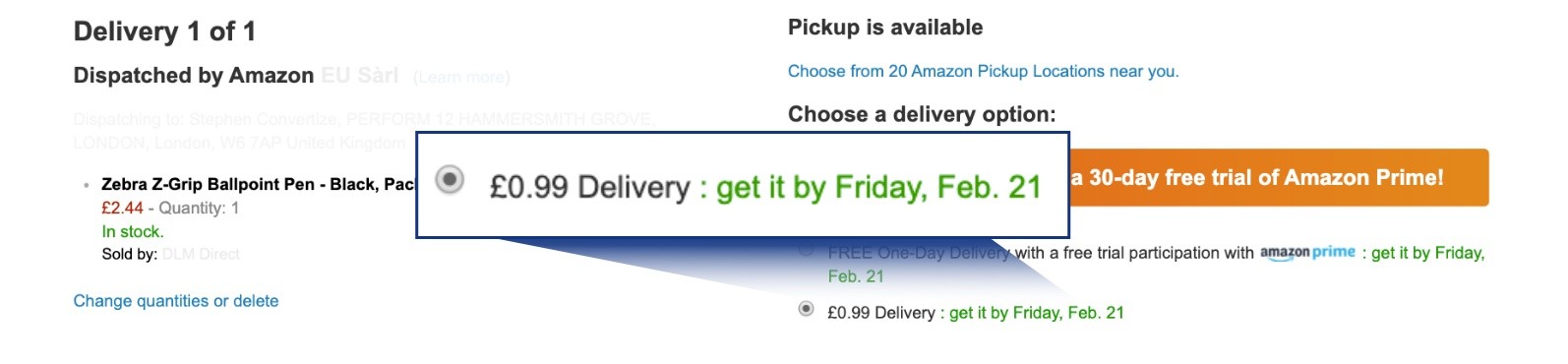
How Amazon Uses Checkout Page Bonuses
One of the main reasons for the huge popularity of Amazon Prime, a paid subscription service now used by 90 million U.S. customers, is that it offers fast and free shipping. As you can see from the image below, the company prefers to write the word FREE in caps.

The best advice for e-commerce businesses here is to work hard at making free shipping offers rather than offering discounts. However, if that’s not possible, there are important principles to consider in terms of how you communicate your shipping costs.
A report from Marketing Science Institute by Morwitz, Greenleaf and Johnson proved that it’s better to present your costs in an “unbundled fashion.”
In the test, they compared two phrases: $69.95 plus $12.95 shipping and handling and $82.90 including shipping and handling.
Buyers paid more attention to the first number they saw. Because of this, the first scenario significantly outperformed the second.
The unbund;ed approach is also how Amazon presents delivery charges when they can’t offer free delivery.
So remember, if you can’t offer a discount or free shipping, you can still optimize your checkout page by giving your customers the bad news in the right way.
24 Checkout Page Optimization Tactics
These 24 checkout page optimization tactics have been collated by CRO experts. Each one is based on UX principles and psychological effects.
1) Offer a Free Upgrade On Your Checkout Page
Providing a free upgrade is a strategy based on the “give and take” idea. If you give your client something of value (a free upgrade), they are more likely to make the purchase or become a return customer. The consumer behaviour expert and psychologist Robert Cialdini identified “reciprocity” as one of his 6 Principles of Persuasion.
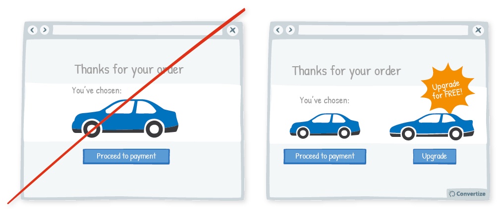
Based On: Reciprocity (Robert Cialdini, 1984)
Checkout page optimization may involve spending a bit of money to improve the offer you make to customers. Even so, this kind of promotion will return any money you invest as it will lead to more purchases in the long run.
2) Highlight Your Refund Policy On Your Checkout Page
By advertising a strong refund policy, you make the payment process easier for customers. Because they see that they can return the product and get their money back, it is less of a gamble for them.
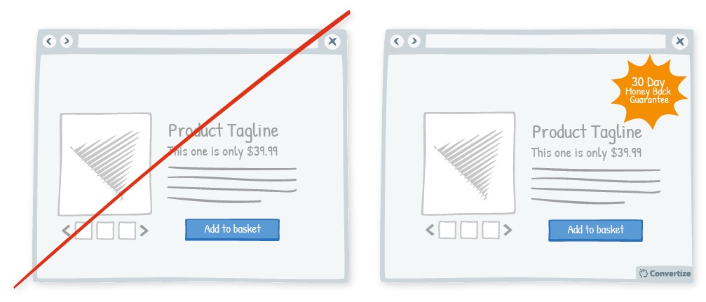
Based On: The Amiguity Effect (Daniel Ellsberg, 1961)
The refund policy may even encourage them to make purchases they otherwise might not have done. They will perceive the investment as less risky, and that their commitment to the purchase isn’t permanent (despite the low probability of them asking for refund).
3) Create Loss Aversion On Your Checkout Page By Showing Scarcity
Loss aversion is the scientific term that explains how the pain of losing is feels stronger than the pleasure of gaining. In general, people are motivated more strongly by the thought of losing something than the thought of what they stand to gain.
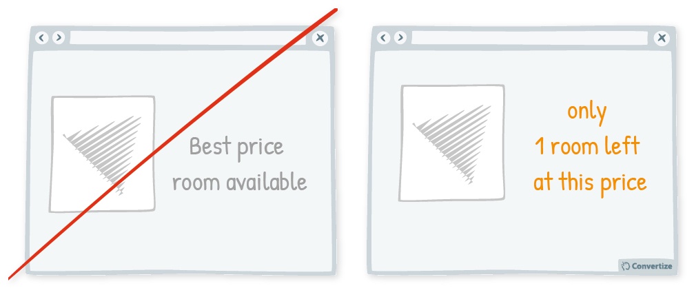
Based On: Loss Aversion (Amos Tversky & DanielKahneman, 1984)
Pointing out that your customer may miss out on a deal or might lose out financially by shopping elsewhere will provoke a powerful feeling of loss. Your customer will, therefore, be more likely to make a purchase.
4) Save Your Customers’ Details To Speed Up Return Purchases
The more tangible the payment process is, the more intensely we feel the it. That can also reduce the pleasure we feel when making a purchase.
Based On: Friction (Richard Thaler, 2008)
Storing your customers’ card details so they can make purchases without entering their card details each time will make the next purchase less “painful”. This will mean your users are likely to be happier with their purchase and more likely to return.
5) Choose Prices With The Fewest Number of Syllables
It may sound ridiculous, but choosing prices with fewer syllables makes them quicker and easier to understand. The clearer you can make things, the faster your checkout process will be. Checkout page optimization is about attention to detail, so every syllable counts.
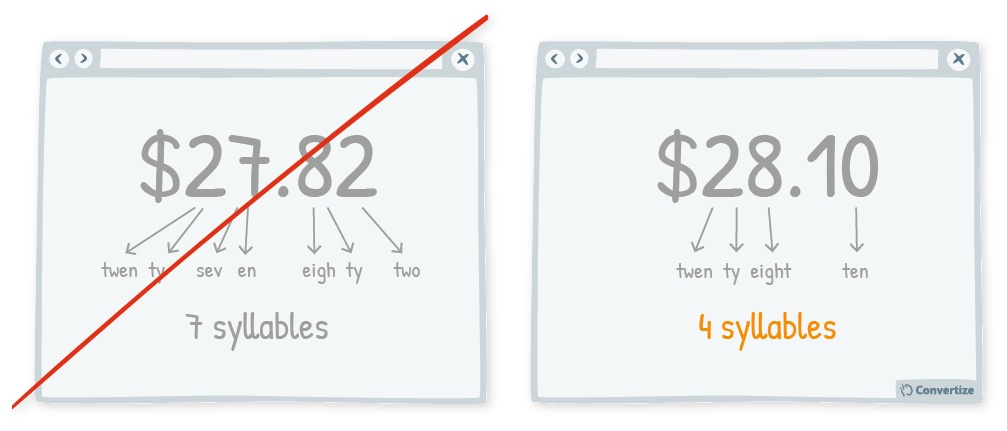
Based On: Cognitive Load and Attention Ratio (Daniel Kahneman, 2011)
Fewer syllables make a price more digestible. It also makes your customers feel like they are in control of the situation. That gives you a better chance that they will accept the price and follow through with the purchase.
6) Show The Full Price In Your Customers’ Shopping Basket
Your customers want to have all information relevant to their purchase before getting to the checkout page. If they feel unsure about what they are going to be charged, they are more likely to abandon their basket.
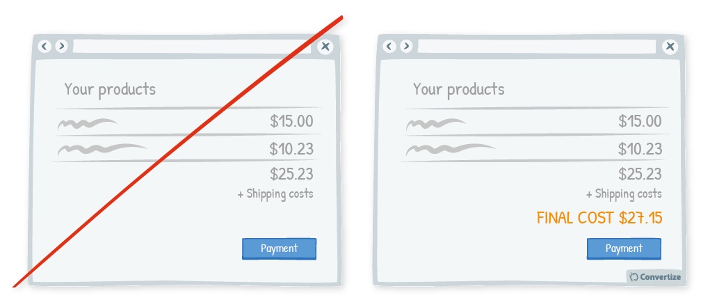
Based On: The Amiguity Effect (Daniel Ellsberg, 1961)
Research has shown that people avoid actions when the results are unknown, or when they don’t feel they have enough information. By showing the final price in the shopping basket before the checkout page is reached, you will increase the chances that your customer completes the purchase.
7) Display An Error Message For Incorrectly-Filled Fields
By showing your customers any problems with the information they enter, you avoid unnecessary confusion. Creating an easy process for your customers is key to checkout page optimization, as they will be put off completing an action if it is too complicated.
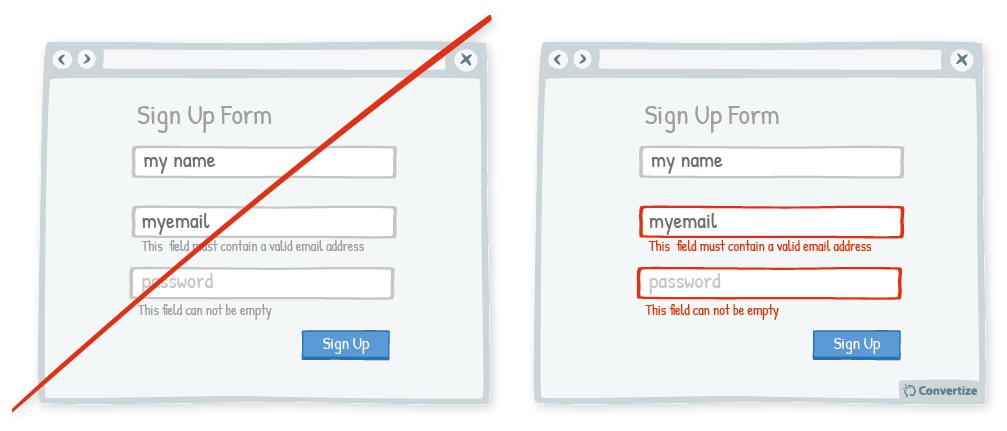
Based On: Cognitive Ease (Daniel Kahneman, 2011)
Using visual cues to show straight away which fields require their attention will make it easier and more painless, increasing the chance that they will complete the action.
8) Provide Visual Feedback To Reward Completed Steps
Building visual rewards (such as ticks, green elements or congratulations) into your checkout page is an example of soft gamification. Improving user experience is key to checkout page optimization, and reward systems make your page more fun.
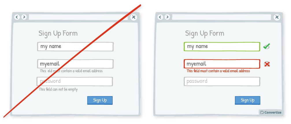
Based On: Self Efficacy Theory (Albert Bandura, 1984), Classical Conditioning (Ivan Pavlov, 1927)
By creating a simple reward system you help to overcome any frustration with the payment process and reinforce your customers’ commitment to making a purchase.
9) Reinforce The Product’s Benefits on the Checkout Page
By displaying 3 simple benefits of buying the item, you increase the impact that these factors have on your customers’ final decision. 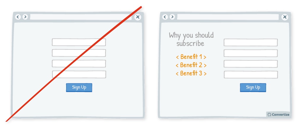
Based On: Availability Bias (Daniel Kahneman & Amos Tversky, 1984)
Things that take up a lot of our attention have a larger effect on our perception of the world. That’s why recent news stories have such a big influence on how we judge probability and danger. By showing just the 3 main benefits of your product, you have more chance of convincing your customers that it is worth their while to click “purchase”.
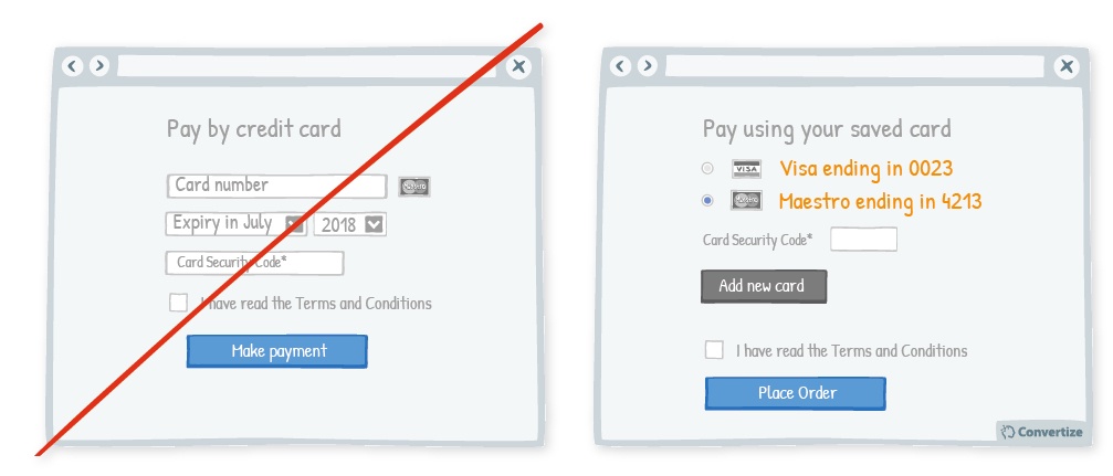
10) Ask For Credit Card Details Last
You should only ask your customers for their card details once all the other information has been given. This is because it’s easier to build up from a small commitment than it is to ask for a large one upfront.

Based On: Commitment and Consistency (Robert Cialdini, 1984)
Asking for credit card details at the end of the checkout process has two advantages:
- By this point ,your customers will be fully invested in the process and more likely to see it through. Consistency is Cialdini’s fourth Principle of Persuasion.
- Some of their details (name, billing address) will be the same. That means you can pre-fill these details, making it easier to finish the process.
11) Use Smaller Font Sizes To Indicate Costs On Your Checkout Page
Using a smaller font size for your pricing is doubly effective. Firstly, it makes the price more subtle and less alarming. Secondly, it has been proven that we associate small visuals with small quantities. A smaller font will make the perceived price feel less significant.
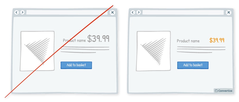
Based On: Magnitude Encoding Process (Daniel Oppenheimer, 2007)
“Encoding” is when a single characteristic shapes our perception of the whole object. With people this is called the Halo Effect. For size-related characteristics, it’s called Magnitude Encoding.
12) Do Not Round Up High Prices On Your Checkout Page
Careful and precise pricing is particularly important when dealing with a large sum of money. It has been shown that when purchasing a car, people will pay more money when the prices are very precise. If the prices feature lower figures (for example £26,213 rather than £25,000), they will pay even more.
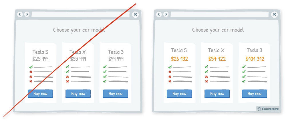
Based On: Perceived Value Pricing (Guanghui Zhao, 2014; William Poundstone, 2010)
If the prices you display have lower figures (for example £26,213, rather than £25,000), customers will be comfortable with even higher prices. Because of this influence it has on decisions, pricing strategy is a central feature of checkout page optimization.
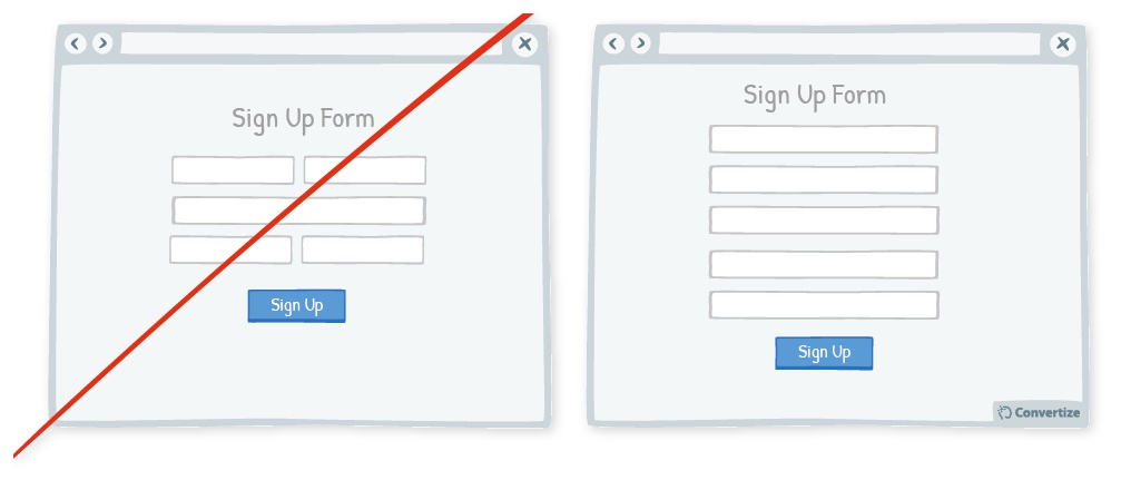
13) Reduce The Number of Forms Needed To Complete The Purchase
Don’t ask your customers for too much information in your forms. Demanding too much time or mental energy will encourage them to delay their purchase.
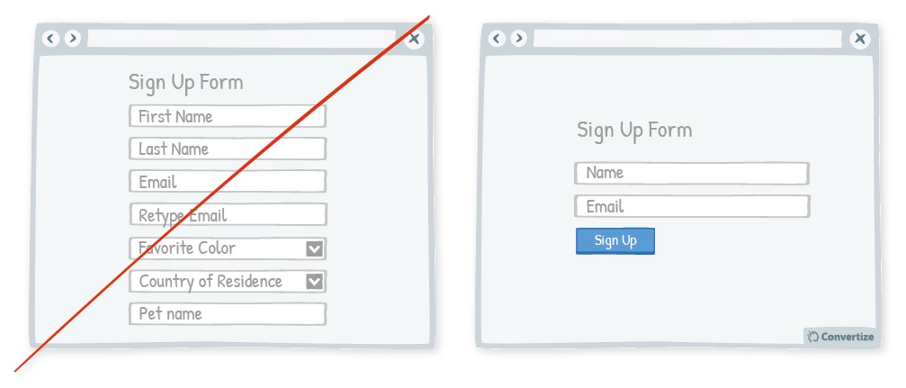
Based On: Cognitive Ease (Daniel Kahneman, 2011)
By reducing the amount of information you ask for, you increase the chance that they will follow through and complete the form.
15) Embed a Value Proposition in Your Checkout Page CTA
Your Call-to-Action text is important as it is the final step before the conversion. You should use the text to reinforce a benefit, reminding your customers of one of the reasons they should buy your product
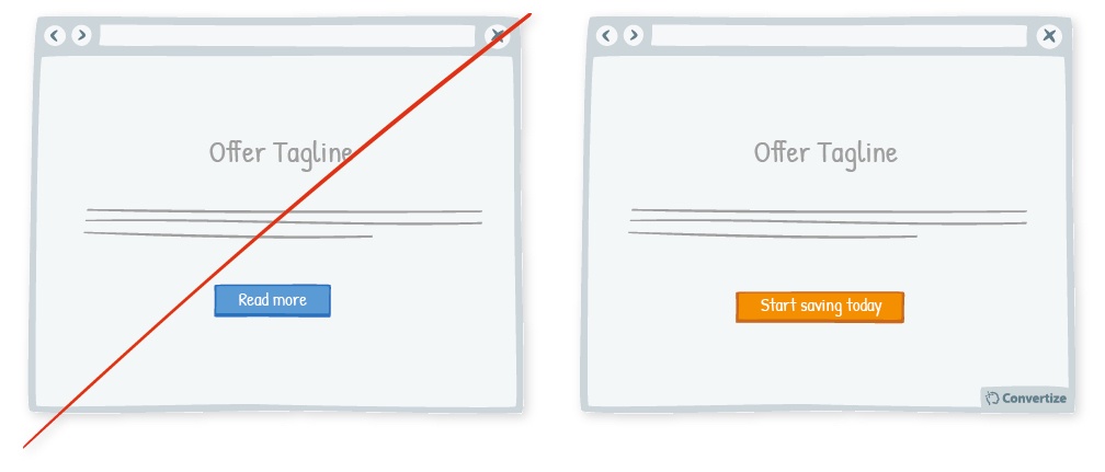
Based On: Focusing Effect (David Schkade & Daniel Kahneman, 1998)
People are likely to make decisions just based on one or two distinguishable features. Because of this, you can reinforce one of the benefits at the checkout stage and encourage your customers to act based on this one factor alone.
16) Optimize Your Checkout Page With Testimonials And Human Pictures
Adding testimonials to your checkout page will give it extra credibility and lead users to place more trust in the payment process.
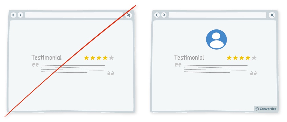
Based On: Social Proof (Muzafer Sherif, 1935; Solomon Asch, 1956)
People are likely to connect more immediately with a visual image than simply with a name. Seeing human pictures evokes an emotional response. It also enhances the Social Proof that comes with a positive endorsement.
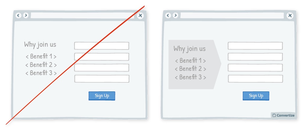
17) Combine Similar Actions And Form Fields
People respond best to clear, direct and simple information. They are easily distracted or put off by unnecessary details.
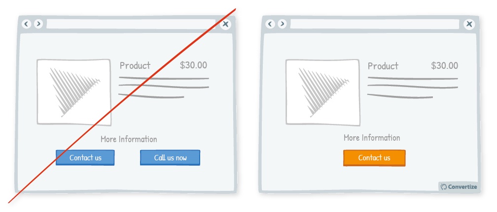
Based On: Split-attention Effect (Rohani Tarmizi & John Sweller, 1988)
To avoid distracting your customers, make sure you streamline any information you display. For example, in the drawing above “contact us” and “call us now” are such similar Call-to-Actions that displaying both will cause confusion.
18) Offer Multiple Delivery Options (Including Same-Day Delivery)
Offering multiple delivery options on your checkout page gives your customers more choice. People prefer to have as much control as possible over their purchase, so different delivery options are always appreciated.
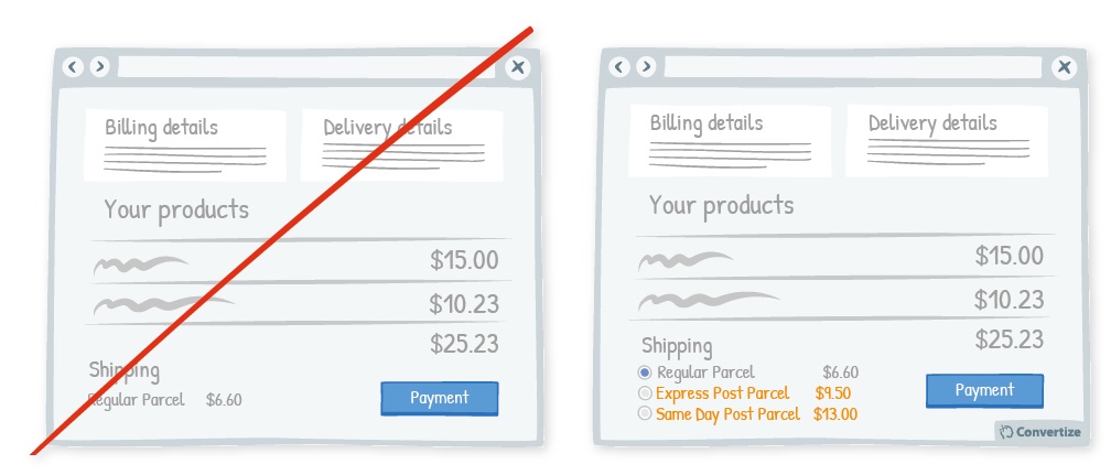
Based On: Autonomy bias (Edward Deci, 1971; Richard Ryan, 2008), Immediacy effect (George Ainslie, 1975)
Research has shown that we are drawn towards immediate satisfaction more than distant rewards. The possibility of a quicker delivery time may be the factor that encourages your customers to complete their purchase. It may also add a new and profitable element to the purchase.
19) Provide Free In-Store Collection
Similar to tactic 18, providing a free in-store collection option increases the control your customers have over their purchase. Anything that gives your customers more choice, but doesn’t increase the complexity of the process, is valuable for checkout page optimization.
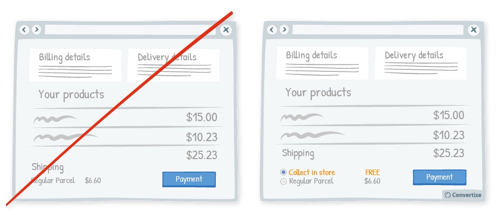
Based On: Need for Certainty (Jerome Kagan, 1972)
With in-store collection, your customers will be getting three advantages:
- The option of avoiding delivery charges (awarding the pleasure of paying less)
- Choosing the delivery option that is most convenient for them (so they have more choice and can be happy with the autonomy they have in making their purchase)
- The possibility of a more “guaranteed” delivery option, compared to the possibility for upset when something is sent via post (and this will help them to feel more secure in their purchase).
20) Try To Include All Your Form Fields in a Single Column
People like to process things quickly and easily. A single column allows them to read your page from top to bottom, without deciding what to focus on.
Based On: Processing Efficacy (Larry Jacoby, 1981)
Using single columns not only makes your checkout page look cleaner, but it is a more familiar format. Because it is what your customers expect to see, they are more likely to trust a checkout page that follows this formula.
21) Set A Free Delivery Deadline To Create Urgency
Offering free delivery is a strong motivator for your customers. Free and super-fast delivery is an even more persuasive proposition. To maximise the effect of this offer, make it available for a limited time only. Creating a sense of urgency will help to motivate your customers to take action immediately.
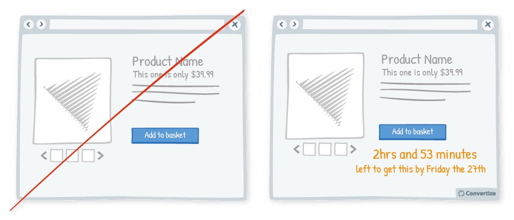
Based On: Loss Aversion (Amos Tversky & Daniel Kahneman, 1984), Scarcity (Stephen Worchel; Jerry Lee & Akanbi Adewole, 1975)
Scarcity occurs when something is low in stock or will run out soon. People place more value on the scarce item and are more likely to take action. Adding value to your products and encouraging action are both essential parts of checkout page optimization.
22) Add White Space Around Your Confirmation Button
Increasing the amount of white space around your confirmation Call-to-Action (CTA) will draw attention to it. Spacious designs are usually considered to be more visually appealing than crowded ones.
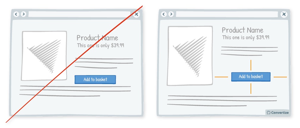
Based On: Von Restorff Effect (Hedwig Von Restorff, 1933)
By making sure there isn’t an excess of information or an overload of visual stimuli, you will be able to maintain your “confirm purchase” CTA as the primary focus.
23) Use Visual Cues To Guide Customers Through Your Checkout Page
Using clean, clear imagery is a great way to draw attention to your Call-to-Action (CTA). As in the example below, adding a simple visual cue helps to draw the customer’s eye to the right place.
Based On: Processing Efficacy (Larry Jacoby, 1981)
Because visual cues are non-verbal, they reduce the cognitive load your customers experience.
24) Use Different Prices for Rational and Emotional Purchases
Our brains process prices differently depending on whether a purchase is rational or emotional. When someone is making an emotional purchase, round prices work best because they are simple to understand and, therefore, processed fluently by the brain. When consumers can process the price quickly, it “just feels right” complementing an emotional or impulsive purchase.
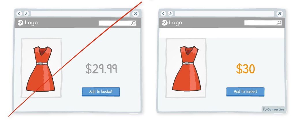
With a more rational purchase, such as in the image below, the opposite is true. We use more mental effort to process non-rounded prices and so these fit more with rational purchases. What’s more, value is a more important consideration for a rational purchase. Using a non-rounded number gives you opportunity to alter your customer’s perception of the price.
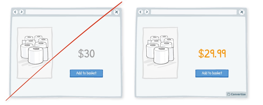
Using a decimal point, such as $29.75 or $29.99, will make the price seem significantly lower than $30, even though the real difference is small. This is because we are prone to only process the first digits of a price (so will read it as “£29 something”).
Checkout Page Optimization: Conclusions
If you’re reading this, it’s probably because you are concerned about your conversion rate. The great news is that this post should help you to fix that.
We always advise paying closer attention to your customers’ problems and trying to adjust to make things better for them. Potential customers don’t like long checkout processes, so ask for only for the information that is strictly necessary information.
To improve your conversion rate, you need to optimize your checkout page:
- Simplifying the checkout process. Shortening the number of fields at a checkout page makes the process faster. Make the page as simple as possible, so a child could complete it.
- A/B testing the page to see if a certain change makes a positive difference. This is mandatory. Testing helps to define your most effective direction.
- Offering free shipping. It’s 2018, and shops that don’t offer free shipping will seem to customers to be stuck in some long-ago era, say 2013.
Tell us about the checkout page at your website. What have you done to improve it? Do you A/B test checkouts at your store relentlessly to improve your conversion rate? We’d love to hear from you in the comments section.
by Benjamin Ligier
Benjamin is a CRO Expert at Convertize. He is passionate about design, web marketing and consumer psychology.


What an incredible article, Benjamin! Great work. Thank you so much for providing so much value here!
I’m going to read this article because it looks promising and will help me out with check out optimization. Yet, I get disrupted by notifications that say Tech fanatics from around the world just viewed this page. One notification should be sufficient. Otherwise, I get disrupted.
Just a heads up.
All the best,
Axel
Great article