4 Questions High Converting Landing Pages Always Answer
What’s the secret to a high-converting landing page? Is there a golden formula? Research shows that the most successful landing pages have one thing in common: they answer 4 key questions.
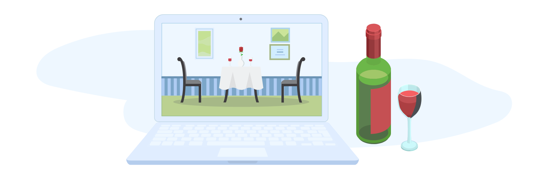
Ignore these questions and you could be killing your landing page conversion rate. But, before we tell you what the questions are, let’s begin with one of our own: When did you last visit a really good restaurant…?
4 Questions to Create High Converting Landing Pages in 2021
It may sound strange, but the last restaurant you went to could teach you a lot about your website.
Every time someone goes to a restaurant, they ask themselves 4 questions. They ask the exact same things when they go online. The answers determine whether they leave immediately or order the special. Get the answers right and your landing page becomes a high-converting sales machine.
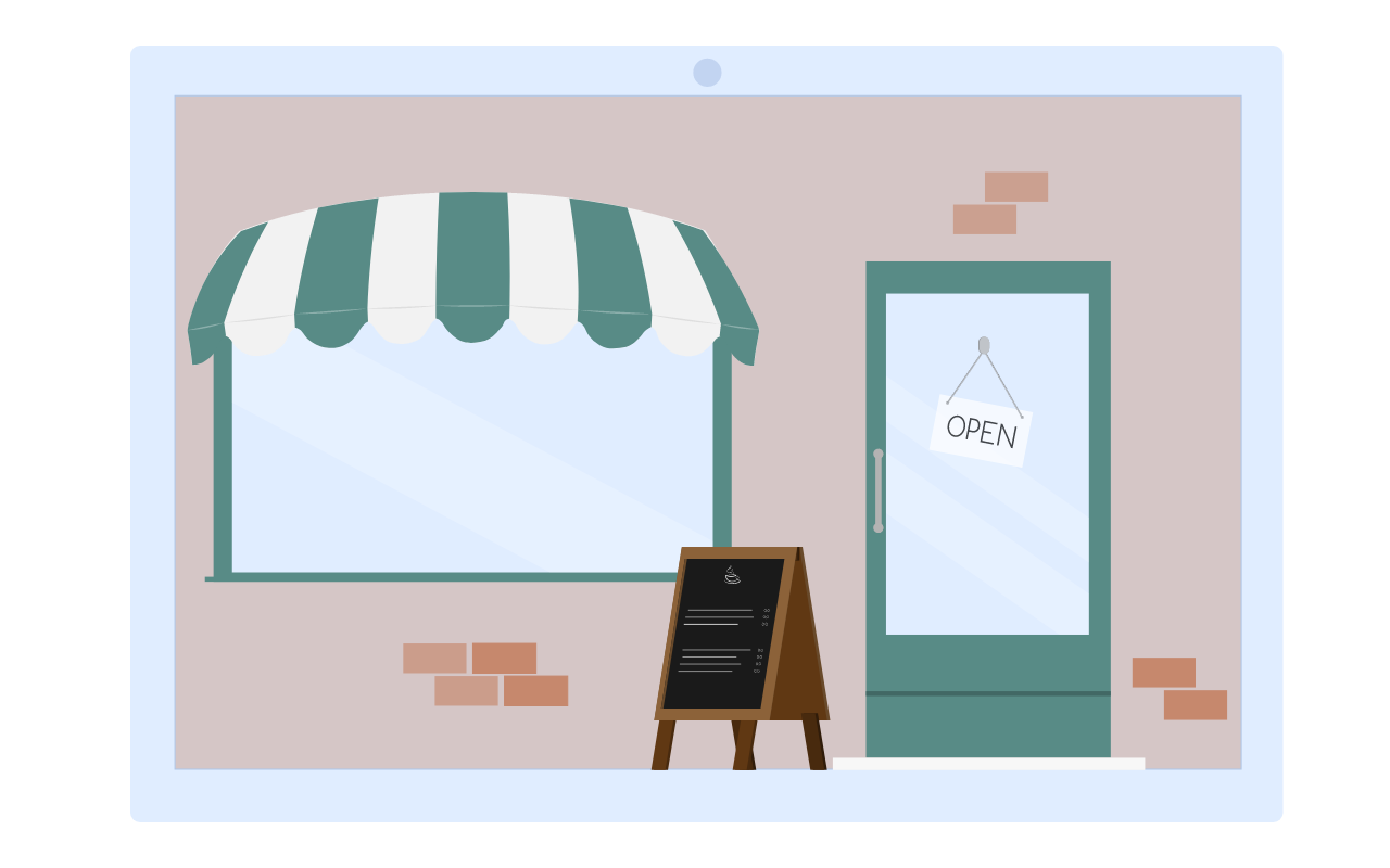
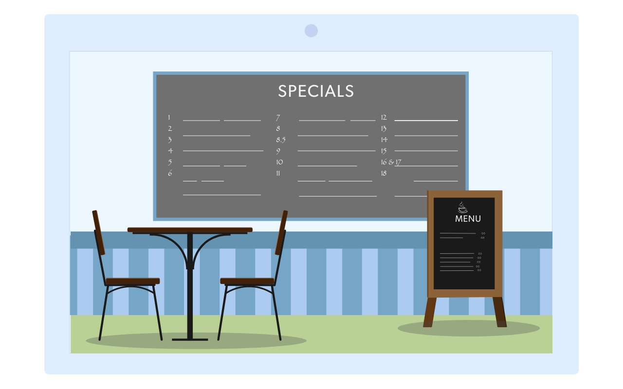
1. Where am I?
You arrive at the restaurant you’ve heard so much about, but you’re not sure it’s the right place…
On your website, visitors need to be reminded who you are. They will look for your logo or brand name on your top bar, so make sure your snazzy graphics are clearly visible and easy to find.
The idea here is to trigger a sense of familiarity. Visitors saw your banners or emails, clicked on your link, and arrived on your landing page. It is essential that this page matches their expectations, with the same visuals as your ads.
Familiarity triggers a state of Cognitive Ease. Not only this, but your users are already experiencing the first stage of Mere-exposure. That means that they are able to browse your website quickly and easily, becoming attached to your brand and your products.
So…
In your adverts and on your homepage, be 100% clear and precise what you are offering and what your business is about. Do this, and you have taken the first step to a high converting landing page.
2. Why am I here?
You heard great things, but the menu is confusing…
In 2015, Microsoft Canada conducted an infamous experiment monitoring online behaviour. The results suggested that the average attention span for an internet user had decreased from 12 seconds (in 2000) to only 8 seconds (in 2015).
The experiment has been questioned by a number of academics, but it does highlight something quite important: users make up their mind about your website within seconds.
Countless studies (such as Daniel Kahneman’s 1973 Attention and Effort) highlight the negative effect of Cognitive Friction on an individual’s mood and responses. That’s why it is so important that a visitor immediately understands what you are offering and how to proceed. You have to be clear and specific.
Here are some simple techniques to remember:
- Make your value proposition in 3 easy points
3 points are enough to explain why someone should pick you over your competitors and won’t overwhelm them with information.
People won’t remember more than 3 items, and in a value proposition they don’t trust very long lists.
- Avoid the curse of knowledge
It is very difficult to think about decisions from the perspective of a less-informed person. But, if a customer can’t understand your offer, they will never take you up on it.
A few months ago, I was on my way to a digital marketing conference in Germany. Prior to going, I looked at the exhibitors’ websites, all 891 of them. Only 18 explained what they did. The others had used impossibly technical language or given too little information.
- Adjectives transmit emotions. Verbs inspire action.
Would you rather start saving 50% off your monthly bill or see “cheap options for your monthly spending”? Verbs help to invigorate content, so keep it punchy and direct.
How can you evaluate wether your Value Proposition is good, bad, or missing?
- Look at your Bounce Rate in Google Analytics to estimate how many users left because they did not understand your message, (i.e. they didn’t see the connection between the ads and your website.)
- Look at your landing page (not more than 8 seconds) and ask yourself: Why should a visitor take action? If your page does not provide a clear and compelling answer to this question, you’ve got a problem. In this case you might want to work on your Value Proposition.

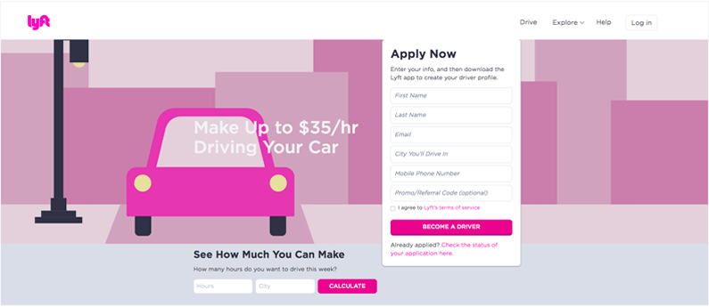
3. What Can I do?
You’re sitting down now, but you’re not sure whether to wait for table service or order at the bar…
Now you need to tell your visitors what you want them to do. And don’t be shy, say it loud:
- You want their details? ASK them to fill in a form
- Want them to call you? ASK them to call you, or book a call with you
- Want to show off your product? ASK them to watch a demo
The purpose of Question 3 is simple; you need to reduce the time a user spends thinking. Doing this will minimise Cognitive Strain, make your site more usable, and improve your conversion rate.
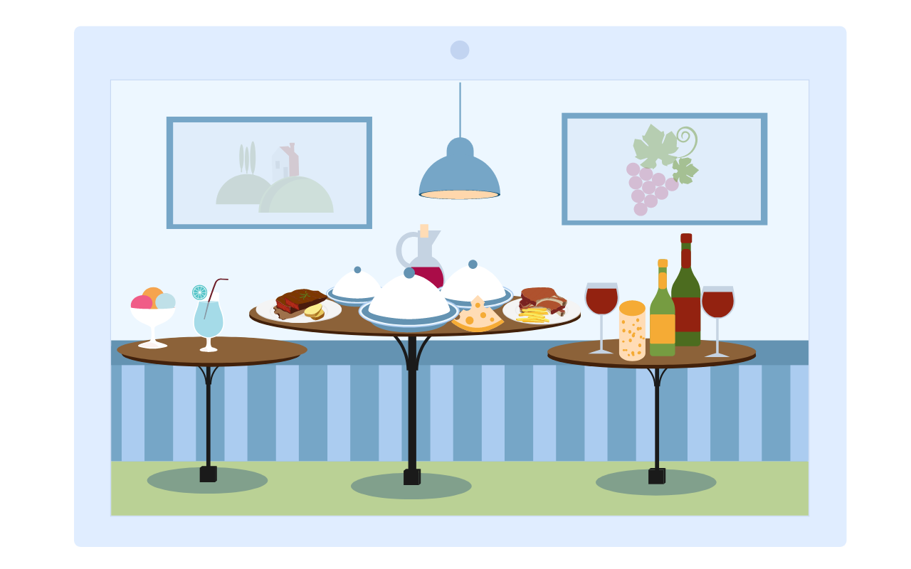
4. Why should I do it?
The waiter arrives and reads the specials. They all sound so good…
It’s likely that you’re not the only business offering your products or services.
How many websites do you think users have visited before landing on yours? Let’s look at hotel booking, for instance: On average, travellers visit 38 different websites before booking a holiday. The same is true for all kinds of E-commerce: 81% of online buyers spend more time doing research than actually buying.
So the objective is: Make sure your customers don’t leave, and give them a reason to stay. This is probably the most important job of any high converting landing page.
Here are some proven ways to answer the “Why Should I” question:
- Turn Low Risk into No Risk: One of the most common cognitive biases is a preference for certainty over opportunity. Even when the potential rewards are far larger for a risky option, most people gravitate towards safer choices. This effect is exaggerated when a low risk becomes zero-risk, so make sure you offer customers guarantees such as refunds and free testing.
- Don’t just say it, show it: On one hand, it is important to explain to your customers why they should pick your product. On the other, it is important to be aware of Single-option Aversion. People often avoid committing to something, even something they really like, if it feels like they have no choice. Price-comparison features or price-matching policies provide a way of overcoming this whilst subtly revisiting your Value Proposition.
- Use Nudges: Marketing effects such as Social Proof, FOMO and Urgency can be easily incorporated into your website. One of the simplest ways to do this is with website notifications. Using them will dramatically increase conversions from your landing page.
- Write Unforgettable, Compelling and Simple to Understand Copy: The words you use are more important than almost anything else. Choosing the right ones is essential. Be specific. Be Unique. Be Relevant.
Create a High Converting Landing Page: Conclusions
ALWAYS put yourself in your (new) visitor’s shoes and always ask these four simple questions:
- 1. Where am I?
- 2. Why am I here?
- 3. What can I do?
- 4. Why should I do it?
If you provide clear and precise answers to these questions, you will see a huge improvement in your landing page conversion rate.
However, if you decide your ‘restaurant’ needs a more thorough make-over, there are a number of tools that can help you with the refurbishment…
- A landing page builder will help make sure your pages look great. Some of these tools have built-in analytics features to help you create a high-converting page.
- Split testing or AB testing allows you to compare two versions of your landing page at the same time. By doing that, you can see exactly which features affect your conversion rate. Some A/B testing tools also come with features like heat maps or tactic libraries to help guide your ideas.
- Analysing and streamlining your conversion funnel is easier with one or two key CRO tools. They can help you to study your users’ behaviour, test new ideas, and encourage visitors towards the checkout.
by Philippe Aimé
Philippe is the CEO of Convertize. He created his first website in 1998 and has spent the past 20 years finding ways to make digital marketing more persuasive. He now heads a team of CRO consultants.