100+ Ways to Increase Your SaaS Conversion Rate in 2026
Did you know that you can leverage psychology to increase your SaaS conversion rate?
Here is the most comprehensive guide to conversion rate optimization tactics for SaaS websites on planet internet. More than 31 900 words (That’s NOT a typo)!
So why should you care about psychology-based conversion rate optimisation tactics?
Look:
Let’s say you’ve developed the most powerful and innovative SaaS product on earth.
That’s great.
But it’s useless if you can’t persuade anyone to try it out or to buy it.
 By their very nature, SaaS products are exclusively bought and used online. So your website is crucial in persuading your visitors to give it a try.
You might want to make it run on steroids like a Tesla Model X (I had the privilege of driving one a couple of days ago… insane power).
At this point you may be thinking:
“OK…. so what are the persuasive techniques I can use to get my visitors to sign up?”
Luckily for you, I’ve taken countless days to create this ultimate guide, containing 104 tactics to optimize your SaaS conversion rate. If you own or work for a SaaS business then this guide is essential and all you need.
And all for free including 100+ precise example sketches on how and how not to apply them.
And even if you just want to increase the number of subscribers to your authority blog, or have an eCommerce site (furthermore, for an eCommerce site, I recommend you to also read Brian Massey’s post with a 110 point eCommerce optimization checklist), many of the persuasion techniques shown below will be applicable to your needs too.
All techniques are based on proven and researched consumer psychology principles which are all explained. And all with a clear and concise example so you know exactly what you have to do.
But you may well say:
“Is this persuasive design of my website really SO important to get much more conversions?”
And you are right in asking this question. But then consider this:
Daniel Kahneman, a psychologist, has received a Nobel Prize in economic sciences because his research showed how even the most rational thinkers are succumbing to persuasive techniques (many of Kahneman’s findings can be found in this post).
Numerous New York Times Bestselling Authors (such as Dr. Robert Cialdini, who has sold over 3m books ) have shown the effectiveness of the Science of Persuasion.
Dorota Zys, co-founder of SaaSGenius is highlighting the power of persuasive web psychology and persuasive web-design here.
Nick Kolenda, an author and blogger, has done extensive research related to the psychological factors that guide consumer decisions. Some of the techniques in this post, in particular several concerning the pricing page, are a summary of the valuable research done by Nick. Read and subscribe to his excellent blog on persuasion applied to marketing.
And Persuasive Technology has become a mainstream discipline in the most prestigious Business Schools worldwide. Stanford even created a “Persuasive Technology Lab“.
And here some hard facts:
Unbounce analysed 64 284 lead generation Landing Pages with a total 74 500 000 visitors to these pages in 10 industry verticals.
All customers of Unbounce had the same technology at their disposal. Here is what they found:
How much better are the top 10% vs the bottom 25% in terms of Conversion Rate (CR)
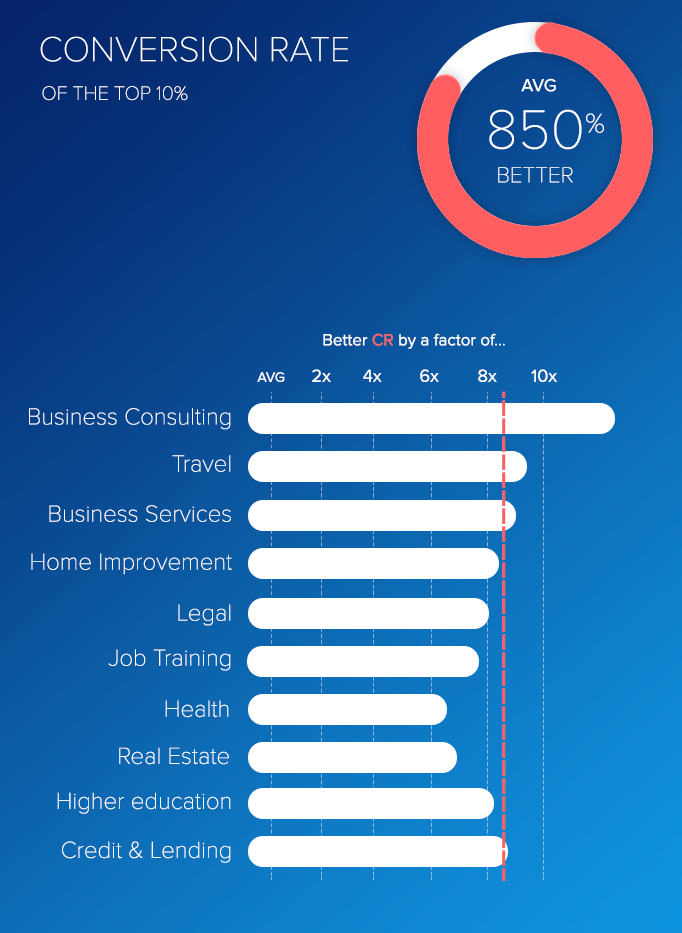
The top performers achieved on average a +850% better conversion rate vs the 25% of bottom performers.
That means they collected 8,5 times more leads!
How did they do it ?
It couldn’t be because of the technology or the tool they used: All used the same.
They simply made there landing page more persuasive, reduced cognitive friction, made use of appropriate cognitive biases,…
Just as you can do by following this guide.
And… as NY Times bestselling author Bryan Eisenberg puts it:
Companies that plan and optimize persuasive momentum usually convert two to four times better than their industry’s average conversion rate.
 Read this: 100+ proven ways to increase sour SaaS conversion rate (backed by psychology)Click to tweet
—
How to use this list in the most effective way?
This list is massive —how do you know which techniques are most important in your specific case? The answer lies in the structure of the list.
To decide, which techniques to focus on first, you need to jump into your analytics. You will probably have a funnel resembling something like this (the drop-off rates will widely vary, in particular depending on whether you are converting to a free trial or a paid subscription):
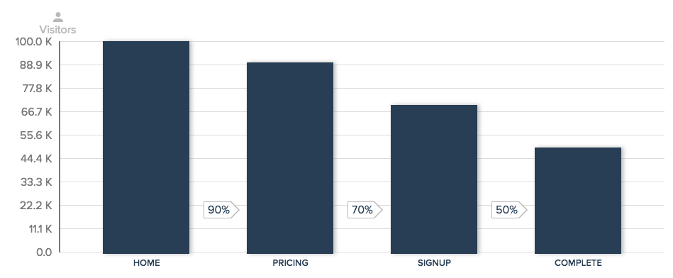
Look at your drop offs at each stage.
If your drop-offs are significant just prior to completion, then you should probably start to focus on the step just prior to the drop-off.
If you are observing a significant drop off at a previous stage, start there.
In order to do so, focus initially on the techniques in the appropriate section (A. to D.) and on those applicable to various page types (E.).
As you can see, I’ve grouped this massive list of optimization techniques according to which page type they’re most obviously used on.
Improve your SaaS Homepage and Landing Page
- #1 : Display your primary Call-to-Action more than once
- #2 : Add Testimonials
- #3 : Add human pictures to your testimonials
- #4 : Is your homepage answering “Who, What, Where and Why”?
- #5 : Add “as featured in” or “recommended by” content
- #6 : Merge similar functions
- #7: Appeal to people’s fear of loss rather than emphasizing potential gains
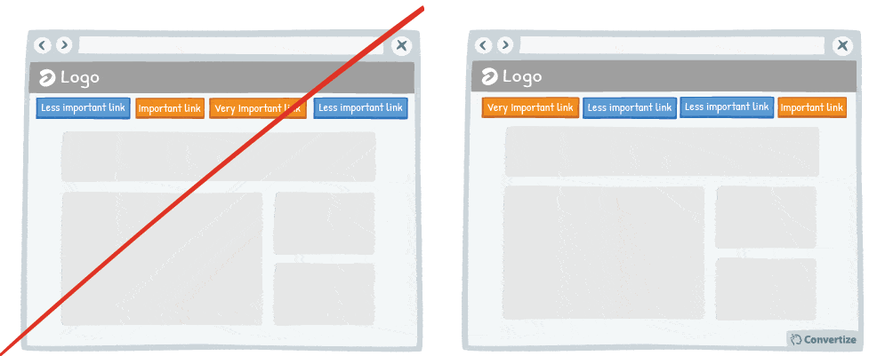
- #8 : Re-order your navigation menu
- #9 : Change your Call-to-Action whilst a visitor is on your site
- #10 : Focus on experience over financial benefits
- #11 : Position images and graphics on the left
- #12 : Use attractive models (when appropriate)
- #13 : Enlarge words that convey emotion
- #14 : Add a visual depth to your Call-to-Action through use of a border
- #15 : Show your product being used in several ways in your photos
- #16 : Hyperlink Primary Menus, List Items, and Complementary Icons
- #17 : Use interactive images rather than static ones
Improve your SaaS Pricing page
- #18 : Have no more than 3 pricing plans
- #19 : Provide a “more info” button for every product
- #20 : Use a higher pricing plan as a decoy
- #21 : Offer a decoy product
- #22 : Choose a price with fewer syllables
- #23 : Display the daily or monthly price to make the amount seem smaller
- #24 : Display a higher price first
- #25 : Product name should be descriptive and unique
- #26 : Put your default pricing plan in the middle and make it more visible
- #27 : Create a default option or add-on
- #28 : Ask customers to subtract rather than add features when creating a custom plan
- #29 : Add strikethroughs for absent features
- #30 : Make the free plan less visible
- #31 : Position prices towards the bottom-left
- #32 : Use a smaller font size for pricing
- #33 : Remove the decimal point when applicable
- #34 : Be precise with large numbers (above 5 digits)
- #35 : Don’t Bundle Expensive and Inexpensive Products
- #36 : Don’t display the currency sign
- #37 : Give your pricing plans relatable, helpful names
- #38 : Create a dedicated pricing page
- #39 : When to round up prices: emotional vs rational purchases
- #40 : Offer the possibility to pay in installments
- #41 : Expose visitors to any high numbers
- #42 : Visually distinguish price comparisons
- #43 : Create your own custom payment currency
- #44 : Display discounts in percentage rather than in value when product price is below 100 (£/$/€)
- #45 : Give a reason for discounts
- #46 : Offer discounts that are easy to compute
- #47 : Increase prices more frequently but by small increments
- #48 : Provide a “more info” button for every product
Improve your SaaS Signup page
- #49 : Display clearly the 3 main benefits of registering
- #50 : Pre-fill form fields where possible (but always allow users to change them)
- #51 : Use single-column forms
- #52 : Use clear imagery to draw attention to your Call-to-Action
- #53 : Praise and congratulate your customers’ choices throughout your conversion funnel
- #54 : On a form, specify which fields are optional rather than which are mandatory
- #55 : Separate your form into smaller sections
- #56 : Save customers’ card details and automate payments
- #57 : Visually indicate any errors or missing fields
- #58 : Provide instant feedback on fields completed
- #59 : Offer the option to register through social media
- #60 : Reduce the number of form fields
- #61 : Is your Call-to-Action persuasive?
- #62 : Let your customers know they have the power to choose
- #63 : Describe the Drawbacks of Your Message
Improve your SaaS Purchase Complete page
- #64 : Ask your customers why they bought your product
- #65 : Reassure your customer on the post-purchase confirmation page and email them
- #66 : Display social sharing buttons after customers have finalised their purchase
- #67 : Use exit surveys to get feedback and boost your likability
- #68 : Ask your customer to share feedback
- #69 : Congratulate your customers on their booking or purchase
More ways to increase your SaaS conversion rate
- #70 : Choose a contrasting button colour and size for your Call-to-Action
- #71 : List the strongest benefits first
- #72 : When using faces on your website, direct their look towards the important elements on your page
- #73 : Display how many people have already registered on your website
- #74 : Blur or fade images to reduce the emphasis on them
- #75 : Make your website responsive (mobile-friendly)
- #76 : Include benefits in your Call-to-Action text
- #77 : Use the 1-1-1 rule
- #78 : Always place your Call-to-Action above the fold
- #79 : Increase the amount of white space around your Call-to-Action
- #80 : Make your visitors pay attention by displaying images that they can identify with
- #81 : Use “We” in order to involve your user
- #82 : Don’t ask for credit card details for free trials
- #83 : Use only 2 words on your Call-to-Action
- #84 : The use of metaphoric phrase makes intangible concepts tangible
- #85 : Use ‘how-to’ pages (and videos if possible) to show your visitor how easy it is to act
- #86 : Use “You” and “Your” if you can’t use names
- #87 : Choose active voice over passive voice
- #88 : Use images instead of just text
- #89 : Be specific with your arguments instead of trying to be a salesman
- #90 : Use 1st person plural pronouns
- #91 : Rather than recommend a product yourself, show users who recommend it
- #92 : Don’t place ads above the product list
- #93 : Offer free trials
- #94 : Personalise your content with your customer’s name
- #95 : Mention the location of your office
- #96 : Offer a way to leave functions blank even once clicked on
- #97 : Be precise with error messages
- #98 : Use Exit Pop ups
- #99 : Be careful when using special characters – faults could decrease your credibility
- #100 : Use a recognisable phone number for your customer service and add your opening hours
- #101 : Display the number of people who’ve purchased a product near the CTA
- #102 : Give useful information away for free
- #103 : Introduce the Call-to-Action using a floating animation
- #104 : Humanise photos of your sales team to increase credibility and likability
Read this: 100+ proven ways to increase sour SaaS conversion rate (backed by psychology)Click to tweetImprove your SaaS Homepage and Landing Page
1. Display your primary Call-to-Action more than once 
By offering the CTA to people at different moments you increase the chance that it is available at the time a visitor feels most inclined to act; perhaps they weren’t ready to go through to the next step when they first arrived on the page but will be after reading its contents.
Studies also show that people react more positively towards stimuli that they have already been exposed to as it becomes more familiar, so showing the CTA button twice or more will allow for this bias to occur and increase your chances that they end up clicking.
Underlying Principles:
- Mere-exposure Effect (Fechner, 1875; Zajonc, 1960)
- Attentional bias (Bradley & al., 1996; Buodo & al., 2002; Pessoa & Ungerleider, 2004; Vuilleumier, 2005)
Mere-exposure Effect
First explored by Gustav Fechner in the 19th Century, the Mere-exposure Effect was then further developed between 1960-1990 by renowned psychologist Robert Zajonc, who discovered that people would react more favourably to certain stimuli the more they were exposed to it.
Humans are naturally more comfortable with and positive towards things that they are familiar with and so it is both possible to elicit a positive reaction from someone by presenting them with something familiar or indeed by making something familiar to them through repeated exposure.
One of Zajonc’s experiments consisted of showing people nonsense characters that looked like Chinese symbols and asking them to guess the meaning. After they had been shown the same symbols several times, the meanings offered become more and more positive as, even subconsciously, people had become more familiar with those symbols.
In marketing, the Mere-exposure Effect can be used in many ways. Of course, you want to stand out to a certain extent but being too different from other brands that people are already familiar with could result in distrust. You can make your own brand appear instantly more familiar by basing your logo, design or features on other similar brands that already have a loyal following.
This similarity, even if it is slight and will only tap into the customer’s subconscious, will instantly make people feel more trustful of your brand.
Another way is to utilise a familiar figure to help make this connection more instantaneous; for example, when brands use a celebrity endorsement it is so successful, not because that celebrity is an expert on the product or industry or because we even trust their judgment, but because they are a familiar face to us and therefore we are immediately drawn towards them and the product they are representing.
Attentional Bias
Attentional bias is the way in which we don’t take into consideration all available factors and possibilities when we make a decision or consider something because our attention is often only focused on certain limited factors.
Our emotional state often influences what we place our attention on and we have a tendency to pay more attention to something that emotionally stimulates us. The more we are touched emotionally, whether that be in a positive or negative manner, the more we will focus explicitly on this emotional stimulus over any other aspect available to us.
Attentional bias affects our brains in the immediate moment but it also affects our memory, which is likely to recall a particular situation in a biased manner, principally retaining the emotion felt over anything else.
This cognitive bias can lead us to make bad decisions or to have skewed memories.
Attentional bias was explored during a series of experiments named the “Stroop test”, which consisted of giving participants a list of words printed in different colours and asking them to speak out loud what the colour was but not the word itself.
The tests showed that participants had more difficulty in focusing on the colour (taking more time and effort to say the correct one) when the words evoked emotions, for example when arachnophobic participants were shown the names of spiders. In these cases, they were unable to focus solely on the colour of the word as their attention was already focused on the emotional stimulus (i. e. the fear they felt associated with the spider names in that particular case).
This psychological principle has numerous applications in terms of persuasion strategies and can be used to focus attention on certain factors or, inversely, to avoid that any limited focal attention is produced. The best utilisation would, of course, be to try to create an emotional association with those things on which we want someone to focus and not to invoke any emotional association with those factors on which we don’t want any particular focus.
2. Add Testimonials
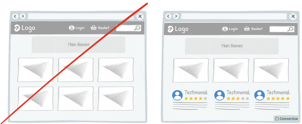
If you have positive reviews about your products or services then always display them on your homepage as social proof.
Research has shown that we have a strong tendency to copy others’ choices when we are hesitating on a decision. Seeing that someone else has had a positive experience will give visitors more confidence in making a purchase.
Underlying Principles
- Social Proof (Sherif, 1935; Asch, 1956; Cialdini)
Social Proof
This principle was first explored by social psychologist Sherif in 1935, and later developed by Asch in 1956. Social proof is the idea that we are intrinsically driven to conform and so will often be influenced to copy others’ decisions and actions, especially when we are hesitating or feel as though we don’t have enough information of our own.
We tend to assume that surrounding people possess more knowledge of any given situation and that the actions of others, therefore, reflect correct behaviour.
This social proof principle is driven by our natural desire to behave “correctly” under most circumstances: we are social and tribal beings, and what others think, say or do is important to us and can be a powerful motivator.
This principle also relies on a sense of ‘safety in numbers’, meaning if we are all doing the same thing then we feel we are protected and validated in some way.
For example, we’re more likely to work late if others in our team are doing the same, put a tip in a jar if it already contains money, or eat in a restaurant if it’s busy. We assume that if others are behaving a certain way then it must be for a reason: the restaurant is good, the service deserves tipping, the work needs to be finished, etc.
Social proof also applies to marketing and sales. For example, online marketing strategies such as displaying validation logos, subscriber count, social shares or testimonials on a website are all based on the social proof principle. The amount of followers, views, likes, subscribers or past satisfied customers that a user sees positively affects how they will perceive the website.
It’s for this reason that we consult TripAdvisor for hotels and restaurants, Consumer Reports before making purchases, Kayak for flight choices, Yelp for eating out, and so on. We want to check and validate our decisions before we make them to ensure we are adhering to the same behaviour as our peers and put a lot of stock in what their testimonials and actions tell us.
3. Add human pictures to your testimonials

Adding human pictures to your testimonials and will lend them an extra credibility and therefore lead users to place more trust in them. People are likely to connect more immediately with a visual image than simply with a name and seeing human pictures evokes a natural emotional reaction that taps into “social proof” – generating a desire to make the same choices as others have done.
Underlying Principles
- Social Proof (Sherif, 1935; Asch, 1956; Cialdini) – Persuasive technique 2
4. Is your homepage answering “Who, What, Where and Why”?
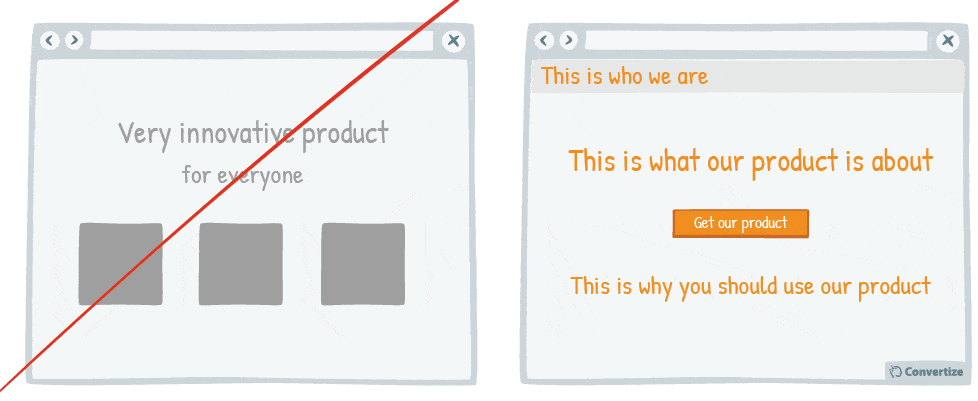
Your homepage is usually the first page on which your customers will arrive when they visit your website and so it is vital that it is clear, easy to understand and informative.
Ask yourself if your homepage is answering four key questions:
- Who are you?
- What are you selling?
- Where can they get it?
- Why should they buy it?
Underlying Principles
- Ambiguity Effect (Ellsberg, 1961)
- Processing Efficacy (Jacoby & Dallas, 1981)
- Information Bias (Baron; Beattie & Hershey, 1988)
Ambiguity Effect
The Ambiguity Effect describes the tendency people have to avoid options with unknown results, or about which they lack information.
Decision-making is affected by a lack of information and ambiguity: people tend to select options for which the outcome is more certain – even if it isn’t necessarily the most advantageous outcome – because they prefer surer things.
The concept is expressed in the proverb: “Better the devil you know than the devil you don’t”. It is, therefore, more likely that someone will choose to invest their time or money in an action for which they already know the outcome than in one that is uncertain or ambiguous.
In other words, people avoid doing things or making choices they know less about. This results in a reluctance to try new things and a limited ability to recognise long-term benefits of riskier decisions compared to marginal gains from safer choices.
The Ambiguity Effect was first studied by Daniel Ellsberg in 1961, where he conducted an experiment now known as the “Ellsberg Paradox”. The experiment offered participants the chance to play a game in which you have to blindly draw a ball from a box and guess its colour to win $20. You can choose to draw your ball from one of two boxes: one contains 50 red balls and 50 green balls, whereas the second contains 100 red and green balls in an unknown proportion.
The results showed that most people preferred to choose from the 50/50 box as, even though not knowing the distribution of ball colours in the second box meant they couldn’t know whether 50/50 would be a more advantageous box for guessing, they preferred to make use of the information provided – even though it couldn’t aid the likelihood of them winning – than to go with the more ambiguous alternative.
The Ambiguity Effect should be taken into account for marketing strategies as, if a potential buyer knows less about your company than they do about a competitor company, they are more likely to go with your competitor, simply because they will feel more informed and therefore as though there is more surety in giving their business to this company.
Therefore it is important to opt for a strategy that places importance on clarity and providing information to ensure that the Ambiguity Effect doesn’t result in lost business.
Processing Efficacy
Processing efficacy is based on the idea that objects differ in the fluency with which they can be processed. Our judgement of something can be dramatically altered by how fluent it seems to process it and we engage more positively with high fluency experiences.
Fluent processing can be facilitated by several variables such as repeated exposure to a stimulus, the aesthetic attractiveness of the object, expressions that rhyme, and so on. By contrast, low processing efficacy occurs when we find something difficult to interact with or understand and so it requires more cognitive effort and strain, which results in a negative feeling towards it.
For example, several experiments have revealed that people are more likely to react positively towards, and agree with, statements that are easier to read: the lack of cognitive strain involved with comprehending the statement results in an intrinsic positive feeling towards it and simplicity is also translated as beauty in the human mind and we often judge something we perceive to be more beautiful as more positive and truthful.
Processing efficacy has multiple applications in web-marketing, especially with regards to website design: the aesthetic attractiveness, the page speed load time or the ease of interaction of your website are all factors that will affect whether your visitors enjoy using your website and therefore engage and interact with it, complete actions, share it on social media, recommend it, etc.
Information Bias
Information bias, studied by Baron, Beattie and Hershey (1988), is the tendency we have to believe that the more information that can be acquired in order to make a decision, the better that decision will be, even if that extra information might be irrelevant. Indeed, we seek out information even when it cannot directly affect our actions or decisions as we simply feel as though we need all information available in order to make a good decision.
For example, Baron, Beattie and Hershey demonstrated this principle with an experiment in which they gave subjects a diagnostic problem involving fictitious symptoms, tests and diseases. The majority of test subjects decided they needed to continue gathering more information and carrying out extra tests in order to make a diagnosis when in fact they had already been given sufficient data to do so.
Information bias can be applied to web marketing to help encourage customers to pay specific attention to something or to make a certain choice. For example, the more information that you provide for a product, even if some of it seems irrelevant, the more likely that people will feel assured enough to make a purchase.
Read this: 100+ proven ways to increase sour SaaS conversion rate (backed by psychology)Click to tweet
5. Add “as featured in” or “recommended by” content
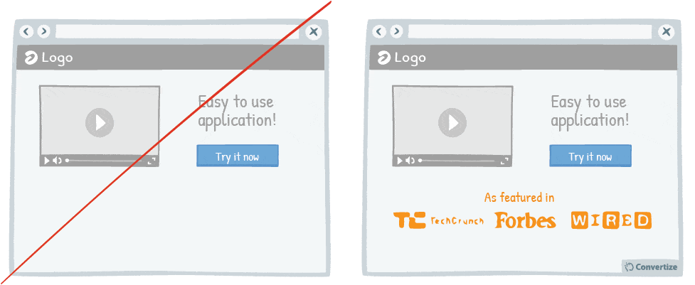
Adding an element of impartiality and authority to your product or brand through adding content that shows you are “featured in” or “recommended by” well known authoritative bodies (such as magazines or other respected companies in your field) will lend weight to what you are selling.
Underlying Principles
- Authority Principle (Milgram, 1960; Cialdini, 1984)
Authority Principle
The Authority Principle underlines our tendency to obey authority. From a very young age, we are “trained” to obey: our parents, teachers, adults, policemen, etc.
As we grow up we already have an intrinsic classing system that shows us who we are expected to obey, people that we consider to be “superior” to us in authoritative terms, but also who we expect to obey us, those that we consider to be “inferior”. This obedience isn’t necessarily coercive (that’s to say reliant on the use of force) but is rather more often simply based on this ingrained reaction to authority figures; there is an unspoken agreement about the balance of control in our societies that is most often adhered to.
There are many elements that can give the impression of authority: expertise, experience, popularity, a uniform (doctor’s coat, police uniform…), a title (Dr., Professor, Director…), physical attributes (strength, size), success, wealth, simply an authoritative attitude, etc. Due to the amount of information available, we often use cognitive shortcuts, only relying on one or two attributes linked to authority figures in order to decide whom we should obey.
For example, we only need see a police badge to follow orders from someone without really questioning what they are asking us to do, whether it really adheres to the law, whether the police badge is even real, etc.
One of the most famous experiments to demonstrate the Authority Principle was named after the American Psychologist who carried it out: the Milgram experiment.
This experiment aimed to measure the extent to which people will continue to be obedient even when the orders being given go directly against morality and personal conscience. Participants were paired up, with one becoming the “teacher” and one the “student”. This draw was fixed so that the student was always an actor and the teacher the real participant of the experiment.
The student had to learn different word pairings and was then attached to an electro-shock machine (fake, of course – unbeknownst to the participant) that the teacher was in control of. They asked the student questions and each time they gave a wrong answer (which they intentionally did most of the time) the teacher was told to give them a shock. They were accompanied by another actor who was dressed in a recognisably scientific outfit and was placed there as the “authority figure” who continued to encourage participants to give the shocks even when the voltage got higher and students became noticeably uncomfortable.
The presence of this legitimised authority, meaning that the person in charge is assumed competent and of an authoritative nature, meant that very few of the participants questioned the ethics or morality of the orders at all, with a shocking 62.5% of participants seeing the experiment through to the end and giving their partners “shocks” of what would have been really dangerous levels. The conclusion was that humans will continue to follow orders given by a presumed figure of authority even when these orders should, in reality, be called into question.
Utilising authority is therefore an effective means of persuasion and yet a further extension of this is shown through the “argument from authority”, meaning when we convince people of our point of view using such “arguments” as: “this has been proved statistically”, “the government/this or that expert has confirmed that…”, “everybody knows that…”, etc. Using such statements can be a useful persuasive tool in marketing and communications.
Another widespread use of the Authority Principle in these fields is the use of a celebrity or other authority figure (industry leader or expert for example) endorsement. Well-known sports brands use well-known sports figures to immediately give their products credibility; if this famous footballer says these football boots are the best then people will be inclined to believe them.
Another way of making the most of this is by putting “expert” testimonies or reviews on your website; the knowledge that people of authority from your field endorse your products will make consumers much more likely to want them too.
6. Merge similar functions
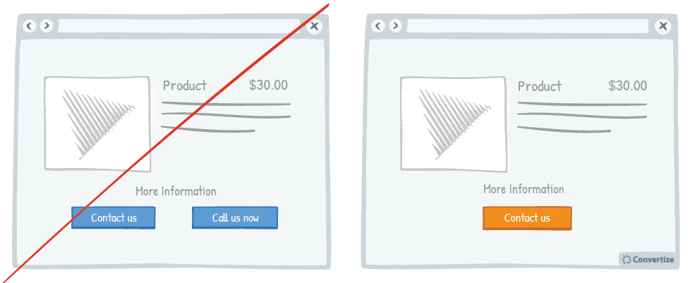
People respond best to clear, direct and easy-to-understand information and are easily distracted or put off by extraneous information or demands on their attention.
To avoid this, make sure you streamline any information displayed, avoiding duplication of similar Call-to-Actions.
Underlying Principles
- Split-attention Effect (Tarmizi & Sweller, 1988)
- Processing Efficacy (Jacoby & Dallas, 1981) – Persuasive technique 4
Split-attention Effect
The Split-attention Effect occurs when sources of information that are mutually dependent for comprehension are separated either spatially or temporally.
For example, if you need both a diagram and written text to understand an instruction but these are given to you separately or at different times, you will find it much harder to digest and understand the information. Whereas if both the text and the image are integrated into one visual then this speeds up the process of comprehension and lightens the demands on your brain.
The Split-attention Effect is especially applicable to learning environments and techniques. Students who are given learning materials that combine all required information into one easy-to-read document will learn faster – and retain knowledge for longer – than those who have to take in the same information from multiple sources.
If you were trying to put together a flat-pack piece of furniture and they provided you with the diagrams on one piece of paper and all the instructions and text on a separate piece of paper so you had to keep moving your attention from one to the other to understand – it would be much harder to follow. Integrating the diagrams and related text into one document on which you can concentrate all your attention will give a much greater chance of understanding and success.
Equally, if you’re trying to sell something online and your customer requires 2 or 3 pieces of information from you in order to feel confident that they are making a correct purchase or decision on your site, then all this information needs to be presented clearly and in one location so that they don’t have to search for it themselves and risk having their attention taken elsewhere.
7. Appeal to people’s fear of loss rather than emphasizing potential gains

In general, people are more motivated to act if they think they are going to lose out on something than they are if they only concentrate on what they might gain. Therefore, pointing out that your customer may miss out on a deal or might lose out financially by shopping elsewhere is more likely to result in a purchase than by simply pointing out what they will gain.
Underlying Principles
- Loss Aversion (Tversky & Kahneman, 1984)
Loss Aversion
Loss aversion was first demonstrated by Amos Tversky and Daniel Kahneman in 1984. This principle refers to the fact that the negative emotions experienced from the pain of losing are psychologically about twice as powerful as the positive ones experienced from the pleasure of gaining. In other words, the idea of losing or giving something up provokes a stronger reaction in us than the possibility of gaining something. The avoidance of loss is, therefore, a strong motivation for us and can lead us to act in certain, sometimes irrational, ways in order to avoid losing out on something.
This desire to avoid the negative feelings associated with loss explains other cognitive biases that also influence our behaviour, such as the Sunk Cost Fallacy, which describes the way in which we prefer to continue on with something as a result of previously invested resources of time, money or effort, even if we are no longer satisfied with it. The Endowment Effect is also closely linked, explaining the way in which we place a higher value on something we already own than something that isn’t in our possession, even if they’re identical, simply because we don’t like the idea of giving up or losing something we consider to be ours.
One example of Loss Aversion we can all relate to is when you sit through the most terrible movie you’ve ever seen in the cinema simply because you’ve already paid for the ticket and invested your time and effort in going there so you feel as though you would be losing out if you left half-way through. In reality, that money is already gone and you won’t be getting it back either way so the rational decision would be to leave and cut your losses, pursuing instead another more pleasurable activity, but the pain of losing makes us act irrationally as we choose not “losing” our money over the possibility of gaining more pleasurable time. We make this biased decision because the brain is telling us that not losing out on something is better than gaining something.
Loss Aversion is utilised in sales and marketing to influence and motivate consumers’ buying decisions. If you are able to make your customers feel as though they are going to “lose out” on an offer, this is likely to motivate them to complete their purchase. This strategy is often seen in online marketing through the use of motivational phrasing such as “offer not to be missed” or “only 2 rooms still left”, etc.
8. Re-order your navigation menu
Re-ordering your navigation menu by putting the most important links at the beginning and the end of your menu will help to ensure visitors notice and click on them. Research has shown that people recall the first and last items in a series best and the middle items worst. Links at the beginning and end of a menu on a website receive the most clicks.
Underlying Principles
- Serial Position Effect (Ebbinghaus, 1913; Murdock, 1962; Glanzer & Cunitz, 1966)
- Processing Efficacy (Jacoby & Dallas, 1981) – Persuasive technique 4
Serial Position Effect
The Serial Position Effect (notably studied by Ebbinghaus, Murdock, Glanzer and Cunitz) refers to the finding that recall accuracy will vary as a result of where an item is positioned within a list.
Items are more likely to be remembered if they are presented at the beginning (the primacy effect) or the end (the recency effect) of a list, relative to those items presented in the middle.
We remember more easily the first few items because of the greater amount of cerebral processing devoted to them, and we remember more easily the last few items because they are still in our short-term memory when recall is needed. Items that benefit from neither of these effects (the middle items) are recalled most poorly.
For example, the Serial Position Effect might be experienced in everyday life when you go the supermarket after having only been given a verbal list of items to buy. In the time it takes to get there and then with all the distractions available as you wander the aisles, it’s unlikely you will remember all the required items: you will tend to remember the first few, as your brain was actively processing these as they were told to you, and the last ones you heard most recently before you left.
The Serial Position Effect has numerous applications within advertising and marketing. Taking this principle into account is important for TV advertising (during which commercial break or where within each break will your ad be best received and remembered?) and for online advertising (where should ads be placed to ensure maximum attention of internet users?).
A study done in 2006 showed that links at the top and bottom of a website menu received the most clicks, so when marketing online it is best to place the most important links at the top and bottom of a page or marketing email.
9. Change your Call-to-Action whilst a visitor is on your site
In order to draw attention to your Call-to-Action, try setting it to alter whilst your visitor is on the page.
We are naturally drawn to those things which stand out from their environment and something which changes in this way will keep returning your visitor’s attention to it and make them more likely to click through.
Depending upon the page on which your Call-to-Action features, you could try altering the colour at time intervals or as visitors scroll down the page to see an increased focus on the button and higher conversion.
Underlying Principles
- Von Restorff Effect (Von Restorff, 1933; Gardner, 1983; Taylor & Fiske, 1978)
Von Restorff Effect
The Von Restorff Effect (named after the psychiatrist who first studied it, Hedwig von Restorff) describes our tendency to remember things that stand out or, in other words, that we are more likely to remember the unusual.
For example, in a list of words that are all written out in the same way (same size, colour, font, etc.) except for one that is notably different (for instance the only one that is in red), we will obviously notice this one and remember it more clearly. This principle can be applied to all manner of things: words, products, images, communication messages, an unexpected happening during a course of standard events, etc.
This effect manifests itself due to the contrast evoked between one element and the others (and NOT a specific colour!) which causes our brains to wake up and pay more attention, meaning that this different element will not only be noticed in the present moment but stick in our brains for longer.
Von Restorff showed in her studies how our eyes and brains are constantly on the lookout for things that disrupt the norm, meaning we are constantly waiting to have our attention seized by anything out of the ordinary. This principle is also known as the Isolation, Prominence or Distinction effect as it is the very fact of being presented with an element that is at odds with everything else.
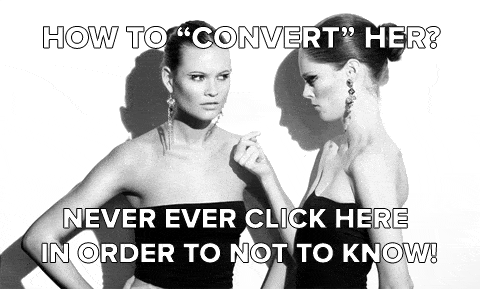
- The use of (intelligently) animated gifs. They can help boost your CTRs (Click Through Rates). In this test I ran on a french webmarketing blog the CTR was 55,74% during the first week!In this specific case the animated image was combined with a very unusual CTA: “How to ‘convert’ her? Never ever click here in order to not to know!”
- The use of completely unexpected shapes. In this example the CTR increased by +230% by turning the ad picture upside down (test done by Bart Schutz):
10. Focus on experience over financial benefits
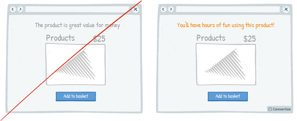
It’s a good idea to avoid references to money when presenting your products to customers and instead to emphasise the enjoyment they will get when using them.
People place more value on the experience than the money and focusing on that will allow them to connect with your product or service.
Underlying Principles
- Time versus Money Effect (Mogilner & Aaker, 2009)
Time versus Money Effect
The Time versus Money Effect was notably studied by Mogilner and Aaker in 2009. They showed that people react much more favourably to sales pitches that make reference to time rather than money. We react much more positively to references to the time we will get to spend with a product over any mention of money (even if that is to say how much money we might save).
Mogilner and Aaker put forward several reasons to explain the Time versus Money Effect. Firstly, we have a much more personal relationship with time than with money so that an evocation of time we might spend enjoying a product creates a more immediate emotional and personal connection with this product, helping to increase our desire to have it. Thinking about the time we will spend allows us to project forward to our own personal experience of using or consuming said product. Time is also a rare resource, less replaceable than money – once time is spent, we can’t get it back – which increases its value. Therefore, if we think that using this product is a worthwhile way of passing our time then it will immediately go up in our estimations. Finally, by concentrating on our future use of this product and not on the price, we are less likely to really think about the monetary value of the product and whether it is in fact too expensive or overpriced. Studies have shown that the act of spending money really decreases our pleasure in purchasing (the Pain of Paying principle) so it is always more effective to concentrate on another aspect of the purchase.
Mogilner and Aaker conducted many experiments to test this principle. In one of them they split students from Stanford University who all had iPods into 3 groups. The first group was asked “How much money have you spent on your iPod?”, the second group was asked “How much time have you spent on your iPod?”, and the third group wasn’t asked any preliminary question. They were then asked to complete questionnaires about their iPods and the first group, who had had their attention drawn to the amount of time they spent using their iPod, gave by far the most favourable opinions and feedback about the product.
The Time versus Money Effect is a principle that is very useful in sales and marketing strategies as it can be extremely effective to market your products from the angle of time customers will spend using them rather than concentrating on any financial offers or other price-based selling points.
11. Position images and graphics on the left

Visual elements positioned on the left are processed by the right hemisphere of the brain, which is better suited for image processing. Therefore, people will “digest” the page more quickly and easily, and it will have a more pleasing effect on them. Smooth cognitive processing is key for all aspects of your website as the easier and more pleasurable users find your site the more likely they are to proceed.
Underlying principles
- Cognitive Ease (Khaneman, 2011)
Cognitive Ease
Cognitive ease or fluency is the measure of how easy it is for our brains to process information. The Cognitive ease associated with something will alter how we feel about it and whether we are motivated to invest our time and effort in it. The Nobel Prize-winning Economist Daniel Kahneman explains in his book Thinking, Fast and Slow (2011) that our brains have two modes of thinking: the first that operates automatically and quickly, with little or no effort and no sense of voluntary control, and a second system that pays more conscious attention to information presented, especially in the case of that which demands more cerebral effort such as complex calculations for example.
When cognitive ease diminishes, because the mental effort required is too much or too complex, we engage this second system of “effortful mental activity” and switch to a state of cognitive strain. The Cognitive ease principle reveals that when people have to switch to the second system of thinking, causing cognitive strain, they become more vigilant and suspicious. It results in a decrease in confidence, trust and pleasure involved in completing the mental action. In other words, people are happier and more receptive towards familiar and easily understandable situations in which they feel safer, more confident and at ease.
For example, when shopping during a sale, the way the prices are marked up will greatly affect people’s attitude and interaction with the products (and the likelihood of purchases being made). If the sale prices are easy to understand using percentages (simply “- 50%” for example) or with the new sale prices already calculated for you (“now 20 pounds only” for example), then shopper’s brains will react in an automatic and positive fashion. However, if it’s necessary to work out a complex mental calculation to understand what the offer is (for example, working out what 12% off £27.28 would be) then the brain will switch to the “second system of thought”. This means that we will pay more attention to the calculation and therefore the real benefits of the offer and start questioning whether it is actually a good deal or not, whether you really need another pair of shoes, etc. The more cerebral effort we demand from our customers, the more of a negative and suspicious reaction we will automatically evoke.
The Cognitive ease principle has many applications in marketing. For example, psychological studies have found that shares in companies with easier-to-pronounce names perform better than those with difficult-to-pronounce names. In online marketing, any possible elements that can simplify a website should be used: infographics, intuitive web design, easy-to-read font, and so on.
12. Use attractive models (when appropriate)
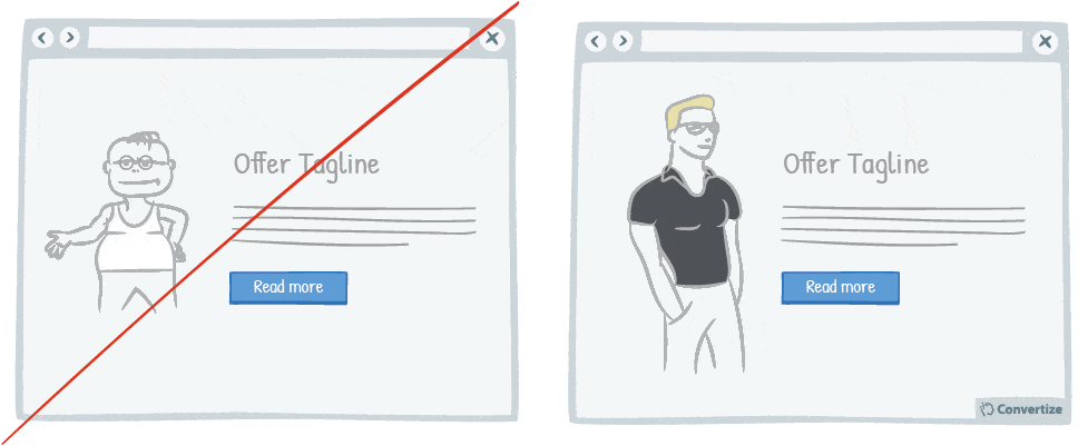
Using attractive models on your site can be very effective in the right context. Studies have shown that using a model to market a product increases its credibility, how much attention people pay to it, and how likely they are to want to purchase it.
Underlying principles
- Physical Attractiveness (Caballero & Pride, 1984; Kahle & Homer, 1985; Kamins, 1990; Bower, 2001; Tsai & Chang, 2007; Buunk & Dijkstra, 2011)
- Halo Effect (Thomdike, 1920; Asch, 1946; Clifford, 1975)
Physical Attractiveness
The principle of Physical Attractiveness explores the way in which we react to models used in advertising (whether that be online, on TV, in magazines, etc.). Many researchers have studied this subject and have found that, when in an appropriate context, the use of attractive models can have a positive effect on an advert’s effectiveness. If we find a model physically attractive, this somehow increases their credibility (Kamins, 1990), our desire to buy and our positive attitude towards the product (Kahle & Homer, 1985), as well as the attention we give to the advert and potential purchase (Caballero & Pride, 1984).
Many hypotheses have been put forward to explain this phenomenon, notably the fact that we tend to compare ourselves to models used in advertising and are prone to project their qualities (beauty, confidence) on to the product they’re using and therefore feel that owning said product will somehow bring us closer in comparison to these models. However, this tendency for comparison can go two ways and in other studies, notably by Bower in 2001, it has been proven that in certain contexts, the presence of attractive models can serve to diminish the effectiveness of an advert as it can also diminish the image that potential customers have of themselves in comparison. So there are several factors in play with this cognitive bias, such as how your customer will compare themselves, the type of product, the sex of the customer, etc. The model’s physical appearance will influence us in some way as we make immediate and perhaps subconscious deductions about them and therefore the product that they are advertising in turn. These deductions could be positive, seeming to represent luxury, success, kindness or other positive values that the consumer aspires to, or equally could be negative, inciting ideas of superficiality, distrust, jealousy, etc. There are certainly cases where using a physically attractive model doesn’t work. For example, Caballero and Pride (1984) showed that if trying to sell something such as tissues, using an attractive model is, in fact, less effective as it diminishes the credibility of the advert and product seeing as someone who is sick and requires tissues would not be looking so healthy and attractive in reality.
In marketing, it is therefore essential to use the Physical Attractiveness principle wisely and carefully, of course making use of attractive models to advertise your products but at the same time being aware of the wider context and whether it is appropriate for certain products and target audiences etc.
Halo Effect
The Halo Effect is a cognitive bias that affects our perceptions, leading us to base our judgments on a selective amount of information we have concerning something or someone. We often tend to use just our first impressions to create a generalised idea of what someone or something is like in totality. For example, we often see someone in a positive light, arbitrarily awarding them many positive characteristics based solely on one positive trait we know to be true, whether or not this one trait is in any way related to the current context or not. In other words, we attribute positive characteristics to people or objects based on just one observation.
This cognitive bias was theorised by Thomdike in 1920 and later proved by Asch (1946) and Clifford (1975). Clifford demonstrated how people considered to be more attractive were often also deemed to be more intelligent as well despite the two factors having no correlation in reality. During his experiment, teachers were shown photos of unknown pupils and asked to make assumptions on several different elements of their characters (intelligence, likelihood of academic success, etc.). The results showed that when given photos of more “attractive” pupils, the teachers described them as more likely to be intelligent or successful than others. There was no basis for these presumptions other than the fact that the one “positive” characteristic they had to go on (in this case, the attractive physical appearance) led them to subconsciously attribute other positive characteristics to these pupils.
However, the Halo Effect also works inversely. The “Devil Effect” shows how we are also likely to judge people negatively based on one single negative attribute. For example, we may demonstrate a negative sentiment towards someone that we don’t even know simply due to the fact that they hang out with a crowd of people we don’t like, or inversely have a negative opinion of a whole group of people simply because one person we don’t like is included in it.
The Halo Effect also has huge significance for brands and businesses. For example, a brand that is well-known for having one particular quality product will find that all of its other products are also assumed to be of a similar quality even if this theory hasn’t been tested. Similarly, when promoting a certain item or service, the good publicity generated will be attributed to the brand as a whole so can have a much wider, more positive impact than a particular advertising campaign merited. In this way, certain marketing strategies use just one or two particular positive elements (such as a client testimony or a popular celebrity endorsement) to cast an overall positive light on their brand image.
13. Enlarge words that convey emotion

Words that convey emotion are important parts of your content as these are trigger words that will elicit a response and engagement from your visitor. Making use of emotive words in your content (pleasure, joy, desire, etc.) is a great and easy way to stimulate your visitors in a positive way. Placing emphasis on these words through making them larger or writing them in capitals etc. will enhance this effect even further as they will stand out immediately to your visitors who will then focus on these elements over other less important ones on the page.
Underlying principles
- Focusing Effect (Schkade & Kahneman, 1998)
- Attentional bias (Bradley & al., 1996; Buodo & al., 2002; Pessoa & Ungerleider, 2004; Vuilleumier, 2005) – Persuasive technique 1
Focusing Effect
The Focusing Effect is the way in which the human mind places too much emphasis on certain limited factors when making decisions. Instead of taking in to account all the many perhaps more important but less distinctive factors when evaluating something or making a choice, we only recognise and place value on a few mainstream or more sensationalised pieces of information. This causes an imbalance in judgement and often leads to misinformed evaluations.
In a study carried out by Schkade & Kahneman (1998) where people were asked whether Californians or Mid-Westerners led happier lives, people overwhelmingly assumed and stated that it was Californians. They were, of course, falling victim to the Focusing Effect as they were basing this decision on well-documented and perhaps even cliche ideals such as better weather, living by the sea, more relaxed, outdoor lifestyle, etc. However, in reality, this is not the case as there is no discernible difference between the happiness of residents in these two areas. By putting emphasis on a limited number of factors, other more important determinants of happiness were overlooked, such as crime rates and safety from natural disasters.
In the commercial arena, the Focusing Effect is often utilised as a selling technique. Knowing that people are in fact more likely to accept the merit of a certain product you are trying to sell if that merit is based on only a few well-chosen factors, means that web marketing strategies can be developed accordingly. Consumers are looking for products that they believe will better their lives in some way and are receptive to being informed of the positive and glamourised aspects of a product, event or service. Focusing on only a few key components of the product you are trying to sell, concentrating on the most widely recognisable or most distinctive features, is an effective way of converting the Focusing Effect in to an affective marketing tool.
14. Add a visual depth to your Call-to-Action through use of a border

Your Call-to-Action (CTA) is a button – you need it to look like one! Adding depth to your CTA through using a border, bevel or shadowing will help to clearly distinguish it as a button that is there to be clicked on. A visual effect to indicate that it is clickable will make it much easier for people to see automatically which parts of the page are interactive and will lead them to engage without any frustration.
Underlying principles
- Representativeness Heuristic (Kahneman & Tversky, 1972)
Representativeness Heuristic
Representativeness Heuristic is a cognitive bias explored by Kahneman and Tversky in their article Subjective Probability: A Judgment of Representativeness (1972). It demonstrates that people tend to “force” statistical arrangements to match with their beliefs when making judgements about the probability of an event under uncertainty. Representativeness Heuristic also explains the way in which we place objects in to a certain category simply based on a limited number of similarities: even if something doesn’t fit exactly into a known category, we will judge it to be the same if we can draw enough parallels. This shortcut leads us to judge the probability of something or the category it fits into in a biased manner by comparing it to a similar thing rather than using objective statistics or knowledge.
For example, if an individual sees three blackbirds fly past in succession, they will expect the fourth bird to go past to be black too, and even assume that maybe there are only black birds in that particular area. They are making biased assumptions based on a mental shortcut that relies on generalisation rather than statistical probability. Mathematically speaking, without knowing any statistics related to the ornithological distribution in the area, the fourth bird to pass is just as likely to be any other colour as it is to be black again.
You can use this principle in web marketing in several ways. In order to make your product appear as attractive as possible to your customers, you can highlight the similarities of this product to another that you know your customer likes (perhaps something they’ve previously bought). You can also make use of this principle to ensure that the products and services you are offering match up with their expectations based on representative models.
15. Show your product being used in several ways in your photos
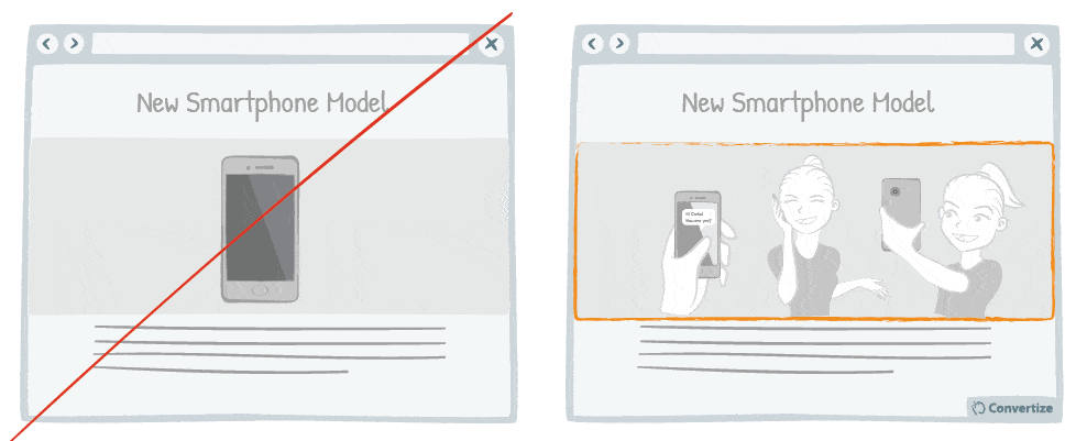
People are more inclined to want to buy a product when it is shown in a way which helps them to visualise themselves using it. Therefore, to reduce the mental effort required on the part of your customer in order to connect with the product and imagine it as part of their lives, it is useful to display several images of the product being used in different ways. This is especially important for online businesses as customers are unable to see the actual product in real life before purchase.
Underlying principles
- Visual Depiction Effect (Elder & Krishna, 2012)
Visual Depiction Effect
Visual Depiction Effect, notably studied by Elder & Krishna in 2012, describes the way in which being able to enter into a mental interaction with a product when seeing it advertised enhances our desire to buy it. People are more inclined to want to buy a product when it is shown in a way which helps them to visualise themselves using it. Simply ensuring that your product is orientated in such a way that it could easily be picked up or used by a right-handed person (as the majority of people are) can vastly increase the interest a potential customer will show in this product. Similarly, it can also be effective to display a product being used by someone, without its packaging, or accompanied by a utensil or tool that we might use in real life when using said product (such as showing a spoon with a yoghurt), etc.
Advertising a product using these tactics helps to reduce the mental effort required on the part of your customer in order to connect with the product and imagine it as part of their lives. The Visual Depiction Effect is therefore very useful to consider when coming up with sales and marketing strategies and is particularly vital for online marketing where imagery plays an essential role as customers are unable to actually see the physical product.
16. Hyperlink Primary Menus, List Items, and Complementary Icons
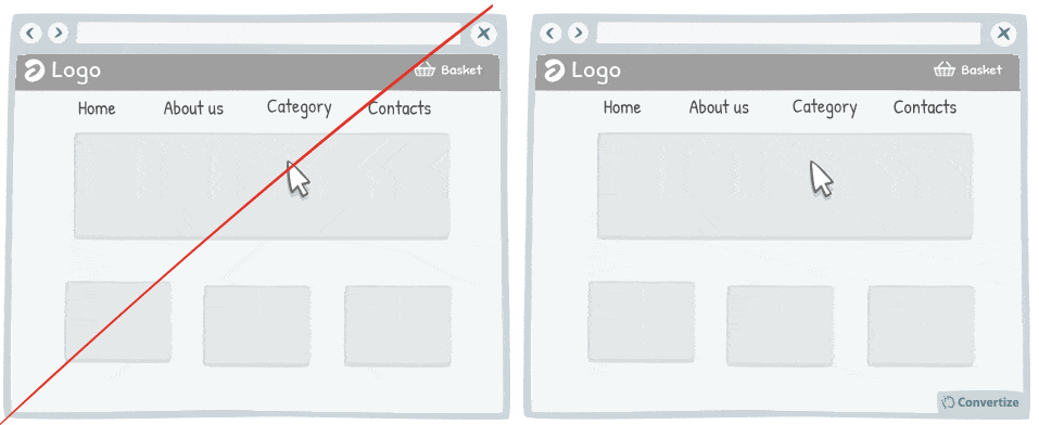
Users are not perfect, they make mistakes regularly. Indeed, it is common to see people click on areas that are not clickable. Do not try to fight against those mistakes, instead, add clickable functionality to those common areas. For instance, expand clickable area in the primary menu, in the list items or in the complementary icons or images.
Underlying principles
- Processing Efficacy (Jacoby & Dallas, 1981) – Persuasive technique 4
- Autonomy bias (Deci, 1971; Ryan, 2008)
Autonomy Bias
The Autonomy bias is part of the Self-determination theory, studied by Deci (1971) and Ryan (2008), which explores the degree to which an individual’s behaviour is self-motivated. Autonomy bias is our universal and innate need to be agents of our own lives. We have a need to make our own choices and to have the ability to implement these choices by our own free will. This may include deciding what we do, how we do it, when we do it and where we do it. A high level of perceived autonomy comes with feelings of certainty, reduced stress and a high level of ‘intrinsic motivation’. This increases the likelihood of persistent behaviour. We especially don’t like to feel coerced: it undermines this intrinsic motivation and we become less interested in doing something.
Studies have shown that restrictions on our autonomy lead to dissatisfaction. For example, one study revealed that the greatest source of dissatisfaction amongst doctors wasn’t having to deal with insurance companies or the piles of paperwork but instead a lack of control over their daily schedules. Studies also show that even altruistic actions (normally shown to increase positivity and well-being) will fail to produce these positive feelings when they’re coerced.
Autonomy bias has applications in management and marketing as a tool for motivating employees or customers to get the best response and engagement from them by knowing when and how best to award them autonomy.
17. Use interactive images rather than static ones
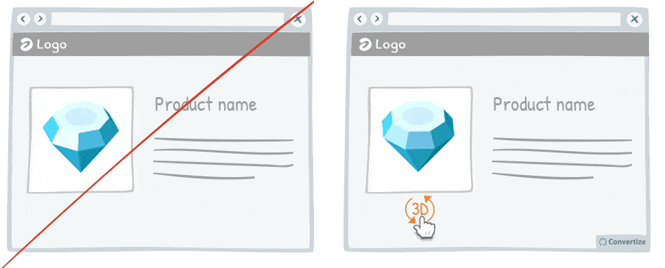
Research has shown that consumers are generally more drawn to interactive images than static ones. The interactive images provide a “fun” aspect to the user experience thanks, for example, to the 3D visualisation of a product. In addition to this fun aspect, it allows customers to better visualise the product, making it almost tangible, which will give them the ability to imagine owning it and encourage purchase conversion. This practice is recommended mostly with products that benefit from being touched or closely looked at, such as clothing, artwork, jewellery, etc.
Underlying principles
- Self-efficacy Theory (Bandura, 1984)
- Information Bias (Baron; Beattie & Hershey, 1988) – Persuasive technique 4
Self-efficacy Theory
Self-efficacy theory, first defined by Albert Bandura (1984), shows that our own perception of how capable we are of completing a task will influence and affect our subsequent behaviour and ability to succeed in this task. In other words, the more competent we think we are, the greater our intrinsic motivation to act is. High or low self-efficacy determines whether or not someone will choose to take on a challenging task or perceive it as impossible to complete.
According to Bandura’s theory, people with high self-efficacy are more likely to view difficult tasks as something to be mastered rather than something to be avoided. Different factors can influence our self-efficacy: past successful experiences for similar tasks, positive feedback or “vicarious experience” (when we see others being successful in a task).
A scientific study revealed this self-efficacy effect by studying two groups of students engaged in solving puzzles over 3 different sessions. Group A received positive feedback after their first session whereas Group B did not. The results then overwhelmingly showed that Group A went on to be more motivated and successful in the subsequent tasks than Group B.
Self-efficacy theory is used in online marketing in order to increase visitors’ motivation and self-confidence when they are asked to complete a task online. For example, showing social proof through displaying details of customers who have previously taken the same actions (bought something, written a review, signed up for a membership, etc.) is a good persuasion technique to encourage others to do the same.
Improve your SaaS Pricing page
18. Have no more than 3 pricing plans

Offering a maximum of 3 pricing plans will help your visitors to make better decisions and feel less overwhelmed. Research shows that information overload results in less effective and satisfying decisions than when less information is presented or fewer options are on offer.
Underlying principles
- Paradox of Choice (Schwartz, 2004)
Paradox of Choice
The Paradox of Choice principle is explored by the American psychologist Barry Schwartz in his book The Paradox of Choice – Why more is less (2004). Schwartz shows how, instead of increasing our capacity to make a decision, an abundance of choice can often lead to feelings of anxiety, loneliness and depression. Even if we might believe we’d be happier if given a larger range of choices in everyday life, we actually make better decisions and end up happier and more satisfied when fewer options are presented to us. Reducing choices will reduce consumer anxiety as too many options is overwhelming for our brains and, having to choose just one option from a large selection of “desirable” options often leads us to feel unsatisfied and hung up on those other possibilities we missed out on. The more choices we are given, the higher our expectations become and the lower our sense of final accomplishment and satisfaction. It can even lead to “suspended action”, where we are so overwhelmed by the choice on offer that we fail to make a decision at all.
This sensation is well known to all during those Christmas shopping trips where we wander aimlessly without a set idea of what we need to purchase in mind and ultimately end up not having bought anything as we spent the whole time deliberating over all the different options on offer. Online dating is also a current example of this Paradox of choice as we are given so many potential matches that we never feel as though we have found “the right one” yet and so continue searching endlessly; rather than considering each profile in terms of its own “potential satisfaction”, we are instead caught up thinking of all the other profiles yet to discover and are constantly worried we are missing out on something better.
The Paradox of Choice is often applied in the world of sales and marketing as it can greatly affect consumer purchase decisions. Whether shopping in store or online, customers can often be put off making that final purchase if shown too many products or if too much cognitive effort is required of them to make a decision. Under this cognitive pressure, customers will tend to either turn away from making any purchase or make a decision that will ultimately leave them feeling unsatisfied. It’s therefore incredibly important to ensure that it is as simple as possible for your customers to make a choice so that they don’t feel overwhelmed and so their final decision is satisfactory for both them and you.
19. Provide a “more info” button for every product

Your customers will feel like the more information they are given in order to make a decision, then the better that decision will be. So the more information you can give them about the product (in this case, offering an option to read more detailed information on a product), the more likely they are to feel confident about buying it.
Underlying principles
- Information Bias (Baron; Beattie & Hershey, 1988) – Persuasive technique 4
20. Use a higher pricing plan as an anchor and “ugly brother”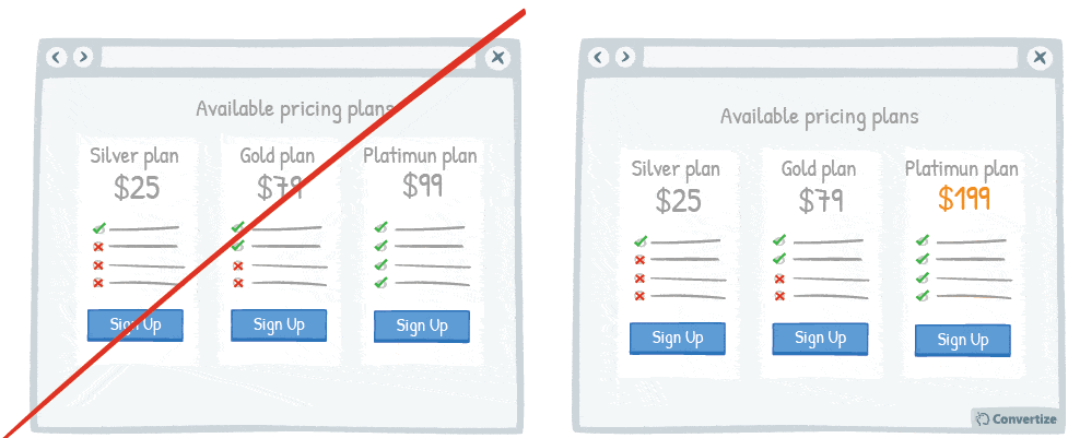
Displaying a pricing plan that is much higher than the others on offer could be an efficient decoy (“ugly brother”) worth testing on your site.
Offering a pricing plan that is significantly higher than the middle plan (which would be the one you hope customers to buy) will make this middle plan seem much more reasonable and like a good deal in comparison. People will feel like they are getting better value for money because they are “saving” a lot in comparison to the higher option (decoy). And you will most likely increase the number of sales for your middle plan compared to your cheapest plan.
Additionally, the higher price can help “anchoring” your visitor at a higher price level for your product and hence make your 2nd highest price plan appear affordable in comparison.
Underlying principles
- Decoy Effect (Huber; Payne & Puto, 1982; Ariely)
- Anchoring Effect (Tversky & Kahneman, 1974; Ariely)
Decoy Effect
The Decoy Effect, first demonstrated in 1982 by Joel Huber and others at Duke University, explains how when a customer is hesitating between two options, presenting them with a third “asymmetrically dominated” option that acts as a decoy will strongly influence which decision they make. An option can be defined as asymmetrically dominated when it is completely dominated by (i. e. definitely inferior to) one option and only partially dominated (i. e. inferior in some aspects) by the other. The asymmetrically dominated option is a decoy serving to increase preference for the dominating option – the one we really want the consumer to choose.
For example, imagine you want to buy a car and the seller shows you two models: car A that has relatively less features but a low price and car B that, on the other hand, has more features but is therefore more expensive. The Decoy Effect will come in to play if the seller now shows you a third car: car C has more features than car A but still a lot less than B and is only marginally less expensive than car B. With these comparisons in mind, car B will stand out as being by far the superior option and deal.
This cognitive bias takes place because our brains don’t evaluate things based on absolute values but instead through inter-group comparisons. When a customer has to choose between just two products, it can make for a difficult decision. In the aforementioned situation for example, the two initial cars on offer really had nothing in common in terms of price, quality or features offered which makes it difficult to draw an effective comparison.
The customer can’t clearly see which is the “better” offer because they are offering totally different benefits: one a good price but one better quality. By introducing the third option though, a more relevant point of comparison is offered (even if it is distorted in order to sway the decision making process a certain way). The fact that the third option offers a lot less for a small difference in price suddenly made car B seem like the outstanding option in terms of value for money.
This theory has vast applications in sales and web marketing and can be applied to anything from pricing in your ads to pricing on your sales page or to determine which products should be shown together on your main products page.
Anchoring Effect
The Anchoring effect, first studied by Tversky & Kahneman (1974), is a cognitive bias that causes people to rely too heavily on the first piece of information they receive as a point of reference. The human mind does not consider the value of something based on its intrinsic value but rather compares different things against one another, making decisions based on these comparative values. Anchoring therefore occurs when individuals use an initial piece of information in order to make subsequent judgements. Once an anchor is set, judgements are made by using this anchor as a point of reference and are more often than not biased by whatever this anchor happens to be. In other words, through the anchoring effect, we use ‘anchors’ or reference points to make decisions, rather than thinking rationally and objectively to make the best decision overall.
The Anchoring effect will affect the way we negotiate, the prices we consider to be acceptable, the quality or value we perceive goods to hold, etc. Many experiments have shown that it is difficult to avoid the Anchoring effect, as it affects our thinking even when we’re unaware of it. In one study, two groups of students were asked to guess at what age Mahatma Gandhi died. The first group were asked whether they thought he died before or after age 9, and the second group before or after age 140 (both anchors far removed from reality as Gandhi actually died at 87 years old). The experiment showed that the two groups gave significantly different answers – of 50 and 67 respectively – precisely because they had been influenced by the anchoring age values initially given.
Numerous examples of the Anchoring effect can be found in the commercial sector: during sales, it is common practice to show the original price crossed out with a sale price right below it in order to give customers the anchorage point of the higher pre-sales price and make it seem like a good deal comparatively. People tend to judge the value of the product in relation to the discount they get off the anchor price rather than the actual cost, as they will be more naturally interested in the difference between the anchor and the sale price rather than the absolute value of the product in question.
In this example, Dan Ariely created completely irrational anchors by requesting participants to write down the last 2 digits of their social security number prior to making bids in subsequent auctions:
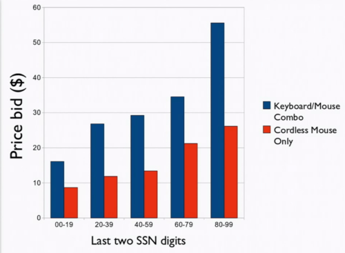
In this example the anchoring ratio can be calculated as follows:
- High anchor (average between 80 and 99): 90
- Low anchor (average between 00 and 19): 10
- Anchoring ratio (AR): △high-low estimate / △high-low anchor (in %)
- AR = (55,64-16,09)/(90-10) = 49%
40 – 60% is typical and found in the vast majority of experiments!
21. Offer a decoy product
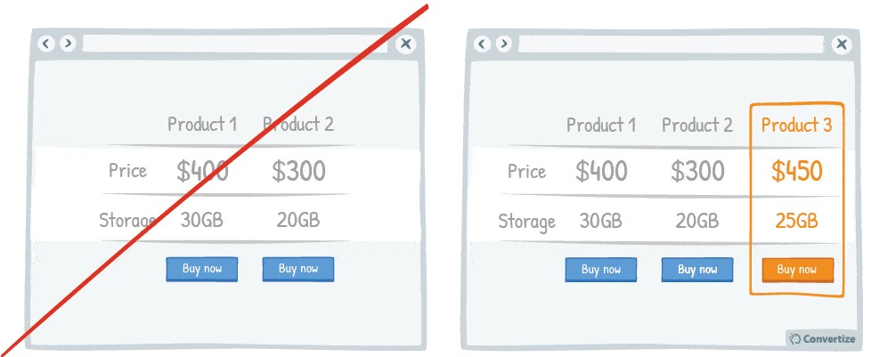
Displaying a decoy product at a higher price will change people’s perception of the perceived value of your other products on offer.
Offering three options instead of two, with the highest price product not offering noticeably more value, then customers will be more likely to choose the middle product as it will seem like the best value deal amongst the three. The higher priced product will make the middle one seem much more reasonable and like a good deal in comparison.
Underlying principles
- Decoy Effect (Huber; Payne & Puto, 1982; Ariely) – Persuasive technique 20
The second product, more expensive but seemingly similar to the first (you have to look twice to find the difference…) is the decoy to the first Nikon at 388,80€:

But decoy pricing can also be applied in a setting with 2 products only. In this example, Williams Sonoma initially had deceiving sales figures for a bread baking machine, on offer for $275.
Instead of applying a discount to the product, they introduced an ugly brother, a second bread baking machine with only slightly better characteristics, but at a significantly higher price.
The result: Sales of the initial machine almost doubled.

22. Choose a price with fewer syllables
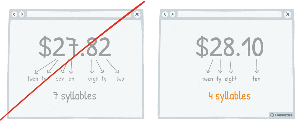
Choosing a price with fewer syllables removes a little of the cognitive strain from your customer and things which are quicker and easier to understand are instantly more familiar. The clearer you can make things the better as people want their user experience to be as stress-free and painless as possible.
Underlying principles
- Cognitive Ease (Khaneman, 2011) – Persuasive technique 11
- Also inspired by Nick Kolenda’s research
23. Display the daily or monthly price to make the amount seem smaller
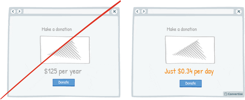
By showing the price per day or month rather than the total price, it can often seem like less. Your customer will tend to use this smaller amount as an anchor to decide whether the purchase is good value and, even though the total price is the same ultimately, they will often feel as though they’re spending less money which will encourage them to make the purchase.
Furthermore, this technique reduces the pain of paying and increases the the perceived value.
Underlying principles
- Anchoring Effect (Tversky & Kahneman, 1974; Ariely) – Persuasive technique 20
- Pain of Paying (Prelec & Loewenstein, 1998) – Persuasive technique 36
- Perceived Value Pricing (Lee & Zhao, 2014; Poundstone, 2010; Mazumdar; Raj; Sinha, 2005; Thomas; Simon; Kadiyali, 2007) – Persuasive technique 30
24. Display a higher price first
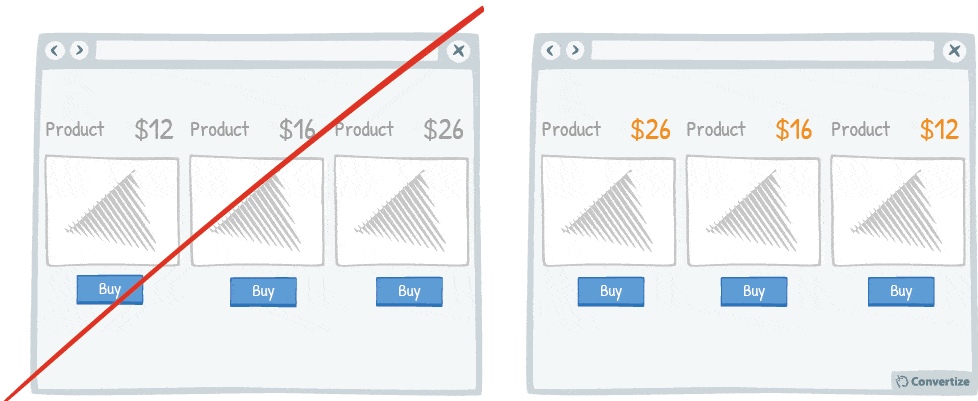
People often use an initial piece of information to make subsequent judgments so if you display a higher price first, it will be the first one your customers read and they will use it as an anchor to evaluate the other prices. Consequently, the following prices will appear smaller and better value in comparison because they are being seen in relation to the initial higher price.
Underlying principles
- Anchoring Effect (Tversky & Kahneman, 1974; Ariely) – Persuasive technique 20
Roger Dooley suggests to combine anchoring and decoy pricing:
First, the decoy – this could be a very expensive product that few customers will buy but will make the product you hope to sell look like a compromise, middle-of-the-road choice.
Then, instead of ordering the products from left to right (for example, from “Free” to “Enterprise”), start with the most expensive product on the left and work down. The high priced product will be the first one seen (assuming the language is read left-to-right) and become the anchor that makes the rest look less expensive.Roger Dooley
25. Product name should be descriptive and unique
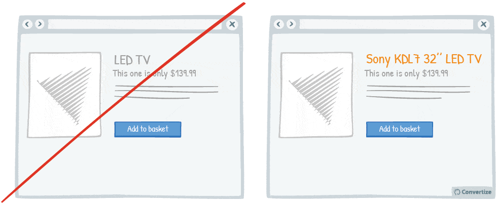
Choose a product names that is descriptive and unique. Indeed, having a descriptive name simplifies the understanding of the product and avoid confusion for your customers. In addition it helps to boost your SEO. Then a unique name allows you to avoid to face too much competition. Indeed, many products have the same name and it becomes more difficult for your customers to find yours, and it goes without saying that it is also very bad for your SEO. Therefore prefer a full, descriptive and unique product name.
Underlying principles:
- Curse of Knowledge (Camerer; Loewenstein & Weber, 1989; Newton, 1990)
- Information Bias (Baron; Beattie & Hershey, 1988) – Persuasive technique 4
Curse of Knowledge
The Curse of Knowledge was first studied by economists Camerer, Loewenstein & Weber in 1989. This cognitive bias leads people who are better informed on a subject to find it almost impossible to consider that subject from the point of view of someone who doesn’t know as much about it. This often means that concepts, ideas and information aren’t presented clearly enough because the person presenting it presumes a certain level of knowledge and comprehension from their audience.
Once you know something it is impossible to put that knowledge aside and you also forget that not everyone has the same information as you so will not necessarily see things the same way or understand something as quickly. Psychologist Elisabeth Newton conducted a famous experiment in 1990 whereby participants were divided in to two groups with one group “tapping” well-known songs whilst the other group listened and attempted to identify these songs. The group who were tapping estimated a successful guess rate of at least 50% whilst the outcome was actually only 2.5%. The fact that those who were tapping the songs already knew which song it was – and, of course, could hear this song in their heads whilst tapping – meant that they were biased towards believing the answer was obvious and just couldn’t comprehend how few people would guess incorrectly. Of course the group listening were just hearing a series of discordant and therefore mostly unidentifiable taps.
The implications of this in the commercial world are vast as it is often a well-informed party who sets pricing for an object or service (a wine expert picks and values wine, a dressmaker sets prices for luxury fabrics etc.) and, due to the Curse of Knowledge, they find themselves unable to anticipate how the most likely lesser-informed customer will perceive their valuation. This often leads to high-quality goods being overpriced for the market and low-quality goods being underpriced.
It is also essential to be aware of – and try to counteract – the bias of the Curse of Knowledge in any kind of business communications. Everyone who works for a certain company will have a similar level of knowledge concerning the basic elements of what that company does. However, it is important to remember that the people you are communicating with outside of your company – customers, other businesses, or even other people within the same field – may not necessarily understand certain phrases, systems or ideas. Keeping communications clear and easily comprehensible for everyone is an important factor in making your website and services both accessible and engaging.
26. Put your default pricing plan in the middle and make it more visible
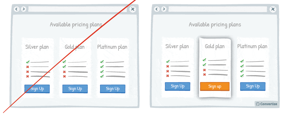
When you have a default pricing plan (the option you would prefer people to choose) then you can influence how attractive this option is by making it stand out from the others. Placing it in the middle and bringing it to the front, using highlighting or putting the Call to Action button in a different colour, will help it to really stand out from the other options so that people will automatically be drawn to it.
Underlying principles
- Von Restorff Effect (Von Restorff, 1933; Gardner, 1983; Taylor & Fiske, 1978) – Persuasive technique 9
27. Create a default option or add-on
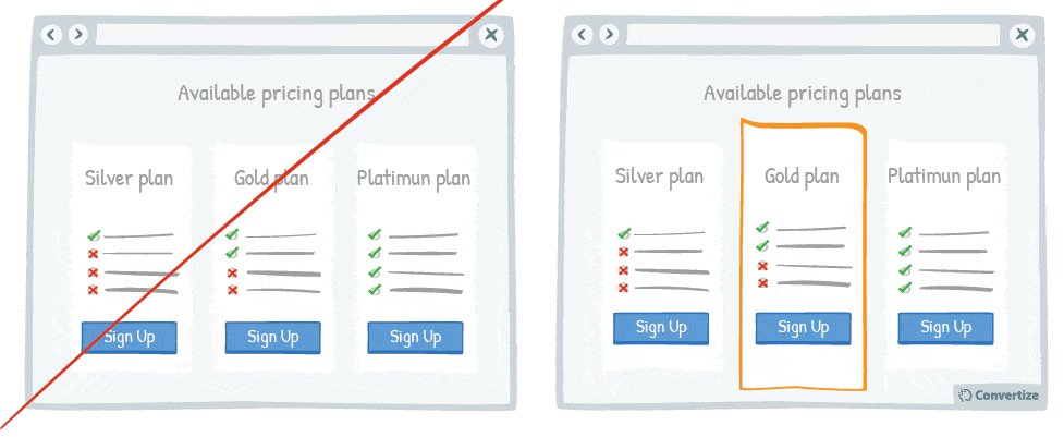
If you have a particular option or add-on that you would prefer your customer to choose, then making it a default option will greatly increase the chances of them doing so.
Default options are so attractive because, firstly, they offer a passive choice, which is often preferable to the cognitive effort of making our own decisions. We also tend to view a default option as “the most popular”, choosing to believe that the reason it is the pre-selected, default option is because it is the one that most people choose.
We like to choose the same things as others as it makes us feel safe in our choices.
Underlying principles
- Loss Aversion (Tversky & Kahneman, 1984)
- Default Effect (Johnson; Hershey; Meszaros & Kunreuther, 1993) – Persuasive technique 7
- Also inspired by Nick Kolenda’s research
Default Effect
The Default Effect was most notably studied by Johnson, Hershey, Meszaros & Kunreuther (1993) and reveals how the fact of having a “default choice” available influences our decisions. Amongst all the options given to us when we need to make a choice, the default choice is the one that doesn’t require us to actually make any active decision as it has already been chosen for us. For example, when we install software on our computer, we’re offered a default installation option; we only need continue with the installation in a passive manner with all the functions chosen for us and this is the overwhelming (non-) choice made. The Default Effect is therefore the way in which any default option on offer is most likely to be chosen over anything else and so offering up a default option gives us a way of influencing people’s decisions.
Scientists believe this comes down to multiple reasons. Firstly, opting for a passive choice requires the least amount of thought process whereas comparing and weighing up different options can mean a lot of time spent evaluating so, especially when we are having a hard time deliberating between several similar options, choosing the default option requires the least mental effort. This allows us to reduce the already large number of choices we face every day and therefore concentrate on making decisions when it’s really important.
We’re also prone to choosing default options as we consider them to be recommendations. In the case of the computer software installation, certain functional choices we’d have to make might seem too technical or complicated for us so we prefer to simply follow the default option that we presume has been set up by someone who knows more than we do or we presume that it’s the default option because it is comprised of the settings most regularly chosen and will therefore probably serve our needs too.
Looking at default choices can also reveal how often we are likely to accept a choice that has happened by default without question whereas if we were asked to actively consider the decision and make a more thoughtful and informed choice we might not agree. For example, scientific studies carried out regarding the relation of the Default Effect on organ donation found that there are less donors in countries where consent is not given by default. If you are simply put on the organ donor list by default because you haven’t actively expressed that you do not wish to be one then you probably would never even really consider this. Whereas if you were asked to actively give your consent then you would be more prone to start thinking about it in detail and might become more emotionally involved and less likely to agree.
In web marketing, the Default Effect can come into play whenever your customer needs to make a decision, whether that be about signing up to your newsletter, or choosing a product or method of delivery etc. Offering a default option when there is a choice you would rather they make (i. e. making sure that boxes to opt people in to receive your offers etc. are always pre-ticked) will increase the likelihood that your visitors will indeed make the choice you’re hoping for.
28. Ask customers to subtract rather than add features when creating a custom plan
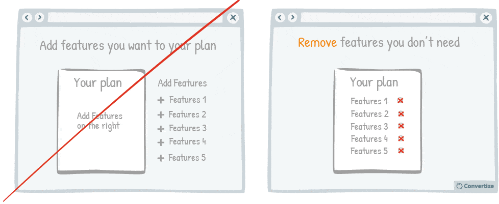
If you are offering your customers the chance to create their own custom plan then it is better to offer by default the plan including all available features.
Studies have shown that we are often inclined to simply go with the “default” option as we like to follow suggestions and have our cognitive strain lessened in any way possible.
Also, it is proven that we are more affected by loss than potential gain and so forcing customers to actively remove features from their plan will draw attention to what they are losing out on and will again increase the likelihood that they will want to keep more features.
Underlying principles
- Anchoring Effect (Tversky & Kahneman, 1974; Ariely) – Persuasive technique 20
- Loss Aversion (Tversky & Kahneman, 1984) – Persuasive technique 7
- Default Effect (Johnson; Hershey; Meszaros & Kunreuther, 1993) – Persuasive technique 27
- Also inspired by Nick Kolenda’s research
29. Add strikethroughs for absent features
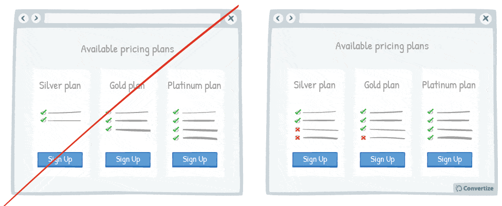
Adding strikethroughs for absent features on lower cost pricing plans is another great way of showing people what they’ll be missing out on. Seeing the features they will not get with a certain pricing plan will make them more likely to consider the higher pricing plans that have the extra features.
Underlying principles
- Loss Aversion (Tversky & Kahneman, 1984) – Persuasive technique 7
30. Make the free plan less visible
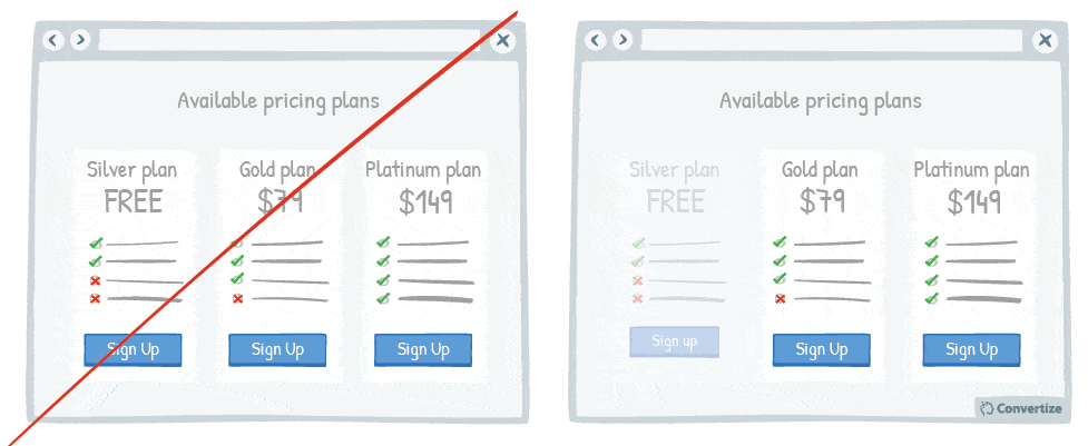
By making the free plan less visible, you will automatically draw attention to the other (paid) plans offered as they will stand out visually on the page. It is important to display your free offer but if it is too visible then your customers will consider it in an equal manner to your other available plans and these might seem less attractive comparatively. In fact, if they see the free plan first they might not even take the time to look at your other plans.
Underlying principles
- Perceived Value Pricing (Lee & Zhao, 2014; Poundstone, 2010; Mazumdar; Raj; Sinha, 2005; Thomas; Simon; Kadiyali, 2007)
- Anchoring Effect (Tversky & Kahneman, 1974; Ariely) – Persuasive technique 20
Perceived Value Pricing
Perceived Value Pricing explains the fact that our perceptions of a price and its value aren’t necessarily determined by actual market price or financial worth but rather through the way in which the price is presented to us. This is because human psychology is victim to a Price-Value Bias which means that we are easily influenced by elements that aren’t necessarily related to the value of the product when we decide how much something is worth. There are very few products and services available that are priced according to a real calculation of their monetary value. Businesses will charge what people are willing to pay. And people will be willing to pay whatever is consistent with the perceived value of the purchase. The value of something is of course highly subjective and will depend on how the customer chooses to perceive it. The important thing to remember is that how the customer chooses to perceive it can be strongly influenced by how it is presented to them.
In sales, the perceived value of a product is often altered by the way the price is framed: meaning the price can be made to seem much smaller or more attractive than it is. For example, the price could be broken down to show how much it would cost per day over a year, which makes the amount seem much smaller as, suddenly, a £300 washing machine becomes less than £1 a day – a bargain! Similarly, the price can be reframed by simply changing the price tag from £100 to £99.99. The difference is minuscule but, in the psyche of the buyer, it becomes a much more attractive purchase. How often have you bought something that was “only” £9.99 when you would have thought twice had it been £10? It’s not just because the former price is slightly cheaper than the latter, it’s been proven that prices ending in ‘9’ are more attractive to us – even when cheaper items may be on offer! In his book “Priceless: The Hidden Psychology of Value”, William Poundstone explains how “we’ve been culturally conditioned to associate 9-ending prices with discounts and better deals.” Similarly, choosing the price you present carefully has particularly important connotations when dealing with a large sum of money: Thomas, Simon, and Kadiyali (2007) analysed 27,000 real estate transactions and found that people paid more money for houses when the prices were very precise (i. e. were willing to pay £362,130 over £350,000). This has been explained by the fact that we associate the small numbers used in precise pricing (1,2,3, etc.) as having small values and therefore automatically see these numbers and think the price is smaller.
The wording used to explain prices can also have an affect on the customer’s perception of its value. For example, when offering a discount, sometimes this won’t have the desired effect because the word “discount” or “bargain” can have negative connotations, making people believe that the quality or value of the product isn’t as high. In order to counteract this it is important to accompany the discount with a reason. As Mazumdar, Raj, & Sinha (2005) noted, some large stores found that giving a straight-forward reason for a discount or saving, such as it being a cost saving obtained from a supplier that they then want to pass on to their customer, helped to minimise negative effects and enhanced the success of promotions.
It’s also important to remember though that, in some cases, making a product appear more expensive actually helps sales because higher price tags already carry with them an intrinsic sense of value. If you’re charging more money for something, people will naturally assume there is a reason for this and attach a higher value to that product. It’s important therefore in marketing your product to really know who your target audience is to understand what type of Price-Value Bias they will be susceptible to.
31. Position prices towards the bottom-left
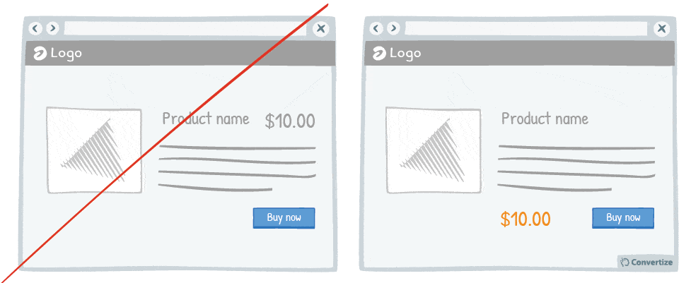
It has been proven that our perception of the value of a price can be influenced by the way it is visually presented to us. People tend to think of numbers on an imaginary horizontal line, with numbers growing larger from left to right. They also associate something low on the page with a lower price, and something higher on the page with a higher price. Therefore, positioning prices towards the bottom-left of the page will unconsciously make the visitor perceive the price as smaller.
Underlying principles
- Magnitude Encoding Process (Oppenheimer; LeBoeuf & Brewer, 2007; Coulter & Coulter, 2005; Thomas & Morwitz, 2005)
Magnitude Encoding Process
If you want people to perceive a price as being small, then it can be very effective to associate all of its features with a small magnitude, including the way it is visually presented. Numerical stimuli (prices included) are represented and encoded in our memories as magnitude representations (i. e., judgments of relative “size”). Therefore if you want a number or price to be perceived as smaller it is possible to influence this through the way it is physically represented.
Research has shown that judgements are made based on, often irrelevant, anchors (the Anchoring Effect principle) but Oppenheimer, LeBoeuf and Brewer (2007) found that this also extends to physical and visual anchors. In other words, people will be biased in making judgements depending on any associated visual stimulus. In the following case, the unrelated small visual stimulus presented resulted in people having smaller numerical values in mind. They conducted an experiment whereby students were given three drawn lines (1 straight, 1 wavy and 1 an inverted “u” shape) and asked to copy these without use of a ruler. Group A were given short lines in length and Group B longer lines. The second section of the experiment consisted of a questionnaire where the first question was “How many miles long is the Mississippi River?” followed by 5 more random questions to avoid anyone catching on to the reasoning behind the test. It found that Group A, who had drawn shorter lines, gave an average response of 72 miles in comparison to the 1224 miles given as an average response by Group B, a huge difference that was entirely due to the length of the lines they were first asked to draw. They later repeated the experiment exchanging the question with “What is the average temperature in Fahrenheit in Honolulu, Hawaii?” and once again Group A with the shorter lines gave a much lower average temperature that Group B, showing that the physical anchor doesn’t have to be visually similar.
In marketing, this principle can be used in a wide number of ways to help prices seem smaller. The visual representation itself of the price has a direct influence on how low or high people will perceive that price to be. Most obviously, use of a smaller visual magnitude (such as using a smaller font) can make the price seem smaller but equally, playing with the placement, the colours used or another visual element can also help to reduce their perception of its magnitude.
32. Use a smaller font size for pricing
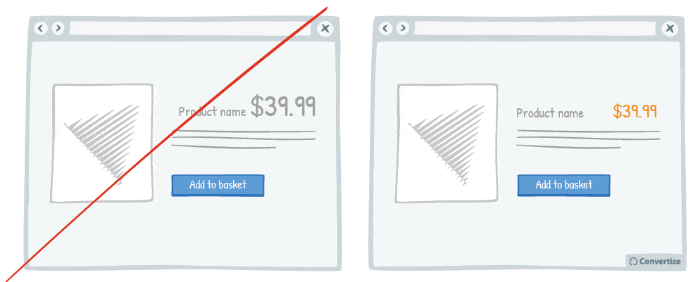
Using a smaller font size for your pricing is doubly effective. Firstly, it of course makes the price more subtle and so doesn’t automatically draw people’s attention towards the fact of paying and how much money they will have to part with to have the product. Secondly, it has been proven that we associate small visual stimuli with small numerical values and so the smaller the physical size of the price, the smaller people will perceive the price to be.
Underlying principles
- Magnitude Encoding Process (Oppenheimer; LeBoeuf & Brewer, 2007; Coulter & Coulter, 2005; Thomas & Morwitz, 2005) – Persuasive technique 31
- Also inspired by Nick Kolenda’s research
33. Remove the decimal point when applicable

Whenever possible, remove the decimal point from your pricing as it is not necessary and adds a little extra cognitive strain for your customer. The clearer you can make things the better as people want their user experience to be as stress-free and painless as possible.
A price tag without a decimal point is more instantly recognisable and will make your customers feel subconsciously more comfortable and in control of their buying situation.
They will react to prices displayed in this way more automatically and quickly, so you will have a better chance that they accept this price and follow through with making the purchase.
Underlying principles:
- Cognitive Ease (Khaneman, 2011) – Persuasive technique 11
- Also inspired by Nick Kolenda’s research
34. Be precise with large numbers (above 5 digits)
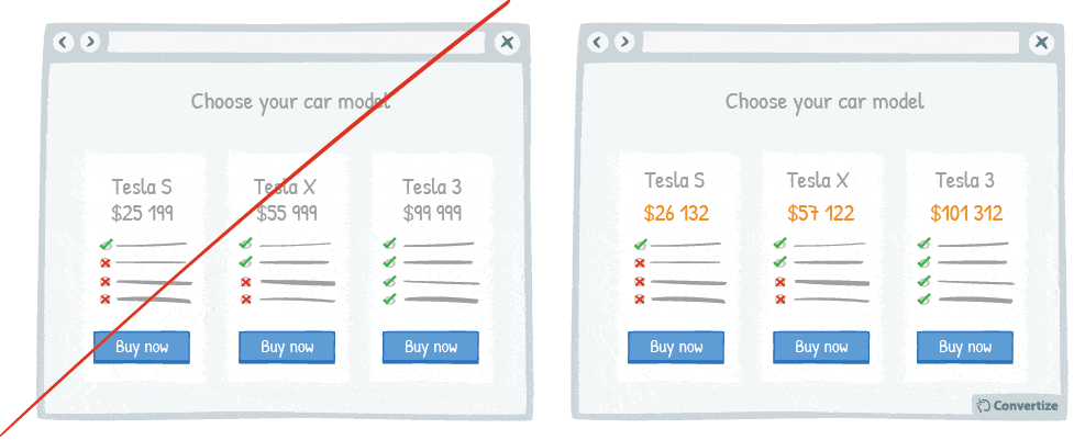
Careful and precise pricing is particularly important when dealing with a large sum of money. It has been shown that when purchasing a car, for example, people will actually pay more money when the prices are very precise and feature lower figures (i.e. would be willing to pay £26,213 over £25,000).
This can be explained by the fact that we associate the small numbers used in precise pricing (1,2,3, etc.) as having small values and therefore automatically see these numbers and think the price is smaller.
Underlying principles
- Perceived Value Pricing (Lee & Zhao, 2014; Poundstone, 2010; Mazumdar; Raj; Sinha, 2005; Thomas; Simon; Kadiyali, 2007) – Persuasive technique 30
- Also inspired by Nick Kolenda’s research
35. Don’t Bundle Expensive and Inexpensive Products
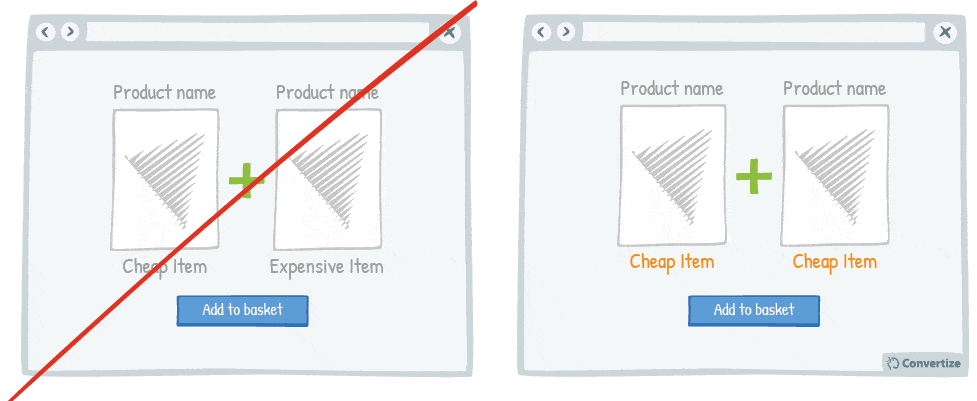
The price of a product is not only based on its value itself but on the perception that users have of it.
When you sell products together, by making a bundled offer for example, do not mix very expensive products with cheap products. People may perceive the offer as cheap and you run the risk of them not making the purchase.
Underlying principles
- Perceived Value Pricing (Lee & Zhao, 2014; Poundstone, 2010; Mazumdar; Raj; Sinha, 2005; Thomas; Simon; Kadiyali, 2007) – Persuasive technique 30
36. Don’t display the currency sign
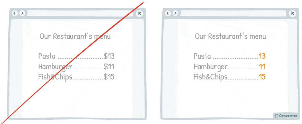
Removing the currency sign from your prices will help customers to avoid the negative feelings associated with spending money. Indeed, research has shown that the act of paying really disrupts the pleasure of buying and that the more obvious, tangible or transparent the payment is, the less we enjoy making purchases and the more likely we might be to back out. However, be careful to ensure that it is still obvious that the figures represent a price.
Underlying principles
- Pain of Paying (Prelec & Loewenstein, 1998)
Pain of Paying
The Pain of Paying principle, first explored by Prelec & Loewenstein in 1998, explains the psychological link between payment and pleasure (or lack thereof) for the experience or product you are paying for. The simple fact is that people don’t like to part with their money and so making payment can reduce the pleasure taken from making a purchase. It has been proven that spending money actually activates the areas in our brain that are associated with physical pain and feelings of disgust.
Therefore, the more strongly we feel this “pain of paying” when we spend money for something, the less we will enjoy it and it can affect our decisions to make purchases. Studies have shown that certain forms of payment hurt more than others: the more evident, tangible or transparent the payment is, the less we are able to enjoy the pleasure of our purchase. We feel this “pain of paying” less when we pay by credit card or when there is a gap between paying and the time of receiving or using the purchase. Inversely, we feel it more when we have to pay for something immediately or by cash as it really draws attention to the amount that something is costing us.
Automatic payment systems available for online purchases are an example of one way in which some brands are trying to reduce the pain of paying in order to therefore make more sales. Registering your customers’ payment details is an effective way of limiting the feeling of making payment and encouraging more purchases. For example, when you buy music or a movie on iTunes, there is no mention of the fact that you are paying, you simply click on the “download” button and, as your bank details are already registered, payment is automatic and therefore less visible and tangible.
37. Give your pricing plans relatable, helpful names
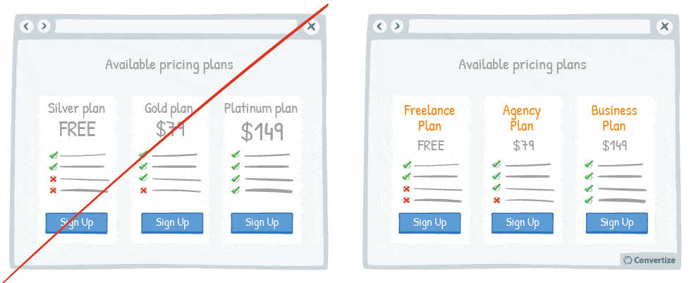
The names you use for your pricing plans can really make a difference. By using names that your customers are familiar with, you will trigger an immediate emotional response that will enhance their positivity towards the available options.
People prefer things that they are familiar with and that their brains are more easily able to recognise and digest. So by using recognisable and familiar names that allow customers to see quickly and easily which pricing plan might be best for them, you are automatically putting them at ease and allowing their cognitive processing to happen fluently and with little upset or frustration.
Underlying principles
- Processing Efficacy (Jacoby & Dallas, 1981) – Persuasive technique 4
- Social Cognition (Pelham; Carvallo & Jones, 2003)
Social Cognition
This principle, studied by Pelham, Carvallo and Jones (2003) asserts that people gravitate toward people, places, and things that resemble the self. It is an unconscious process that is grounded in people’s favourable self-associations: they are biased towards characteristics that relate to themselves. In other words, people like something they have a connection with, even thought they may not be aware that this is the reason they feel favourably towards it. For example, customers will gravitate towards a business or website that they feel they share something in common with or that relates directly to something they connect with. This principle of Social Cognition is also referred to as Implicit Egotism.
Academic research has shown through several studies that people’s personal details are likely to affect their life choices. For instance, there are statistically more people named Louis living in the city of St. Louis than in any other city, and people named Dennis or Denise become dentists more often than people with other names. It was also found during a study done in Pelham that there was a direct correlation between people’s birthdays and the number of the address where they lived. It seems that people subconsciously choose towns, careers and addresses that have a link with the primary elements of their identity (name, age, birthday, etc.).
This cognitive bias has vast applications in marketing and sales. It is good practice for brands to adapt their marketing strategies to their target audience in order to incite an immediate sense of familiarity and connection to the product, even perhaps including the customer’s specific details within their product where possible. For example, brands such as Starbucks Coffee and Coca-Cola put the names of their customers on their coffee cups and Coca-Cola bottles so that they immediately feel more connected with the brand.
38. Create a dedicated pricing page
Creating a page that is dedicated solely to your pricing schemes and offers has many benefits. Firstly, it’s a simple, clear and effective way of displaying all your prices to your visitor meaning that they can consult these prices easily without the other potential distractions of your site and will therefore be more likely to make a satisfactory choice.
Secondly, studies have shown that a simple physical act of closure (closing down a tab or shutting a menu etc.) helps to stop us from thinking over our decisions and questioning whether we made the right choice.
With a dedicated pricing page your visitors have had time to look over your various offers, made a decision and will then leave the page, effectively closing the subject psychologically and avoiding any possibilities of regret whilst thinking over the alternative options not taken. Avoiding this will help to increase the overall satisfaction your customer feels with the products or services they have purchased which in turn will lead to return business and happy customers.
Underlying principles
- Choice Closure (Gu; Botti & Faro, 2013; Johnson, 2007)
Choice Closure
When we make decisions, we’re often racked with post-decision regret, constantly agonising over what life might have been like had we made a different one. Choice Closure explains the way that this can be avoided to a certain extent through the simple act of physical closure. Being able to complete a physical act of closure helps our brains to accept the finality of a choice, helping the decision-maker to move on from alternate possibilities and be much more satisfied with their choice. As humans, we are more able to grasp abstract actions through physical experiences (Johnson, 2007) and adding action and imagery to a psychological concept of closure makes it much more final for us. This physical act can be as simple as closing a menu or internet browser.
Choice Closure can help to limit unfavourable after-thoughts about a choice we’ve made and to raise satisfaction with what we have chosen. Gu, Botti & Faro (2013) conducted an experiment at the London Business School whereby people were asked to choose from a range of 24 different tea varieties. It was made very clear to them that they wouldn’t be able to alter their choice afterwards. Some people were asked to close their menu after they’d chosen and results overwhelmingly showed that these people were far more satisfied with their choice of tea than those who were simply asked to make a choice. The only difference was that one small act of closing the menu, which closed those participants’ minds off to alternate choices and post-choice regrets.
Choice Closure is a really useful tool in the commercial world as it can help to vastly improve customer satisfaction post-sale, which leads to repeat business and future sales. Offering some kind of Choice Closure to customers is particularly beneficial when a large range of options are available, as this incites the Choice Paradox (whereby people tend to be overwhelmed by options and often can’t make a decision and, if they do, are more likely to be plagued by post-decision regret).
39. When to round up prices: emotional vs rational purchases
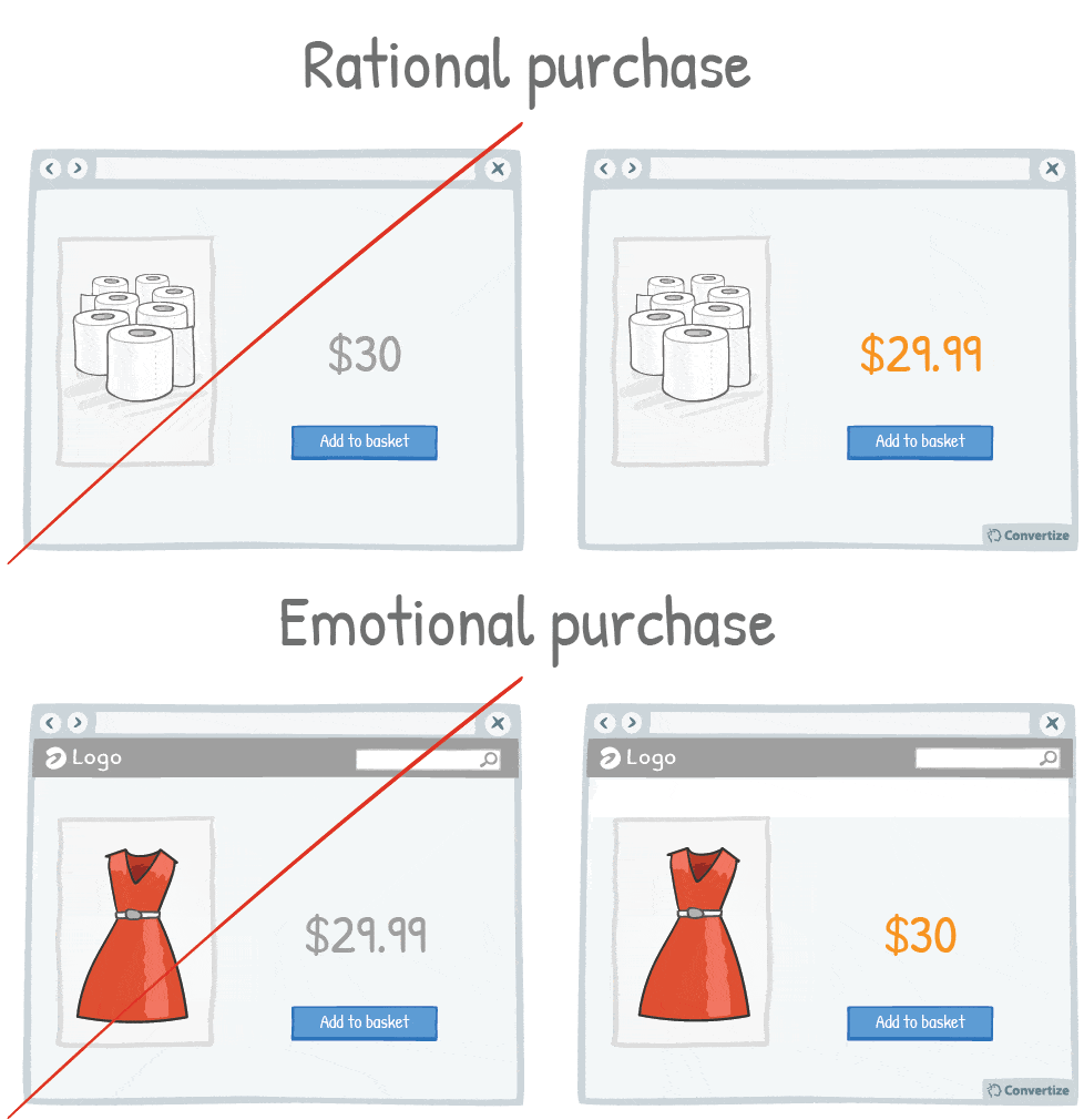
Our brains process prices differently depending on whether a purchase is guided by rationality (for example for non-luxury, necessary goods) or by emotions (those products which we buy to make us happy, or when we “just can’t help ourselves”, etc.).
When someone is making an emotional purchase, round prices work best because they are simple to understand and are therefore processed fluently by the brain. When consumers can process the price quickly, the price “just feels right” which fits nicely with an emotional, and perhaps impulsive, purchase – such as the dress in the image above.
When dealing with a more rational purchase, such as toilet paper as shown above, then the opposite is true. We use more mental effort to process non-rounded prices and so these seem more fitting with rational purchases. What’s more, we’re often more concerned with value when we buy something rational and using a non-rounded number gives the opportunity to alter buyer perception of the price value. Using a decimal point, such as $29.75 or $29.99, will make the price seem significantly lower than $30 – even though in reality there is not so much difference – as we are prone to only process the first digits of a price (so will read it as “£29 something”).
Underlying principles
- Cognitive Ease (Khaneman, 2011) – Persuasive technique 11
40. Offer the possibility to pay in installments

The way in which a price is presented to your customer can greatly influence how they perceive the value of it. For example, offering people the option to pay in installments will subconsciously make them feel as though they are getting a better deal even though it is the same price overall. A price that is displayed as £99 per month for 5 months is much more attractive than a price that is simply displayed as its total of £495. This is why subscriptions work so well as well – giving customers the chance to pay monthly instead of in one annual lump sum not only makes it more financially viable but also makes them feel as though they are paying a smaller amount as it is the installment amount which carries the most weight in our perception of the price.
Underlying principles
- Perceived Value Pricing (Lee & Zhao, 2014; Poundstone, 2010; Mazumdar; Raj; Sinha, 2005; Thomas; Simon; Kadiyali, 2007) – Persuasive technique 30
- Anchoring Effect (Tversky & Kahneman, 1974; Ariely) – Persuasive technique 20
41. Expose visitors to any high numbers

Exposing website visitors to any high numbers before displaying your product prices can be very effective in influencing their perception of your price value.
Studies have shown that people tend to use the first piece of information they receive as an anchoring point to then judge subsequent information. In this way, showing high numbers to your visitors will ensure that the first reference number they are exposed to is very high and therefore, in comparison, your prices may seem much lower than they actually are.
Any large number will work, with no link to pricing necessarily required: number of members, satisfied customers, visitors per month, etc.
In the above example a big number of fans in the community also serves also as social proof.
Underlying principles
Anchoring Effect (Tversky & Kahneman, 1974; Ariely) – Persuasive technique 20
42. Visually distinguish price comparisons
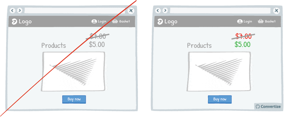
Displaying a previous, higher price alongside your current price is a great way of convincing people that what you’re offering is good value. One easy and effective way to enhance this though is to visually distinguish the old and new prices.
People will misattribute a physical distinction to a numerical distinction (i.e. the more different the two prices displayed look visually, the greater people will perceive the difference in price to be).
So using a different colour, font size, placement or even crossing out the old, higher price are all ways that you can remove the similarities between this and your new, lower price and enhance people’s perceptions of the difference between the two.
Underlying principles
- Magnitude Encoding Process (Oppenheimer; LeBoeuf & Brewer, 2007; Coulter & Coulter, 2005; Thomas & Morwitz, 2005) – Persuasive technique 31
43. Create your own custom payment currency

Using a custom currency (credits, points, etc.) will reduce the pain of paying (the negative feelings associated with spending money). Indeed, research has shown that the act of paying really disrupts the pleasure of an experience and that the more obvious, tangible or transparent the payment is, the less we enjoy making purchases and the more likely we might be to back out. By using a currency that is not associated with “real” money, customers will have a different perception of price and payment. The figure itself is likely to be smaller (as in the above drawing, where customers are seeing the number “10” instead of “40”) which immediately makes the price seem smaller and customers are unlikely to take the time to properly calculate the real equivalent price.
Underlying principles
- Pain of Paying (Prelec & Loewenstein, 1998) – Persuasive technique 36
44. Display discounts in percentage rather than in value when product price is below 100 (£/$/€)
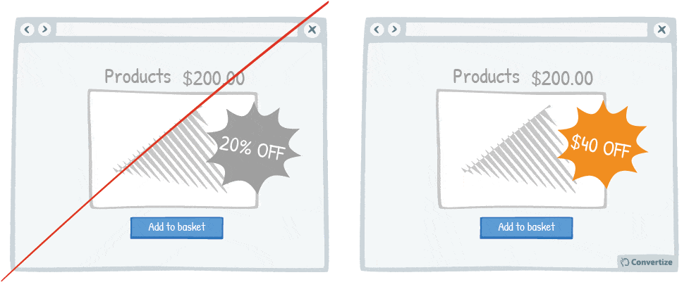
By displaying discounts in percentage rather than in value when product price is below 100 (£/$/€), you make your promotions seem as attractive as possible by altering the way you frame them. If the original price is less than $100 then it’s better to show the reduction in terms of a percentage (eg. 25% off).
However, if it’s higher than $100 then it’s better to show it numerically (eg. $25 off). Although the discount offered will of course remain the same, it is the customer’s perception of how large it is that can be affected. In each case, the numerical value attached to the discount will be the largest possible, which will of course bias the customer’s perception of how large the discount itself is. They will automatically make a judgement based on the discounted figure shown rather than calculate what the actual final price of the product is.
For example, 10% off of $250 doesn’t seem as interesting as $25 off, just as $3 off of $12 doesn’t seem as interesting as 25% off.
In both cases, the discount itself is exactly the same but will be perceived as larger due to the magnitude of the discount value.
Underlying principles
- Perceived Value Pricing (Lee & Zhao, 2014; Poundstone, 2010; Mazumdar; Raj; Sinha, 2005; Thomas; Simon; Kadiyali, 2007) – Persuasive technique 30
45. Give a reason for discounts
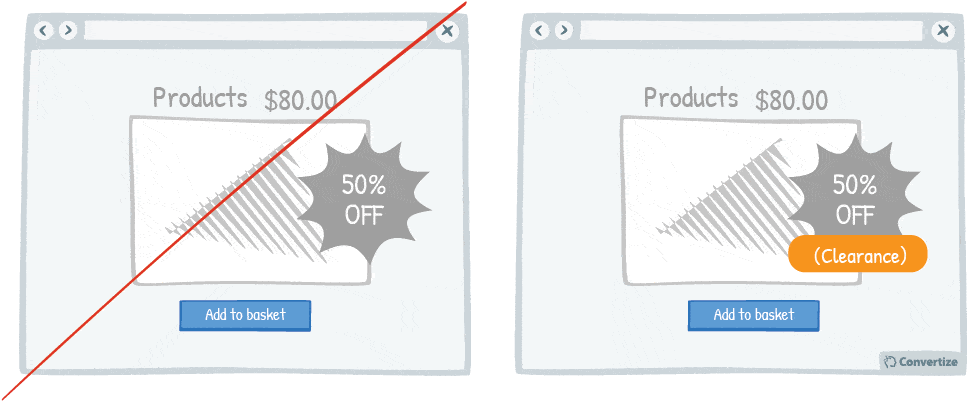
Whilst offering discounts is a great way of moving stock, you don’t want your customers to be left wondering why certain products are discounted and potentially questioning the quality of the product: a discount should be presented in a positive way with a clear and obvious justification.
People don’t evaluate prices based on any absolute value but rather on their perception of a value which is often shaped by how it is presented to them and the references provided for comparison.
Your discount should therefore be presented in a positive manner through giving a credible and immediately recognisable reason for it (stock clearance, older model, one-day sale, etc.) in order to encourage the customer to focus on how much saving is being made with this new price and will see it as a good deal not to be missed.
Underlying principles
- Perceived Value Pricing (Lee & Zhao, 2014; Poundstone, 2010; Mazumdar; Raj; Sinha, 2005; Thomas; Simon; Kadiyali, 2007) – Persuasive technique 30
- Reference Pricing (Tversky & Kahneman, 1974; Green & al. 1998; Ariely; Loewenstein & Prelec, 2003; Nunes & Boatwright, 2004)
Reference Pricing
It is human nature to compare, and to judge value based on these comparisons, and the world of consumerism is no exception. Most people will only feel justified in purchasing something if the price of it matches a perceived value. This value can be changed according to how it is framed – as with Perceived Value Pricing – and the use of Reference Pricing is one such way that framing a price can change our perception of its value. Reference Pricing refers to the fact that individuals will decide what is a justifiable price to pay for a product or service by comparing it to other reference prices (such as competitors’ pricing or previous, pre-sale pricing etc.).
For example, if you are told that an obscure vinyl record is on sale for £300, you won’t really have any idea whether this is good value or not as there is no point of market reference. If you then find out that another copy of the same record recently sold for almost £1000 then this provides a frame of reference and now the one on sale for £300 seems like it is a very good deal. On a smaller scale, if your local supermarket is selling tins of soup for £1, you’re unlikely to look twice unless you specifically came in to the store for that. However, if they have a visible reference price available showing that this soup is sold at a competitor’s store for £2 – it immediately puts the value, quality and price in to a new perspective and makes the soup a much more attractive purchase.
Research has shown that Reference Pricing even comes in to play on a subconscious level and that even the prices of unrelated products in close proximity can affect the perceived value of something. In a study conducted by Nunes & Boatwright (2004), CDs were placed on a beachside stall next to sweatshirts that were being sold alternately for $10 and $80 (at half hour intervals). When the sweatshirts were sold for $10 people were only willing to pay $7.29 for the adjacent CDs, but when they were being sold at $80, this price jumped almost 18% to $9! Without them even realising, customers were being influenced by the Reference Pricing of the completely unrelated sweatshirts.
In sales and marketing, Reference Pricing is a useful tool to help give products and services the desired value perception. By contrasting your prices with that of competitor’s or by highlighting how large a discount you are offering on a previous advertised price, customers will be likely to consider the purchase justified and, even more so, a good deal.
46. Offer discounts that are easy to compute
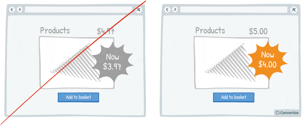
Using precise, non-rounded numbers is a good way of making your prices seem smaller but one occasion when you don’t want to do this is when you’re offering discounts. You want your discounts to seem as significant and interesting as possible and so it is more effective to use rounded numbers to ensure these discounts are easy to compute.
People will see the difference between $4.97 and $3.97 as being smaller than between $5 and $4 simply because they can’t compute the difference as easily or quickly and because precise numbers lend themselves to smaller values.
Underlying principles
- Perceived Value Pricing (Lee & Zhao, 2014; Poundstone, 2010; Mazumdar; Raj; Sinha, 2005; Thomas; Simon; Kadiyali, 2007) – Persuasive technique 30
- Cognitive Ease (Khaneman, 2011) – Persuasive technique 11
47. Increase prices more frequently but by small increments

Avoid waiting until the moment of desperation to suddenly raise your prices, anticipate and increase them gradually. Using frequent but small price increases will reduce the impact that these could have on your customers. A sudden increase in price will immediately be more noticeable and will put many customers off even if it is the first increase you have made in years (unless a significant improvement of the product justifies this increase). However, if you increase your prices regularly but by small increments, your customers will not have a concrete, long-standing reference price and therefore won’t be as affected by these increases.
Underlying principles
- Weber’s Law (Weber, 1834; Fechner, 1860)
Weber’s Law
Weber’s law was originally postulated during research that Weber carried out in 1834 to try and calculate the threshold for perceiving a change in weight and was later applied to the general measurement of sensation and perceptions by Weber’s student Fechner. It states that the perception of change in any given stimulus is always dependent on what that stimulus is. In other words, whether a change will be noticed is affected by how big, heavy or significant etc. that something was beforehand and how significant the change. Our sensorial capacity has limits and there is an “absolute threshold” that describes the minimum amount by which stimulus intensity must be changed in order to produce a noticeable variation in sensory experience. Weber’s law shows that a difference of approximately 10 percent is the average point where people are stirred to respond.
Weber originally tested this using the sensation of weight but it can be applied to a variety of sensory modalities (brightness, loudness, mass, length, etc.). It can also be applied to numerical values such as prices, the deletion of sections of text, or any other perceptions we might have. We can even take the well-known example of when a friend goes to the hairdresser without telling you: the likelihood of you noticing the new hair cut will depend entirely on how different it is from beforehand. If it’s just a trim without any changes to style or colour then there’s a strong likelihood that you won’t even notice. However, if she cuts it from waist to chin length then the change from the original is significant enough that it will be impossible to miss.
Weber’s law is often used in marketing, particularly with regards to price increases for products and services. It implies for example that it is possible to increase prices by small enough amounts – that fall under the “absolute threshold” – without your customers even noticing.
48. Provide a “more info” button for every product

Your customers will feel like the more information they are given in order to make a decision, then the better that decision will be.
So the more information you can give them about the product (in this case, offering an option to read more detailed information on a product), the more likely they are to feel confident about buying it.
Underlying principles
- Information Bias (Baron; Beattie & Hershey, 1988) – Persuasive technique 4
Improve your SaaS Signup page
49. Display clearly the 3 main benefits of registering
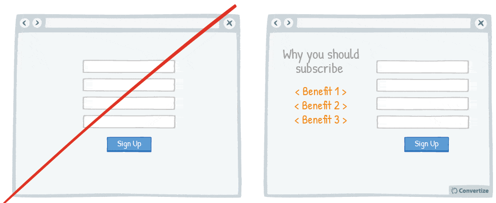
If you do not offer a guest checkout option, you should clearly explain to your customers the advantages of registering (to encourage them to take the time to do so). By showcasing just the 3 main benefits, you can make your point clear, unambiguous and simple to digest, which will give you more chance of convincing your customers that it is worth their while to register.
Underlying principles
- Ambiguity Effect (Ellsberg, 1961) – Persuasive technique 4
- Focusing Effect (Schkade & Kahneman, 1998) – Persuasive technique 13
- Need for Certainty/Uncertainty (Kagan, 1972)
Need for Certainty/Uncertainty
Kagan (1976) revealed that as part of our six basics human needs, there exists at the same time both a need for certainty and another need for variety and uncertainty. This need for certainty comes from the fact that our brain likes to know what is going on and feel in control of its interactions by recognising patterns. Indeed, feeling more certain about the world around us, as though we understand something correctly and can, therefore, predict what will happen, leads to positive feelings of control and security. Moreover, when the craving for certainty is met, there is a sensation of reward. The ability to predict something and then obtain data that meets those predictions results in a positive feeling. That’s why some people enjoy the accomplishments they feel by cleaning their house, organising their files, solving problems, and so on: it gives them a positive feeling of certainty. In contrast, the brain reacts negatively towards uncertainty leading us to feel alert, anxious and uncomfortable.
The paradox is that this tension we feel when we are uncertain can also have a positive effect. It is often uncertainty that drives creativity and results in the variety and the element of spontaneity and surprise that we also crave as humans. Because of this, both certainty and uncertainty are human needs that have to exist in balance.
This theory has many important applications in marketing. In some cases, bringing certainty to your customers, reassuring them and giving them information is vital to ensure positive feelings are induced. Indeed, there are even entire industries that exist to resolve larger uncertainties because people are willing to pay in order to receive an increased level of certainty (for example, for expert advice on stock market predictions). On the other hand, sometimes inducing a certain level of uncertainty in your customers helps to encourage them to interact in the way you would like, motivating them to complete the desired action in order to regain a comfortable level of certainty.
50. Pre-fill form fields where possible (but always allow users to change them)
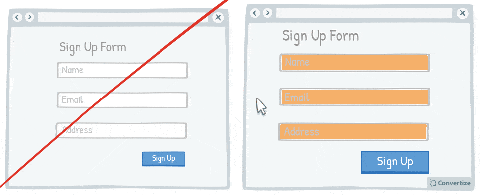
Making forms as simple and quick to fill in as possible will encourage your customers to complete them. Therefore, where possible (and applicable), it’s helpful to pre-fill form fields with information you already have (such as name, email address etc.). However, it is important that you allow the user to change these details if they want to as people are more open to completing actions where they feel as though they are in control.
Underlying principles:
- Cognitive Friction (Sweller, 1988)
- Autonomy bias (Deci, 1971; Ryan, 2008) – Persuasive technique 16
Cognitive Friction
Cognitive friction theory, developed by Sweller (1988), refers to the total amount of mental effort being used in the working memory. Sweller described the process as having three main parts: sensory memory, working memory and long-term memory. Your sensory memory receives all the information from your daily actions and activities (sounds, smells, everything you see, etc.). Then that sensory information passes into your working memory which either processes or discards it. If your brain processes the information, tries to categorise it, learn it, or put it in a “knowledge structure/schema”, this information then passes into long-term memory. Once this has taken place, we begin to process the information automatically and without much cognitive effort.
Cognitive friction theory is based on the fact that individuals are limited in their working memory capacity and so understand and learn more easily through instructional methods that avoid overloading it with superfluous information. In other words, heavy cognitive load can have negative effects on task completion and lead to errors and interference in the task. Learning happens best under conditions that are aligned with this human cognitive architecture.
For example, studies have shown that the widespread use of laptops and cell phones in classrooms has generally reduced academic success. Indeed, it increases the distractions available for students (who will inevitably check Facebook and emails etc whilst also taking part in the class) which in turn increases their overall cognitive load and reduces space in their working memory for effective reception of important information.
Cognitive friction theory has many applications in web marketing, especially with the continuous development of new technologies. Some navigation functions risk overloading users and driving them into a state of cognitive strain which then lessens the likelihood of them taking desirable actions.
51. Use single-column forms
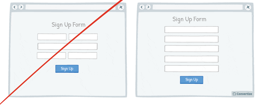
People like to process things quickly and easily and will be put off by anything that complicates this cognitive fluency. Using single column forms not only makes them look cleaner and easier to navigate, but it is a more familiar and predictable format for completing something – running smoothly from top to bottom. This will help ensure that your site visitors are encouraged to complete the form.
Underlying principles:
- Processing Efficacy (Jacoby & Dallas, 1981) – Persuasive technique 4
52. Use clear imagery to draw attention to your Call-to-Action
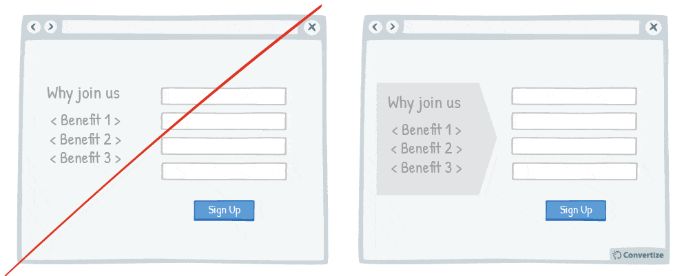
Using clean, clear imagery is a great way to draw attention to your Call-to-Action (CTA). As in the example above, adding an additional simple visual stimulus that stands out through colour or another visual difference (shape, size etc.) will help ensure the customer’s eye is drawn to the desired place. Equally, making sure there isn’t an excess of information or an overload of visual stimuli will help keep the CTA as the primary focus.
Underlying principles
- Von Restorff Effect (Von Restorff, 1933; Gardner, 1983; Taylor & Fiske, 1978) – Persuasive technique 9
- Processing Efficacy (Jacoby & Dallas, 1981) – Persuasive technique 4
53. Praise and congratulate your customers’ choices throughout your conversion funnel
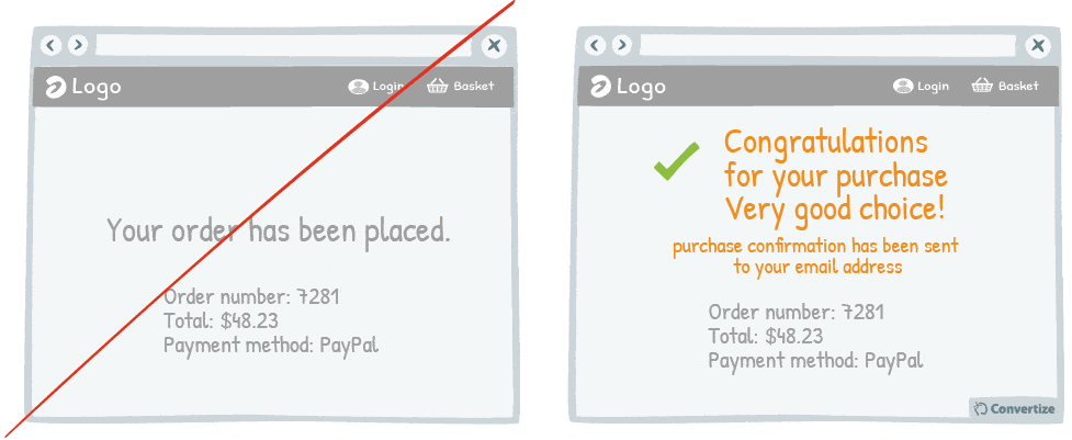
Don’t hesitate to congratulate your customers on their purchases. This constant confirmation that they are making a good choice will cement feelings of positivity and satisfaction around their purchase and will lead to more post-purchase satisfaction as well. Indeed, we tend to remember our choices as being good ones anyway as we like to convince ourselves that we have behaved correctly and made good decisions. By adding to this pre-disposition with affirming messages and praise, which can be awarded to customers throughout the conversion funnel and in a post-purchase email, high satisfaction levels will be ensured.
Underlying principles
- Cognitive Dissonance (Festinger, 1957)
- Choice-supportive bias (Henkel & Mather, 2000)
Cognitive Dissonance
Cognitive dissonance refers to a situation involving conflicting attitudes, beliefs or behaviours. Studied notably by Festinger (1957), this theory implies that when there is an inconsistency between attitudes, beliefs or behaviour, we are motivated to change something in order to eliminate this dissonance. This dissonance produces a feeling of discomfort that we automatically strive to reduce by restoring the balance. In other words, when we feel like our thoughts, feelings or actions are in conflict, Cognitive Dissonance sets in and gives you the uncomfortable feeling that something isn’t quite right. Dissonance can be resolved in one of three basic ways: change of beliefs, change of actions or change of perception.
For example, people who smoke are aware of the dangers smoking presents to their health and this presents a cognitive dissonance. In order to reduce this dissonance they can either change their behaviour (stop smoking), change their beliefs (trying to find stories about how many smokers live to an old age to challenge their conceptions), or change their perception of smoking (by telling themselves that it doesn’t matter if it damages their health as “we’ve all got to die of something” and “smoking makes me happy so it’s worth the risks”, etc.).
Cognitive dissonance principle has consequences for marketing strategies. For example, how well consumer satisfaction aligns with consumer expectation will affect how likely they are to be loyal to a product or service. When they don’t meet, it is called “post-purchase dissonance”. It is therefore important to understand and effectively handle the expectations and grievances of both your current and future customers.
Choice-supportive bias
In cognitive science, choice-supportive bias is the tendency to remember our choices as better than they actually were, because we tend to over attribute positive features to options we chose and negative features to options not chosen. Individuals tend to think that “they chose this option so it must have been the better option”. As a result, we feel good about ourselves and our choices and have less regret for bad decisions.
For example, Henkel and Mather (2007) found that giving people false reminders about which option they chose in a previous experiment session led them to remember the option they had chosen as being better than the other option. In the first experiment session, participants had to decide between two used cars. In the second experiment session, Henkel and Mather gave them a list of the features of the two options but with some new positive and negative features mixed in with the old features. Next, participants were asked to indicate whether each option was new, had been associated with the option they chose, or had been associated with the option they rejected. Participants attributed the most positive features to the option they had originally chosen, even those that were completely new and hadn’t been attributed to either car in the first session.
Choice-supportive bias has applications in web-marketing, for example to get your customers to attribute positive features to your brand and products, and even negative ones to others. For example, a strategy can be to show previously visited pages and bought items to your visitors (in other words remind them that they have already “chosen” you). Another good practice can be reassuring customers on the choices they make to enhance their own choice-supportive bias and result in greater post-purchase satisfaction.
54. On a form, specify which fields are optional rather than which are mandatory

When you ask your customers to fill in a form, specify which fields are optional rather than which are mandatory. On many websites we see asterisks or other visual cues to indicate if a field is mandatory but this can discourage users as it is immediately obvious how much they need to fill in and how much time that might take (especially on larger forms). It is important that people feel comfortable about the task you are requesting them to perform (in this case, filling out a form) and that they recognise they can easily carry it out. Therefore, ensuring that optional fields are clearly marked out will make the form seem both clear and obvious but also give the impression that it will be quicker to complete.
Underlying principles
- Cognitive Ease (Khaneman, 2011) – Persuasive technique 11
- Autonomy bias (Deci, 1971; Ryan, 2008) – Persuasive technique 16
55. Separate your form into smaller sections

When you want someone to complete a form, it is best not to discourage them by presenting that form in one large block that will immediately seem dense, unclear and long. By separating your form into smaller sections you make it not only visually more pleasing and cleaner but give the impression of a few small things that need filling out, which will seem less daunting than one large thing. People will see there are only a few fields to complete for the first section and so will start that automatically – then, once they have completed this, they will feel compelled to keep filling out the following sections of the form to complete what they have started.
Underlying principles
- Processing Efficacy (Jacoby & Dallas, 1981) – Persuasive technique 4
- Foot-in-the-door Technique (FITD) (Freedman & Fraser, 1966)
Foot-in-the-door Technique (FITD)
The foot-in-the-door technique is the idea that it is more effective to start by asking people for something small, and then when they give it to you, you are in a better position to ask for something bigger. Indeed, Freedman and Fraser (1966) have shown that a small agreement creates a bond between the requester and the requestee. The person you ask acts according to the cognitive bias that they have to justify their agreement to themselves. Humans like to justify their decision-making so they will convince themselves that they accepted the first request for a reason and then feel obliged to act consistently with this reason by accepting a second and third request, and so on. The phrase “foot in the door” originated during the heyday of door-to-door salespersons that would place their foot in the way of a closing door. With their foot literally in the door, the potential customer would have to listen to the sales pitch and this would potentially give them their way into a bigger sale.
Freedman and Fraser conducted many studies that demonstrated this cognitive bias. In one of them, they asked people to place either a small sign in their car window to promote safe driving, or a small sign in a window of their house about keeping California clean. About two weeks later, the same people were asked by a second person to put a large sign advocating safe driving or “keeping California clean” in their front garden. Many people who agreed to the first request also complied with the second, far more intrusive request.
Foot-in-the-door technique also works online for web marketing strategies. For example, you can ask for an email address (a small request that doesn’t cost anything or take too much time) and once the user has given this, they’re then much more likely to agree to complete a bigger, more important task (register online, sign up for a newsletter, make a purchase etc.).
56. Save customers’ card details and automate payments
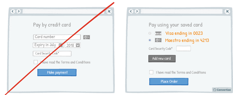
It is better to optimise the payment process as much as possible. Studies have shown that certain forms of payment hurt more than others – the more observable, tangible or transparent the payment is, the less we feel the pleasure of our purchase. Therefore, offer customers automatic renewals for regular subscriptions so they don’t need to enter their card details for each transaction.
Underlying principles:
- Pain of Paying (Prelec & Loewenstein, 1998) – Persuasive technique 36
57. Visually indicate any errors or missing fields
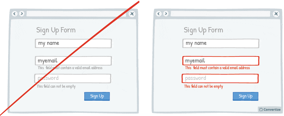
By immediately showing your customers any issues with information they are entering, you will avoid any added stress or misunderstandings. Creating an easy process for your customers is key as they will be put off completing an action if it is too complicated, difficult or information is not clearly given to help them. Using visual indications to show straight away which fields require their attention will make it an even easier and more painless experience, increasing the likelihood that they will continue and complete the action.
Underlying principles
- Cognitive Ease (Khaneman, 2011) – Persuasive technique 11
58. Provide instant feedback on fields completed
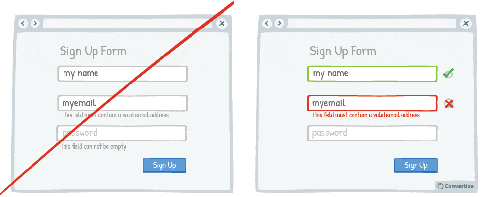
Letting your customer know instantly whether information they have entered is correct or incorrect will help to make the whole process clearer and easier. Research has shown that people are more motivated to complete an action if they feel like they are capable of doing so.
Something as simple as helping them through showing clearly which information has been accepted and which needs to be changed can increase the chances of an action (such as registering or making payment) being completed.
Underlying principles
- Self-efficacy Theory (Bandura, 1984) – Persuasive technique 17
59. Offer the option to register through social media

Statistics show that 1 in 4 customers abandon a purchase if they are forced to register for an account first. Today people feel like they have too many accounts and so one way of streamlining this and making it much easier for them is by allowing them the option of registering through an existing social media account.
Underlying principles:
- Autonomy bias (Deci, 1971; Ryan, 2008) – Persuasive technique 16
60. Reduce the number of form fields
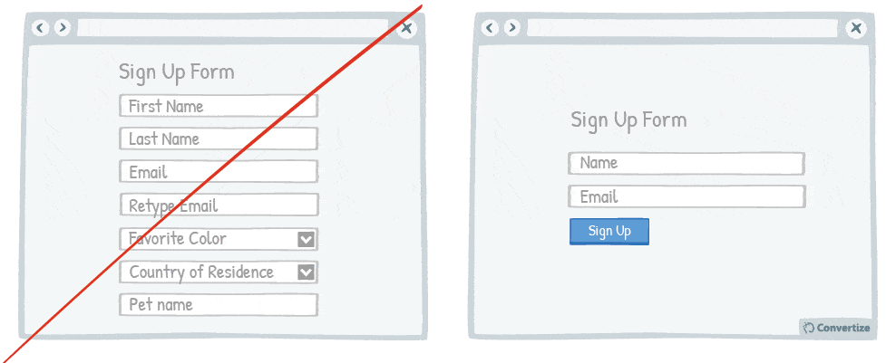
Don’t ask your customers for too much information in your initial sign up form. This is likely to put them off as they won’t want to spend the time or the mental energy on filling out multiple fields. Minimise what you’re asking for and reduce cognitive friction in order to increase the chances that they will follow through and complete the form.
Underlying principles
- Commitment and Consistency (Cialdini, 1984)
Commitment and Consistency
The Commitment and Consistency principle is one of the six principles established by Cialdini (1984) in his book Influence: The Psychology of Persuasion. It describes the way in which people want their beliefs and behaviours to be consistent with their values and self-image. Firstly, we tend to view consistency as an attractive social trait and as indicative of someone being rational, trustworthy and stable, and so we all want to be seen to be consistent. Secondly, the Commitment and Consistency principle is a mental shortcut we use to simplify our decision-making: we are given so many decisions to make daily that we reduce this amount by using a past decision as reference for subsequent related choices. The consequence of this cognitive bias is that we act in ways that are consistent with our initial action or thought, so that when we commit to something or someone, we stick to it. We also try to behave in ways that are consistent with the image we have portrayed to others, and with the public image they have of us.
For example, if an individual is thought of as someone who knows about politics, he or she is more likely to participate in subsequent political conversations, even if they have no real interests but simply want to remain consistent with this public perception of their character. In the same way, children who are often congratulated by their parents for achievements and working hard are more likely to continue to work hard and do well in order to remain consistent with this external perception of themselves.
The Commitment and Consistency principle has many applications in marketing strategies. Encouraging customers to make a small commitment to your brand or site (by offering them something easy to complete and/or free – perhaps a free trial or simply signing up for membership in order to get a discount) you are then in a better position to motivate them to continue on engaging with your site as they will feel compelled to remain consistent with this initial behaviour.
61. Is your Call-to-Action persuasive?
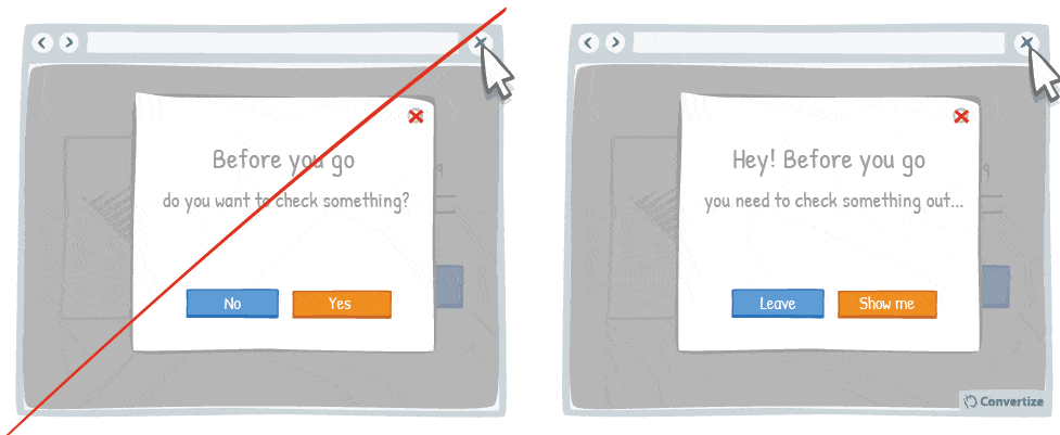
You want your Call-to-Action (CTA) text to tell people immediately why they should click on it and to help persuade your visitors to proceed forward with a positive action. Using engaging and persuasive text instead of simply the options “yes” or “no” is a simple way to improve the effectiveness of your CTA. People are likely to make decisions just based on one or two distinguishable features and so if you can engage their interest with just one thing at this point then this could be enough to persuade them.
Underlying principles:
- Need for Certainty/Uncertainty (Kagan, 1972) – Persuasive technique 49
- Focusing Effect (Schkade & Kahneman, 1998) – Persuasive technique 13
62. Let your customers know they have the power to choose
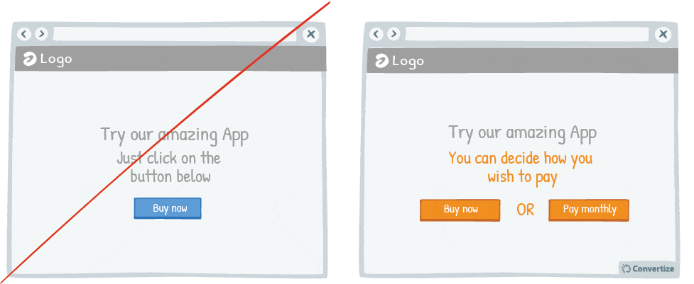
A unique and effective tool of persuasion can be to remind your customers that they have the freedom to choose what to do. Incorporating wording in your copy that emphasises to your customers that they have control over their actions and decisions on your site will reduce their psychological reactance. This occurs when we feel that someone or something limits our freedom of action or choice or that we are being compelled to do something, resulting in negative emotions and often a desire to do the opposite. So using terms such as “you are free”, “it’s up to you” or “you can decide” is a powerful way to give people a positive feeling of control and encourage them to indeed convert.
Underlying principles:
- Psychological Reactance (Brehm, 1966)
- Illusion of Control (Ellen Langer, 1975)
Psychological Reactance
Psychological reactance is a cognitive bias that was initially studied by Brehm in 1966 that describes the extreme reactions human beings experience when we feel as though we are being pushed towards doing something or as though our freedom to make our own choices is being threatened. Reactance is a psychological defence mechanism that we utilise more or less subconsciously in order to try and get back our freedom. We become “motivationally aroused”, meaning we’re flooded with an excess of righteous motivation that leads us to fight for those freedoms. This often presents itself as a Boomerang Effect of non-conformity, meaning we in fact end up supporting the very position or behaviour that we were being pushed away from. In other words, when we feel we are being forced into something, we often end up with a very negative perception of whatever that is and in fact tend to do the exact opposite thing as a form of extreme resistance. Research has shown that the more we feel our freedom of choice is being threatened the more elevated and extreme our reactance will be.
a cognitive bias that was initially studied by Brehm in 1966 that describes the extreme reactions human beings experience when we feel as though we are being pushed towards doing something or as though our freedom to make our own choices is being threatened. Reactance is a psychological defence mechanism that we utilise more or less subconsciously in order to try and get back our freedom. We become “motivationally aroused”, meaning we’re flooded with an excess of righteous motivation that leads us to fight for those freedoms. This often presents itself as a Boomerang Effect of non-conformity, meaning we in fact end up supporting the very position or behaviour that we were being pushed away from. In other words, when we feel we are being forced into something, we often end up with a very negative perception of whatever that is and in fact tend to do the exact opposite thing as a form of extreme resistance. Research has shown that the more we feel our freedom of choice is being threatened the more elevated and extreme our reactance will be.
Kiesler, Mathog, Pool & Howenstine conducted an experiment by contacting two groups of young women and asking them to sign a petition for opening a family planning and contraception clinic. One of these groups was then also sent some anti-contraception propaganda. The experiment revealed that many more of the women from the group who had also received this anti-contraception propaganda signed the petition supporting the family planning and contraception clinic than from the group that had not. Instead of inciting a negative reaction against contraception as the propaganda had intended, it had in fact had the opposite result, encouraging the women to support the contrasting cause.
Sometimes reactance is visible when someone does something they know they shouldn’t just as a way of disrespecting authority or acting rebellious. An awareness of psychological reactance can be effective for persuasive strategies, especially in marketing, to encourage a certain behaviour or reaction from your customers or to avoid being subject to a Boomerang effect.
Illusion of Control
The Illusion of Control, named thus by the Psychologist Ellen Langer in 1975, shows that humans have the tendency to believe that we can control or influence anything, even those things that are totally random. We believe ourselves to be capable of creating positive outcomes or avoiding negative ones. This Illusion of Control allows us to avoid the anxiety that can be induced by situations and happenings that are actually out of our control. For example, in a casino, you will often see a player blowing on the dice or throwing them with a certain force in an attempt to obtain the results they want from their roll. The throw of the dice cannot be influenced, it is completely random, but these actions give the player the necessary illusion of control to feel comfortable in their situation.
In 1975, psychologist Ellen Langer conducted an experiment where participants were given the opportunity to buy a lottery ticket for one dollar. The first group were given the option to choose their own lottery ticket whereas the second group were simply given one at random. Participants were then asked whether they would consider selling on their lottery ticket and, if so, what price they would ask for it. The results showed that the first group who had chosen their own tickets were less willing to sell it on and, if they were, they asked for a price that was at least four times more expensive than those from the second group were stating. This shows that the participants from the first group were affected by the Illusion of Control, believing their tickets to be of more value and more likely to be winning tickets than those from the group who were given their tickets at random.
The Illusion of Control has numerous applications in business and web marketing. Giving your customers the impression that they are in control of any transactions will help to avoid the negative sentiments attached to incertitude and lack of control. For example, it will generate positive sentiments if you allow customers to select filters or options to enable them to take control of their searches and, during the purchase process, make it clear that they are able to make all decisions according to their own desires and wishes (by offering different payment methods, delivery options, etc.). The more you can give your customers control over certain elements of your site, the more you will incite their positive feeling of control and encourage conversions.
63. Describe the Drawbacks of Your Message

On most websites, negative reviews or drawbacks are invisible while on others (e.g. Amazon), those are clearly displayed alongside the pros. Believe it or not, but hiding your drawbacks is not the solution because your customers will go search for reviews about your product on other websites or will simply not trust you because you are not impartial. But you can also use your drawbacks to show your benefits. For example say, “we don’t have this option X because we have chosen to focus on this Y option to best meet your needs.”
Underlying principles
- Psychological Reactance (Brehm, 1966) – Persuasive technique 62
- Information Bias (Baron; Beattie & Hershey, 1988) – Persuasive technique 4
Improve your SaaS Purchase Complete page
64. Ask your customers why they bought your product
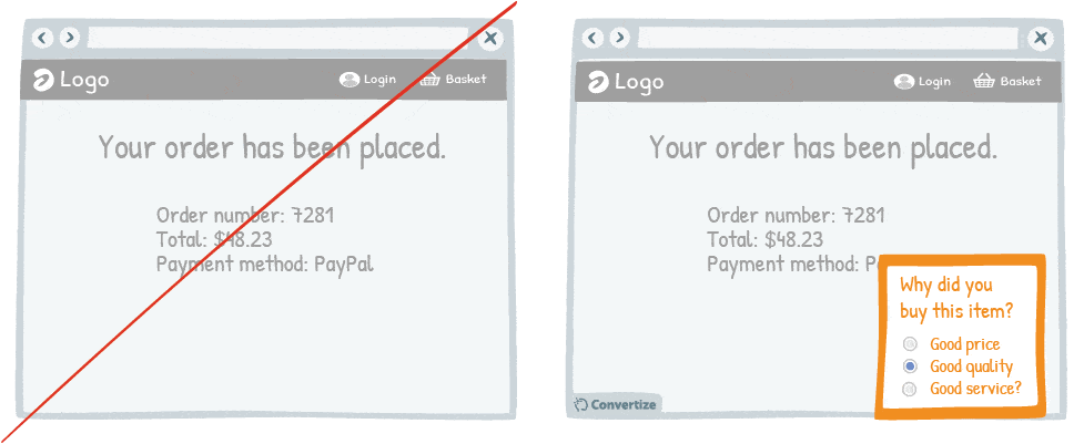
Asking your customers why they bought your product is a good way of making them think about those reasons and this in turn will reassure them of the purchase they have just made. The happier you can help customers to feel about their decisions and purchases, the more likely they are to be completely satisfied and become a repeat customer.
Moreover, people always like to be asked their opinions and there is a satisfaction just in being able to give feedback that will further enhance their positive feeling associated with their recent purchase.
Underlying principles
- Cognitive Dissonance (Festinger, 1957) – Persuasive technique 53
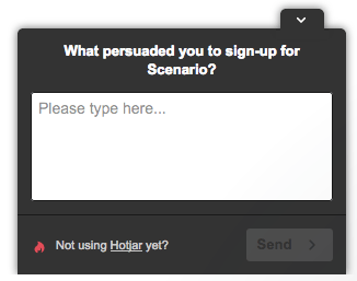
They also provide good user guides of what type of polls to create on which page.
65. Reassure your customer on the post-purchase confirmation page and email them
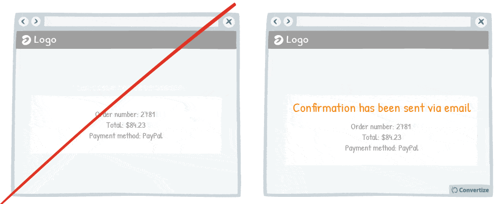
Reassure your customers on the purchase or booking they have just made by clearly confirming the transaction has successfully gone through and by sending them a follow-up confirmation email.
This will induce positive feelings and help to therefore reassure them about their choice to complete this transaction. The happier you can help customers to feel about their decisions and purchases, the more likely they are to be completely satisfied and become a repeat customer.
Underlying principles
- Cognitive Dissonance (Festinger, 1957) – Persuasive technique 53
66. Display social sharing buttons after customers have finalised their purchase
It’s important not to miss an opportunity to offer your clients the chance to share your content or their actions on your site on social media as this can greatly boost awareness and popularity.
However, if you bombard your customers with social media links and suggestions at all times it will both be quite irritating and also possibly distract them from what you would like them to do (i.e. make a purchase). Having these displayed will also increase the loading time of your pages so it is all round better to concentrate solely on conversion on your pre-purchase pages.
However, giving customers the opportunity to engage with social media once they have made a purchase is an excellent idea. Not only will this timing avoid distracting your customers from their pre-purchase process but it will also catch your customers when they are most likely to give positive feedback about your product, having just purchased it themselves.
Studies have shown that we have a tendency to attribute much more value to things that we own and that we also tend to consider choices we have made to be the best possible. Due to these cognitive biases, your customers are likely to have only good things to say about your site and product – and be more inclined to do so on social networks – once they have completed a purchase as it is a type of self-justification.
Underlying principles:
- Cognitive Dissonance (Festinger, 1957) – Persuasive technique 53
- Choice-supportive bias (Henkel & Mather, 2000) – Persuasive technique 53
67. Use exit surveys to get feedback and boost your likability
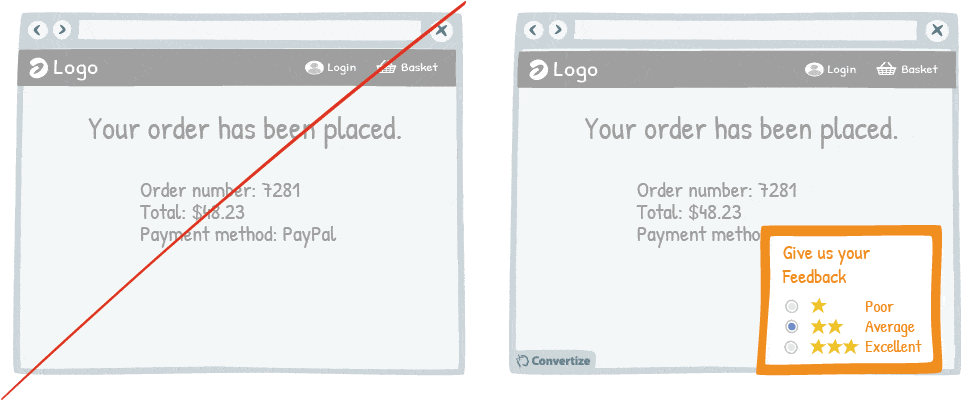
It’s proven that people enjoy giving their opinion and to be asked for feedback. What’s more if you ask for this using simply a short, easy-to-complete survey then you really increase your chances that people will do this for you. Succeeding in this is doubly useful: firstly, you will receive some helpful feedback that you can then implement to improve your site and services and, secondly, you will boost your own likability.
This is because, as studies have shown, people who carry out a favour or “service” for someone are much more likely to take away a positive impression of that person because we use it as a self-justification reason as to why we are helping them out.
Therefore, getting your customers to complete a survey for your will boost their positive feelings towards your brand and site, which will ultimately lead to them coming back to make further purchases with you.
Underlying principles
- Ben Franklin Effect (Franklin, 1732-1758; Jecker & Landy, 1969; Limperos & al., 2014)
Ben Franklin Effect
The Ben Franklin Effect has been named after one of the most well-known Founding Fathers of America, Benjamin Franklin, as he is quoted as having said the following: “He that has once done you a kindness will be more ready to do you another than he whom you yourself have obliged.” The Ben Franklin Effect, later studied by several scientists (Jecker & Landy 1969; Limperos et al. 2014), shows that doing someone a favour leads us to feel more favourable towards them in general and to be more inclined to do them a second or third favour. We follow the reasoning that if we have agreed to do them a favour then it must be because we like them (even when that’s not strictly the case) and so we subconsciously decide to like them even more in order to stay consistent with our own behaviour. Inversely, if we act in a negative way towards someone then we convince ourselves that it is because we have negative feelings towards them because they are not nice or worth good treatment etc. This is one of the explanations for atrocities often committed during wartime as the “enemy” is dehumanised through this Ben Franklin Effect, which lowers the threshold of guilt and morality.
Contrarily to our usual assumption that our feelings towards someone will dictate how we treat them, the Ben Franklin Effect shows that our behaviour towards someone can actually dictate how we feel about them instead. In fact, if you can encourage people to act kindly towards you, they will begin to feel more kindly towards you too. In his autobiography, Ben Franklin illustrated this point with an example from his own life: in the 1730s when he started his political career, he managed to bias an “enemy” towards him in this manner. There was one Assemblyman who didn’t care for Franklin at all but he knew that if his political career was to be successful he would need this man to be on his side. So he asked him simply if he could borrow one of the books from his private library knowing that this would flatter the man, especially as Franklin was renowned in the literary world for being a successful printer and writer. Indeed, asking someone for help or a favour is a subtle yet very effective form of flattery as it suggests that we consider them to have something that we don’t, whether that be material, intellectual or skill-based. As expected, the man lent him the book and this small act of kindness led him to eventually change his view of Franklin and the two ended up being good friends.
The Ben Franklin Effect is used regularly in sales strategies, the most well-known being the “Foot-in-the-door Technique”, which consists of asking someone for a small agreement in order to later get a more significant one. The studies conducted by Limperos et al. (2014) also showed the way in which the Ben Franklin Effect could be applied to social media, for example through friend requests on Facebook. In web marketing, it is possible to enhance people’s perceptions of your brand and products through asking them for small favours, such as sharing something on social media, joining up to a newsletter, giving their opinion and feedback, etc.
68. Ask your customer to share feedback
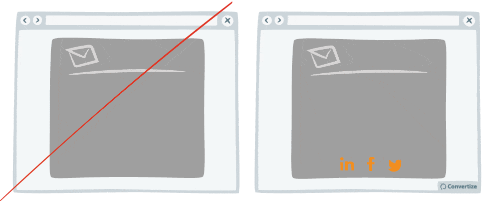
If you want to build up your social media community and generate organic publicity then asking customers to share feedback on products they’ve purchased from you can be very effective.
Once we’ve purchased a good, we tend to attribute a greater value to it as we become psychologically attached to things that we already have in our possession. This will lend itself to a generally positive review of purchased items and so sending out an email asking customers to share their feedback after they’ve received your product can be very beneficial.
Asking your customers to do you a small, easy “favour” such as sharing their purchase from your site can also help to generate positive feelings towards your brand in general.
It has been proven that when we do someone a favour, we then feel more favourable towards them in general. Our actions actually dictate to our thoughts and emotions as we reason that we obviously did something for this person because we like them.
Underlying principles
- Ben Franklin Effect (Franklin, 1732-1758; Jecker & Landy, 1969; Limperos & al., 2014) – Persuasive technique 67
69. Congratulate your customers on their booking or purchase
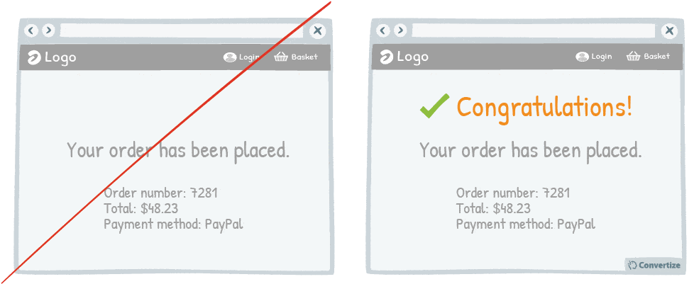
Congratulating your clients on the purchase or booking they have just made will induce positive feelings and therefore help to reassure them on their choice to complete this transaction. The happier you can help customers to feel about their decisions and purchases, the more likely they are to be completely satisfied and become a repeat customer.
Underlying principles
- Cognitive Dissonance (Festinger, 1957) – Persuasive technique 53
More ways to increase your SaaS conversion rate
70. Choose a contrasting button colour and size for your Call-to-Action
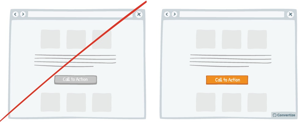
The objective of a Call-to-Action (CTA) button is to encourage your visitors to do something in particular. Choosing a contrasting button colour and size will make it more prominent and visible on your page so that your visitors are more likely to click on it.
Underlying principles
- Von Restorff Effect (Von Restorff, 1933; Gardner, 1983; Taylor & Fiske, 1978) – Persuasive technique 9
71. List the strongest benefits first
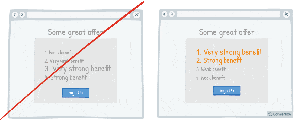
Re-ordering the benefits of your offer by putting the strongest ones first will be much more likely to capture your visitors’ attention, produce a better recall during the customer journey through website and make a better impression.
Studies have shown that people recall the first and last items in a series best (Serial Positioning effect). The first items in the list were put into long term memory (Primacy effect). The last items went into short term memory (Recency effect).
However, Glanzer & Cunitz demonstrated that the recall of the last items diminishes with time (already after 30 sec it is almost inexistent), whereas the Primacy effect remains.
Underlying principles
- Serial Position Effect (Ebbinghaus, 1913; Murdock, 1962; Glanzer & Cunitz, 1966) – Persuasive technique 8
- Primacy Effect (Glanzer & Cunitz, 1966)
72. When using faces on your website, direct their look towards the important elements on your page
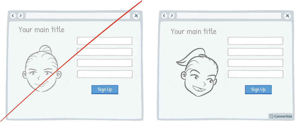
As humans, we have a natural, innate tendency to follow others’ gazes. It’s an important social stimulus and often the way we learn about the world as we are growing up. This can, therefore, be an effective way of drawing your website visitors’ attention towards a particular element on your page, such as a form or CTA.
Underlying principles
- Gaze Cueing (Perrett; Hietanen; Oram & Benson, 1992; Baron-Cohen, 1995; Emery, 2000; Frischen; Bayliss & Tipper, 2007)
Gaze Cueing
Gaze Cueing is the way in which we pay particular attention to the gaze and line of sight of others when looking at a face, focusing in on this element and often finding our own gaze drawn by someone else’s.
Scientists have shown that the human gaze is an important social stimulus on which we learn to focus right from when we are born. As children, we utilise the gaze of our parents to learn about the world, read expressions, etc. In fact, eyes are a considerable source of information regarding emotions, intentions, beliefs and desires of others, as a lot of expressiveness is portrayed through the eyes. Studies have shown that 55% of information transmitted during a face to face conversation relies on visual contact. The eyes are a central factor in our social interactions and have an immense power over us: immediately attracting our attention amongst all facial features or other stimuli.
There are numerous communication and marketing techniques that make use of Gaze Cueing. For example, websites often use the human face (photos, etc.) in their adverts or on their homepage and are careful to place important elements (such as Call-to-Action buttons, etc.) within the gaze path of the model to help ensure that the website visitor has their gaze automatically drawn towards the desired elements of the page.
73. Display how many people have already registered on your website
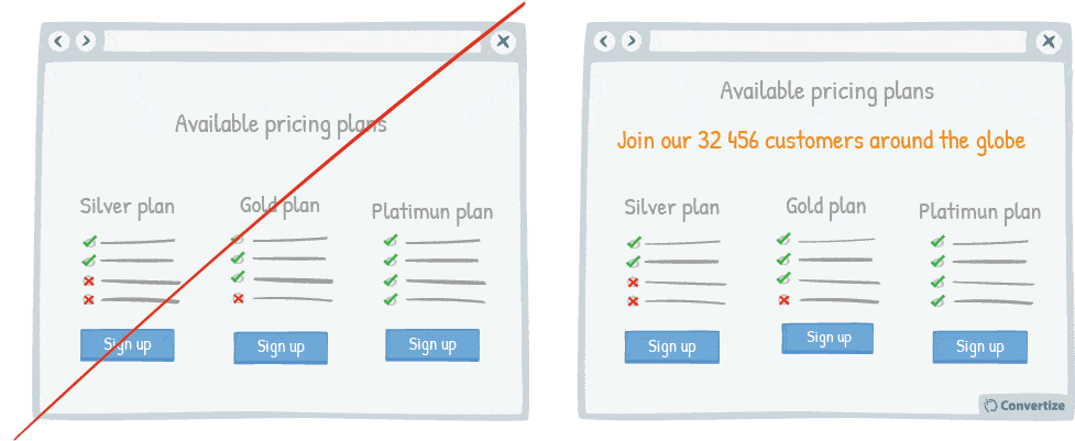
Displaying the number of people who have already signed up to your website or newsletter is an effective persuasion tool. Research has shown that we have a strong tendency to copy others’ choices and behaviour – especially when we are hesitating on a decision – and this form of “social proof” taps into our desire to behave as others have done.
Underlying principles
- Social Proof (Sherif, 1935; Asch, 1956) – Persuasive technique 2
74. Blur or fade images to reduce the emphasis on them
By blurring or fading images, you can place emphasis on something else instead. People are more likely to notice and remember an element that stands out and is different from others. Your visitors will immediately be attracted to the notably different items on your page, such as the search bar in the example above.
Underlying principles
- Von Restorff Effect (Von Restorff, 1933; Gardner, 1983; Taylor & Fiske, 1978) – Persuasive technique 9
75. Make your website responsive (mobile-friendly)
A mobile-friendly website is essential to ensure that you cater to the increasing number of people browsing on their mobile devices. A website that is mobile responsive will not only be more aesthetically pleasing but will also be easier to use and make for a much better user experience. If they arrive on your website and it doesn’t function well on their mobile device (or makes purchasing difficult) this is likely to result in lost sales.
Underlying principles
- Aesthetic-Usability Effect (Bloch, 1983; Donald Norman, 2002)
Aesthetic-Usability Effect
The Aesthetic-Usability Effect, studied by Donald Norman (2002), states that the more aesthetically pleasing a product is, the more usable it is perceived to be and the more likely it is to, therefore, be used regardless of functionality. The reason for this Aesthetic-Usability Effect is that when a product or service is aesthetically pleasing to a consumer they build an emotional relationship with it: this relationship breeds a sense of loyalty and the consumer will stick by their choice even if they encounter problems with it. According to Bloch (1983), “visual appearance is the first thing a potential buyer notices about a product” and they are more sympathetic to faults or failures if a design is aesthetically pleasing, leading them to believe that the better-looking option is the better option overall.
For example, numerous studies have found that, technically, Apple products are not as usable as others on the market – meaning, people get tripped up more frequently and have a harder time understanding how to use the product than with other similar devices. However, Apple users either don’t notice or don’t care because Apple products are so aesthetically pleasing. The same concept has been found true of Mini Cooper cars, which have a lot of quirks (like the speedometer being located where the radio should be and the clock found on the ceiling), but people forgive these minor anomalies simply because they like the way it looks.
This principle has numerous applications in web design: when a customer visits a website they are likely to prefer those they enjoy looking at and feel good about using even if they don’t perform the tasks as effectively as another. It is therefore important to foster a positive attitude to your website by using an aesthetic web design to encourage positive feelings such as patience, loyalty and affection, which will lead to much greater long-term usability and success.
76. Include benefits in your Call-to-Action text

Use your CTA text to reinforce a benefit, reminding the user of one of the reasons they should want to act. People are likely to make decisions based on one or two distinguishable features and so if you can reinforce one of the benefits at this stage, this can help persuade them to act.
Underlying principles
- Focusing Effect (Schkade & Kahneman, 1998) – Persuasive technique 13
77. Use the 1-1-1 rule

People respond best to clear, direct and easy-to-understand information and are easily distracted or put off by extraneous information or demands on their attention. To avoid this, try following the simple yet very effective 1-1-1 rule on your landing pages: 1 value proposition, 1 clear message, 1 call-to-action. Any additional information could distract your customers from your main goal.
Underlying principles
Attention Ratio (Schwartz, 2004; Kahneman, 2011)
- Processing Efficacy (Jacoby & Dallas, 1981) – Persuasive technique 4
Attention Ratio
Attention Ratio is based on the fact that people are more likely to follow through on an action if their focus is concentrated and their attention is not split between lots of different elements. This is because having too much choice, information or visual stimuli overwhelms the human brain and can lead to indecision and distraction.
This is especially applicable to the internet as we are bombarded with information, links and contrasting visuals all the time, which can lead to a lack of ability to focus, follow through on our intended course of action or complete even simple tasks. Attention Ratio therefore describes how the number of interactive links you provide on a web page should be directly relative to the number of conversion goals you have (which should in any case only be 1).
If you’re trying to convince your customer to buy a certain product or service, you should have a landing page that highlights just that one thing and leaves them a clear path towards the purchasing goal. If you surround that product with lots of other deals or information – such as events, sales coming up, or invitations to sign up for newsletters or other unrelated deals – then your customer’s attention will become so divided that they are unlikely to actually complete the intended purchase.
Imagine, for example, that you received an invitation for a gallery opening in the post and you decide to go. However, as you’re on your way you notice that the gallery have put up signs everywhere outside their door with suggestions about other places you can go first to eat or local sites you might like to visit. You become distracted by these; you realise that in fact, yes, you are hungry and, yes, you would like to see a famous church. In the end, you don’t make it to the gallery…
The same applies for web marketing – don’t distract your customers from your main goal. If you send out a newsletter for a specific campaign, say a half price sale on your latest publication, then the link provided should lead to a landing page (never just your homepage) and that landing page should only have information about the publication on sale. There should be only one Call to Action button that leads the customer straight to the purchase of the sale item and, by focusing your customer’s attention rather than dividing it, your conversion rate should increase dramatically.
78. Always place your Call-to-Action above the fold
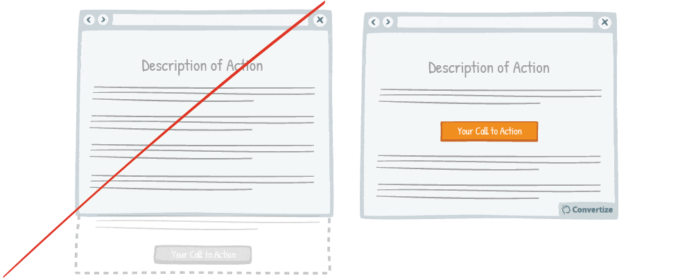
The “fold” is the line that separates the visible part of your web page from the part that will only be visible once your visitor scrolls down. Your Call-To-Action (CTA) button should always be placed above the fold so that it is immediately visible when people arrive on your page. This reduces the chance of your visitor leaving before they have been exposed to the CTA.
Underlying principles
- Mere-exposure Effect (Fechner, 1875; Zajonc, 1960) – Persuasive technique 1
- Attentional bias (Bradley & al., 1996; Buodo & al., 2002; Pessoa & Ungerleider, 2004; Vuilleumier, 2005) – Persuasive technique 1
79. Increase the amount of white space around your Call-to-Action

Increasing the amount of white space around your Call-to-Action (CTA) will draw attention to it and make for a much more pleasing visual experience for the user. Equally, making sure there isn’t an excess of information or an overload of visual stimuli will help keep the CTA as the primary focus.
Underlying principles
- Von Restorff Effect (Von Restorff, 1933; Gardner, 1983; Taylor & Fiske, 1978) – Persuasive technique 9
- Processing Efficacy (Jacoby & Dallas, 1981) – Persuasive technique 4
80. Make your visitors pay attention by displaying images that they can identify with

Don’t simply use random images on your website; it’s best to encourage your customers to identify with the image. If you sell DIY products to private individuals, the most effective images will show an ordinary person tinkering with the kind of products you sell rather than putting an image of a professional plumber or other DIY-related business. Your customer will feel as though the image is more representative of what they will be doing and will thus feel closer to your products.
Underlying principles
- Picture Superiority Effect (Paivio, 1971; Hockey, 2008)
- Attentional bias (Bradley & al., 1996; Buodo & al., 2002; Pessoa & Ungerleider, 2004; Vuilleumier, 2005) – Persuasive technique 1
Picture Superiority Effect
Picture Superiority Effect relates to the fact that the human brain learns and retains information much better when it comes in the form of images rather than words and therefore visual sources can have a much greater and more lasting impact than text. This is where the phrase “a picture paints a thousand words” comes from. Allan Paivio (1971) explains this principle with the theory of “dual coding”: that we retain images better than words because they are coded twice in our memory. Paivio explains that our memories take in information using two different codes: “verbal” codes and “image” codes. When we’re presented with an image it generates both a verbal and an image code (taking the visual image and generating a verbal code using an associated word or phrase) whereas when we’re presented with something that is solely verbal it only generates the one verbal code. When our brain then wants to retrieve information, it finds it easier to locate the images because they have been “dual coded”. This is why we find it both easier to memorise and then later remember information that is presented in a visual manner.
Hockey carried out an experiment in 2008 to demonstrate the Picture Superiority Effect. He asked participants to memorise both random pairs of words and random pairs of images. He then rearranged the pairs so that some of them were no longer with their original partners and asked the participants to identify those that had changed and those that hadn’t. The results overwhelmingly showed that people were able to identify the original image pairings much easier than the word pairings.
Picture Superiority Effect can be utilised in many ways: it is certainly an aid for learning environments to help people learn and retain information more easily, but it can also be highly effective when applied in communications, marketing or advertising to help your message be absorbed better and retained for longer.
81. Use “We” in order to involve your user
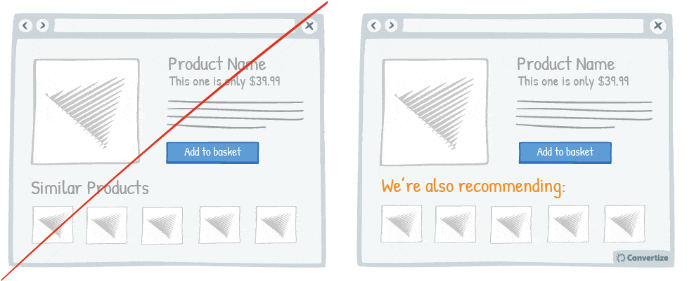
By using a personal pronoun instead of an impersonal form, you immediately involve your customer in the situation or product you’re referencing, which will trigger a subtle emotional response and make them feel connected to you: part of the “we” team. They will feel as if they’re being directly spoken to and will be more likely to feel a connection and interact further with your brand and website.
Underlying principles
- Social Cognition (Pelham; Carvallo & Jones, 2003) – Persuasive technique 37
82. Don’t ask for credit card details for free trials
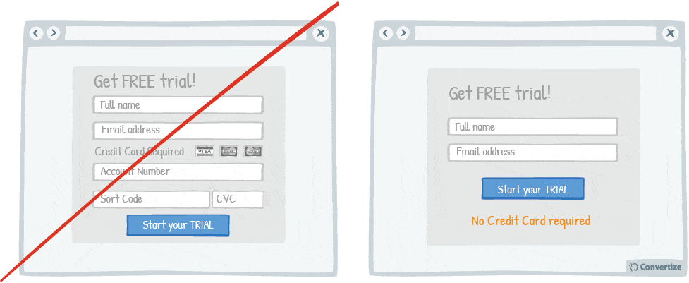
Being required to enter credit card details evokes the negative feelings associated with spending money. Research has shown that the act of paying really disrupts the pleasure of an experience and that the more obvious, tangible or transparent the payment is, the less we enjoy making purchases and the more likely we might be to back out.
Offering a free trial without a credit card required not only allows you to show the benefits of your product without making customers pay, therefore removing the obstacle raised by the “pain of paying”.
Requiring them to enter their credit card details counteracts the point of this and will also make customers question why they need to enter their details for an apparently “free” trial.
And, more importantly it creates trust which you want to establish to win a paying customer (wheras asking for a credit card would actually do the opposite).
Underlying principles
- Pain of Paying (Prelec & Loewenstein, 1998) – Persuasive technique 36
83. Use only 2 words on your Call-to-Action

The simpler and more attention-grabbing you can make your Call-to-Action (CTA) the better. Customers prefer to use less mental energy and want to be led with ease around your site. Using only 2 words on your CTA will help not only draw attention to it but will also encourage visitors to follow through on the action as it will make the process seem simple and easy.
Underlying principles
- Cognitive Ease (Kahneman, 2011) – Persuasive technique 11
84. The use of metaphoric phrase makes intangible concepts tangible
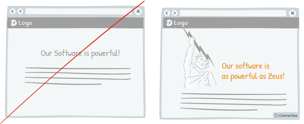
Metaphorical language is a compelling form of communication that can allow you, in certain cases, to better convey your message. It can help to better attract your customer’s attention and allow them to better retain the information as well.
In fact, people are much more likely to connect and engage with something that touches them emotionally.
Metaphorical language often evokes imagery and emotions which will bypass your customer’s rationality and make them more open to new ideas and persuasion, which can help encourage action and engagement.
Underlying principles
- Metaphor Effect (Lakoff & Johnson, 1980)
Metaphor Effect
The Metaphor Effect describes the way in which our brains react to metaphors, meaning language formulas that describe something through likening it to something similar, often something that arouses an associated image. “To have a heart of stone” is one such metaphor in which the stone represents a hard and cold element, qualities that translate as lacking feeling or empathy when applied to the heart. The Metaphor Effect is the way in which we tend to understand and remember more easily such metaphorical language as it activates our imagination.
Metaphors engage the right hemisphere of the brain, which controls our mental imagery (the same function that allows us to dream). The images created are more easily understood and more memorable than simple literal language. Literal language appeals to only a small fraction of the way in which our brain makes sense of the world around us. The other senses and emotions it makes use of are activated by metaphorical language, going beyond the literal sense of a phrase in to the realm of imagery and more abstract concepts. Like all analogies, metaphors help us to understand more complex ideas and enrich the meaning of language used.
Metaphorical language is therefore a compelling form of communication that allows you, in certain cases, to better convey your message. If a metaphor can help transmit imagery and emotion, your reader is likely to have their attention drawn more quickly and to retain the information much better and, in fact, people are much more likely to connect and engage with something that touches them emotionally (the Attentional Bias).
In web marketing, the use of metaphors can greatly help to improve the quality of content on your site in order that it may attract the attention of your visitors as well as stay in their memories for longer. When we’re on the internet, our senses are more limited than they are in real life so using metaphorical language can help to stimulate a wider range of senses and emotions – especially important when attempting to convey more abstract ideas. It can also upset the rational balance of your customers, placing emphasis instead on their imagination and emotions, which are much more receptive to new ideas and persuasion.
85. Use ‘how-to’ pages (and videos if possible) to show your visitor how easy it is to act
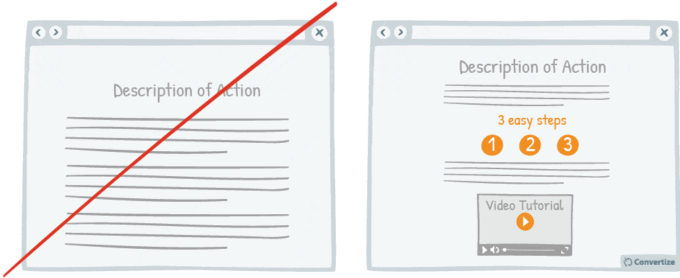
If you show your visitors how easy it is for them to act (i.e. to complete an action on your website or to utilise one of your products or services) by providing “how-to” pages and videos, it will increase their belief in their own competence to do so. This will therefore increase their motivation to do it as research has shown that the more confident we feel in our own abilities, the greater our intrinsic motivation to act.
Underlying principles
- Self-efficacy Theory (Bandura, 1984) – Persuasive technique 17
- Information Bias (Baron; Beattie & Hershey, 1988) – Persuasive technique 4
86. Use “You” and “Your” if you can’t use names
By using a personal pronoun instead of an impersonal form, you immediately involve your customer in the situation or product you’re referencing, which will trigger a subtle emotional response and make them feel more connected and involved. It also adds that important “human” element, which will help make your customer feel as though they are interacting with a somebody rather than a something. By using “you” or “your” you make your customer feel special, as if they’re being directly spoken to, and they will be more likely to feel a connection and interact further with your brand and website.
Underlying principles
- Social Cognition (Pelham; Carvallo & Jones, 2003) – Persuasive technique 37
87. Choose active voice over passive voice

Make simple, concise sentences in the active voice to simplify the understanding and impact of your message. A grammatically complex sentence will not have the same immediate effect on the mind of your customer and will thus have a lower level of persuasion. Instead, a simple sentence in the active voice allows your readers to digest your message more easily, inciting a more positive reaction. Also, try making your customer perform the action rather than be the recipient of it to involve them immediately and personally. For example “you will spend hours enjoying this product” rather than “this product will be loved by everyone”.
Underlying principles
- Cognitive Ease (Khaneman, 2011) – Persuasive technique 11
- Processing Efficacy (Jacoby & Dallas, 1981) – Persuasive technique 4
88. Use images instead of just text
“A picture paints a thousand words”. Indeed, the human brain learns and retains information much better when it comes in the form of images rather than words. Images do not require translation, the meaning is immediate. Presenting an image instead of – or at least as well as – accompanying text will allow your customers to better understand and remember the message you are trying to get across.
Underlying principles
- Processing Efficacy (Jacoby & Dallas, 1981) – Persuasive technique 4
- Picture Superiority Effect (Paivio, 1971; Hockey, 2008) – Persuasive technique 80
89. Be specific with your arguments instead of trying to be a salesman
Arguments or tag-lines that are too fluffy and reminiscent of an unfounded sales pitch – such as “our customers love us” or “our software is very reliable” – can be effective in the right context but more often won’t attract or convince potential customers as you would like. Using concrete words, especially featuring facts or figures, will have much more impact. For example, instead of saying “our customers love us” say: “142 customers use our product.” Tell your customers a powerful story rather than giving them a sales pitch.
Underlying principles
- Processing Efficacy (Jacoby & Dallas, 1981) – Persuasive technique 4
- Need for Certainty/Uncertainty (Kagan, 1972) – Persuasive technique 49
- Information Bias (Baron; Beattie & Hershey, 1988) – Persuasive technique 4
90. Use 1st person plural pronouns
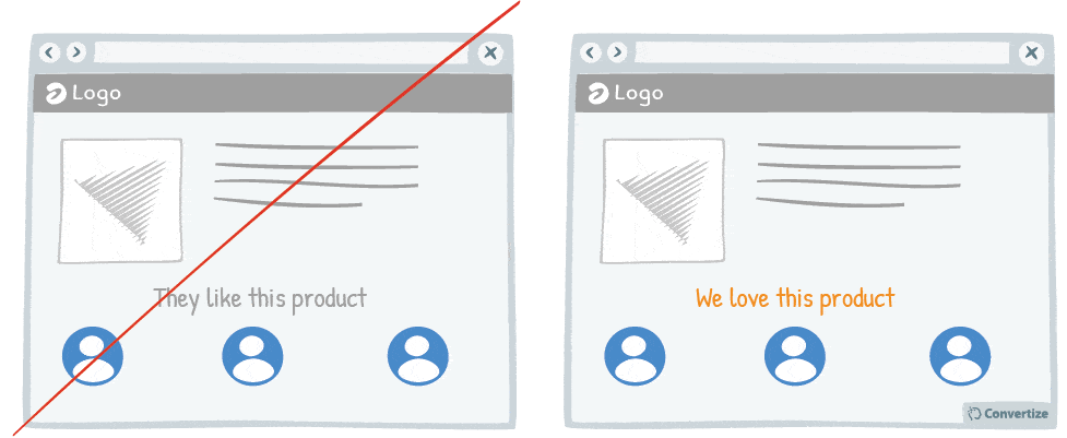
The power of “we” or “our” is not to be underestimated. We are social and group-dwelling beings, people, and we feel most comfortable and positive when we are included as part of a group. Therefore, instead of excluding your visitor by using “they” or other 3rd person pronouns, include them in the most basic way by using 1st person plural pronouns instead.
Underlying principles
- In-group Bias (Sumner, 1906; Tajfel, 1982; Maas & Acuri, 1996)
- Cheerleader Effect (Walker & Vul, 2013)
In-group Bias
In 1906, sociologist William Sumner posited that humans are intrinsically more comfortable existing within social groups and that we are also inclined to believe our own group superior to any others. We tend to favour and place more merit on the opinions and actions of people from our own in-group. We build up our social identity and self-esteem through belonging and people who are from within our group remind us of this belonging and are automatically given preferential treatment.
Tajfel conducted an experiment by splitting a class of 14-year-old boys into arbitrary groups and then assigning them random tasks. These tasks started out quite inanely and eventually turned into slightly more competitive ones where a monetary value was assigned. Despite the fact that they all knew each other and potentially had alternative friendship groups outside of this experiment, Tajfel observed how quickly the boys not only formed strong alliances with their own assigned groups but also began to make choices that would be to the detriment of the other groups. For example, one of their last tasks was a hypothetical situation concerning the profit that could be made through selling art and the boys were given choices about which actions they could take. Some actions led to them making a profit, some led to all groups making a profit and the final actions would lead towards them making a profit whilst other groups suffered a loss. Overwhelmingly the boys chose the latter option, not only wanting their group to succeed but other groups to fail.
In the commercial world, this In-group Bias is obvious in extreme brand loyalty. Take Apple for example: people are proud of being part of the Apple ‘gang’ and feel like they have more in common with the other people who also use Apple products, producing at once an instant bond and loyalty towards them and also a disconnection from those who are “outside” this group because they use alternate brand technology. On a smaller scale, the In-group Bias is an effective way of gaining loyalty and trust for your product or service by building up membership schemes or showing customer testimonials on your site from other people who would be considered part of the same “in-group” using your brand.
Cheerleader Effect
The Cheerleader Effect is the way in which, when confronted with a group of items, the human brain automatically treats them as a set and forms an impression of this set as a whole without really taking in to account the individual characteristics of each item. We generate average information on everything we are viewing – including setting, size, emotions conveyed (in animate objects) and attractiveness – and then make a visual judgement based on these averages. Therefore, those items that may be less attractive or desirable find that they are elevated in status to the average that has already been accepted.
This is called the Cheerleader Effect as it is something most notably perceived in the way that people are considered more attractive when they are in a group than when they are seen alone (i. e. the way that cheerleaders are all considered to be highly attractive even though each individual may not be seen in that way were they on their own). Walker and Vul conducted a series of studies on this in 2013 by presenting participants with photographs of the same faces twice, once in a group setting and once alone, and found that in every case their attractiveness level was rated higher in the group photos. This is due to the way our visual system makes sense of seeing multiple items: by choosing the most positive features from all and combining them to make one easy-to-digest ensemble.
The applications for this can be vast as it is something that happens in our brains automatically with both animate and inanimate objects and is very hard for us to override even when we’re aware of it. In web marketing, it can be far more effective to present your products in a group to elevate the general appeal of each individual item as the viewer will average out their qualities – rather than concentrating on features they don’t like – to find an appealing mass of offerings. This can be the same for presenting customer testimonials. If you present your testimonials in a group setting then the less positive reviews will be averaged out with the better ones so as not to leave an overall negative impression on your website’s visitor.
91. Rather than recommend a product yourself, show users who recommend it

Studies have shown that individuals tend to follow others’ choices or behaviour when trying to make decisions. We automatically presume that if lots of our peers are doing something or buying a particular product then it is for a good reason and that we would do well to follow their example.
Therefore it’s much more powerful to show visitors how many previous customers recommend your product rather than recommending it yourself.
Underlying principles
- Self-efficacy Theory (Bandura, 1984) – Persuasive technique 17
- Social Proof (Sherif, 1935; Asch, 1956) – Persuasive technique 2
92. Don’t place ads above the product list
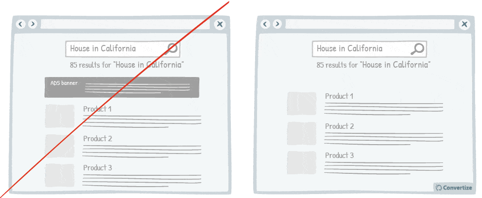
It is best to make sure that your customer’s attention is fully focused on the main factors that will lead to conversion.
Therefore it isn’t advisable to have ad banners places above your product list.
Not only might this be a distraction for them from their original conversion purpose, but it may cause confusion. Your visitors may think that the header is related to their search and they may be tempted to click on it thinking that it is an option or a filter.
If the ads are relevant to their search, it is still better to position them elsewhere on the page, leaving the product list clear of any confusion.
Underlying principles
- The Split-attention Effect (Tarmizi & Sweller, 1988) – Persuasive technique 6
- Paradox of Choice (Schwartz, 2004) – Persuasive technique 18
93. Offer free trials
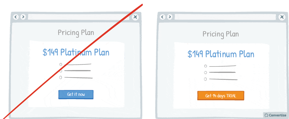
Offering a free trial lets customers experience the benefits of your product or service without making them commit to any type of payment which cuts out the negative feelings associated with spending money. Indeed, research has shown that the act of paying really disrupts the pleasure of an experience and that the more obvious, tangible or transparent the payment is, the less we enjoy making purchases and the more likely we might be to back out.
Underlying principles
- Pain of Paying (Prelec & Loewenstein, 1998) – Persuasive technique 36
94. Personalise your content with your customer’s name
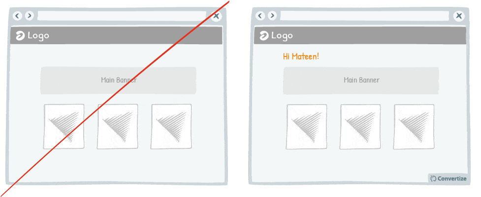
Your customer will feel more involved in and connected with your content if you make use of their name to give it a personalised touch.
A natural tendency we experience is “implicit egotism”, which means that by incorporating your reader’s name, you will trigger a positive emotion and enhance their perception of your message – especially when sending out directed messages in the form of email blasts.
Big brands such as Starbucks Coffee or Coca-Cola even put the names of their clients on their products (coffee cups or Coca-Cola bottles) so that their clients immediately feel more connected with the brand.
Underlying principles
- Social Cognition (Pelham; Carvallo & Jones, 2003) – Persuasive technique 37
95. Mention the location of your office
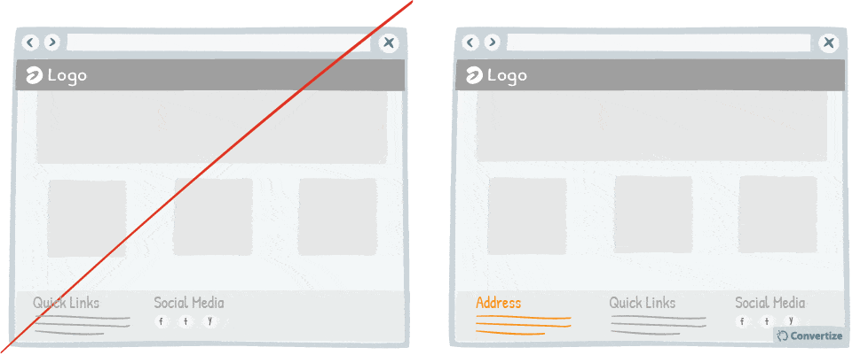
One of the biggest issues for making sales online can be the lack of security some shoppers associate with online sites. Therefore it can be very effective to mention your office address clearly on your site as this will immediately increase the level of trust that your customers have in your brand and will increase the likelihood of them feeling confident enough to purchases a subscription. In fact, when the level of security appears heightened in this way, people are more likely to take even larger risks than normal and so might make more purchases or opt for a more expensive model or payment plan that they would have otherwise.
Underlying principles
- Risk Compensation (Peltzman, 1975)
Risk Compensation
Risk Compensation, which was studied in detail in relation to motorway accidents by Professor Sam Peltzman in 1975, describes the way that humans will in fact be more likely to take greater risks when they feel they’re protected by certain factors.
For example, the Peltzman Effect came from Prof. Peltzman’s study that found that measures taken to reduce road traffic accidents actually had no real effect at all as, when people felt like they were safe because they were required by law to wear their seatbelt or their car was fitted with auto-lock brakes, then they were actually more likely to drive faster or more dangerously close to the cars in front, believing themselves to be in a reduced state of risk.
In web marketing, knowledge of Risk Compensation can be applied to encourage conversion through making your customer feel like your website is a safe place to shop. If they feel secure and happy then they will be more likely to actually make purchases and even make more purchases than they would have done otherwise. Adding https (protocol for secure communication), trust badges and customer testimonials to your site will make your customer feel like they’re shopping in a secure environment and put them in the right state of mind to make purchases on your site.
96. Offer a way to leave functions blank even once clicked on
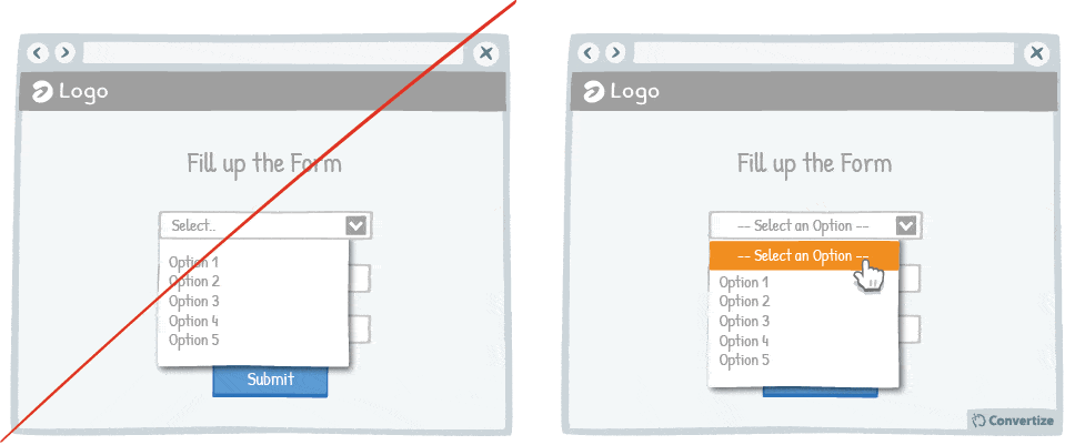
It can often happen that a customer might click into an option or function from a drop down list only to realise that they don’t want to select anything but find themselves stuck as they are unable to quite the function without making a selection. It is important to always give your site visitors the possibility to escape from any option or function easily. If, for example, in order to undo a sorting filter they have placed on a search, it is necessary to press the back button to come out of the page and then start over again, not many people will bother coming back.
Similarly, if they are unable to get out of a drop-down list without making a selection, then they will most likely quit the process in frustration. However, if they can find an ease and logic in the use of your site, knowing that they can rectify errors or cancel options they do not in fact want, then they will be more likely to feel confident in using your site and to ultimately convert.
Underlying principles:
- Zero-Risk Bias (Baron; Gowda & Kunreuther, 1993)
- Autonomy bias (Deci, 1971; Ryan, 2008) – Persuasive technique 16
- Illusion of Control (Ellen Langer, 1975) – Persuasive technique 62
Zero-Risk Bias
Zero-risk bias is an irrational logic that we apply when making a choice, leading our brains to prefer an option that totally eliminates any risk over options that could, in fact, eliminate more risks and could end up with better results. So when presented with two options, we will go with the one that eliminates a small risk completely rather than the one that decreases a large risk exponentially because there is still an element of risk involved. This is because we have a cognitive bias that leads us to crave absolute certitude of outcome when we make decisions. Irrationally, we prefer to have a few guaranteed benefits rather than the possibility of much more significant benefits.
For example, researchers analysed financial investment decisions made during the 2008 economic crisis and found they were heavily influenced by the Zero-risk bias: during this time of economic incertitude, investors were much more likely to lean towards “sure bets” such as governmental investments than towards private investments that may have seemed more risky – although would have had much bigger payouts had they come in. Therefore, most people were opting for a much smaller but more guaranteed return than for these higher risk, higher payout options. Research has found that a large number of important political and economic decisions are influenced by this zero-risk bias, for example the implementation of zero-risk health laws to remove any carcinogenic elements from food – regardless of actual health risks or benefits – and the drive for perfect cleanup of hazardous sites. These all come from a focus on complete elimination over targeting where the most difference to actual threats could be made.
Zero-risk Bias has numerous applications for sales and marketing strategies. If you can attach a zero-risk quality to your products or services then customers are more likely to make a purchase – and to choose yours over other options that may contain an element of risk. Remembering that people will most often choose the elimination of risk over a greater decrease (for example, when asked whether they would prefer the option that decreased risks from 5 to 0% or from 50 to 25%, people overwhelmingly chose the former despite the fact that the decrease in risk is nowhere near as significant) means that you can present your products in such a way as to make them appear much more desirable due to the zero-risk bias. For example, should you offer two similar products – one that is better value for money but doesn’t have a great returns policy and another that is much more expensive but offers a 30-day money back guarantee – customers are more likely to opt for the more expensive option because they feel as though there is no purchasing risk attached.
97. Be precise with error messages

When displaying error messages, make sure that you clearly explain the reason for the error. If your user is getting error messages without anything to tell them why it can’t be validated and how to rectify the situation and move forward then it will become very frustrating and it is likely that they will quit the site without completing their action. Always ensure to give an explanation and, even better, a solution. For example, when they have to create a password, instead of simply saying that there is a mistake, tell them why and what to add or remove to create a valid password.
Underlying principles
- Processing Efficacy (Jacoby & Dallas, 1981) – Persuasive technique 4
- Need for Certainty/Uncertainty (Kagan, 1972) – Persuasive technique 49
98. Use Exit Pop ups
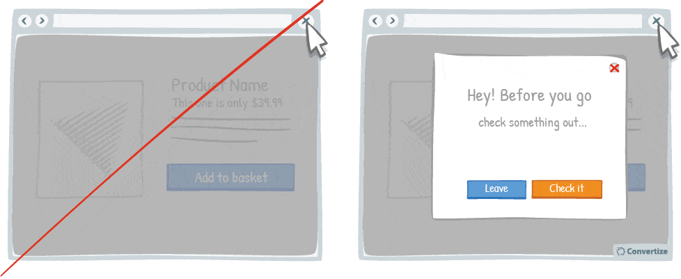
It happens all too often that your users leave your website because they did not find what they wanted. Perhaps they only visited one or two pages.
Therefore, by setting up an “exit pop-up” when users go to click on the button to close the page, you can present them a pop-up message containing a short text and call-to-action. This could be providing them new information, suggesting they subscribe to your newsletter or informing them of a new/different product.
This is a very effective way of getting their attention and possibly persuading them to stay on your site a bit longer.
Underlying principles
- Loss Aversion (Tversky & Kahneman, 1984) – Persuasive technique 7
99. Be careful when using special characters – faults could decrease your credibility
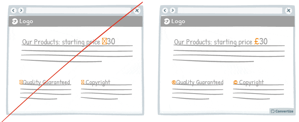
When you create a web page, be careful that you don’t have any accidental character faults due to coding problems or lack of care. The kind of symbols that are often seen on web pages, such as ▢ ø, which don’t mean anything and have obviously arrived there by mistake, can really affect the credibility of a page and a company. It’s not a very complicated error to rectify but it is worth taking the time to do so unless it should have serious consequences for your sales.
Underlying principles
- Zero-Risk Bias (Baron; Gowda & Kunreuther, 1993) – Persuasive technique 96
- Processing Efficacy (Jacoby & Dallas, 1981) – Persuasive technique 4
100. Use a recognisable phone number for your customer service and add your opening hours
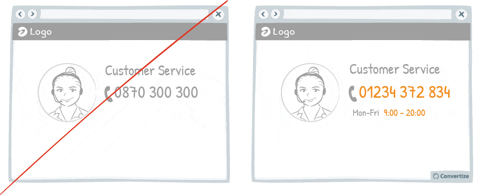
If you use a special service phone number then your customers will automatically think twice about calling as they will be expecting high call charges and long wait times. This will make your business immediately seem as though it is trying to extort money out of people and so will lose credibility. Your potential customers will perhaps be more likely to search elsewhere than phone this number. Therefore using a more recognisable, regular phone number will inspire more confidence and encourage people to call. It is also advisable to add your customer service opening hours so that potential customers have the chance to call you when best suits them.
Underlying principles
- Risk Compensation (Peltzman, 1975) – Persuasive technique 95
101. Display the number of people who’ve purchased a product near the CTA

Studies have shown that individuals tend to follow others’ choices or behaviour when trying to make decisions. We automatically presume that if lots of our peers are doing something or buying a particular product then it is for a good reason and that we would do well to follow their example. So if you have a popular product – then let potential customers know it! If the number is high, then display how many people have already bought a certain product to give it credibility and appeal. Your customer will certainly be influenced by knowing that a large number of other people have already chosen to buy this product.
Underlying principles
- Social Proof (Sherif, 1935; Asch, 1956) – Persuasive technique 2
102. Give useful information away for free

It is proven that we are more likely to give something to someone if they have given something to us already – the desire to reciprocate such behaviour is strong and can certainly lead to action and conversion. Giving your visitors information or knowledge for free will activate this desire to give something back. So your customers will be more inclined to buy, register or subscribe if you have previously provided them something they deemed useful. This needn’t be anything too spectacular – simply letting them know that you are offering free delivery or a discount coupon etc. will trigger this reciprocity bias.
Underlying principles
- Reciprocity Principle (Cialdini, 2006; Coffee, 2013; Wedekind & Milinski, 2000)
Reciprocity Principle
The Reciprocity Principle describes the human tendency to be more likely to want to give something back after something is received, whether that be a favour, gift, invitation, etc. Sociologists explain this psychological principle by the sense of obligation or indebtedness we automatically feel when someone does something for us because of the social norms that govern our relationships. From a young age, we are socially “trained” to feel as though we are indebted to people who act in our favour. This activates a “give-give” reaction in us that motivates the desire, or even presumed obligation, to always “return a favour”.
An example of this might be when someone buys you a Christmas gift simply because you gave them one: they feel compelled to do so based on the ingrained Reciprocity Principle. Inversely, the Reciprocity Principle can also act in negative situations, meaning that if someone acts wrongly towards you, you are likely to feel a compulsion to do the same to them, even if this would go against your usual character. In both cases, the principle is the same: you adjust your behaviour in relation to that of someone else’s to maintain this “give-give” societal norm.
The Reciprocity Principle has many sales tactic applications. For example, it is the root of the “rejection-then-retreat” sales technique that consists of making a request that will likely never be accepted and then, once rejected, making a more reasonable request that will then be – hopefully – accepted by your customer as they know you have made a concession so they feel compelled to also make one. In web marketing, strategies that give something for free to start with in order to hook a customer in and motivate them to want to give something back are also based on the Reciprocity Principle, as are content marketing strategies that rely on giving customers useful and interesting information before asking them for anything in return.
103. Introduce the Call-to-Action using a floating animation
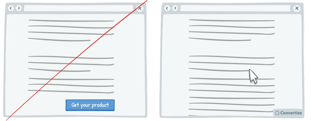
Introducing a Call-To-Action (CTA) using a floating animation that appears after a few moments could help increase conversions. Drawing attention to the Call-To-Action is essential for getting people to click on it and we always tend to notice things that stand out. Therefore, the more attention-catching you can make your Call-To-Action the better. A floating animation on an otherwise static page will be sure to catch the eye of your visitor and the movement will ensure that they take the time to really look at it, leading to an increased click-rate.
Underlying principles
- Von Restorff Effect (Von Restorff, 1933; Gardner, 1983; Taylor & Fiske, 1978) – Persuasive technique 9
104. Humanise photos of your sales team to increase credibility and likability
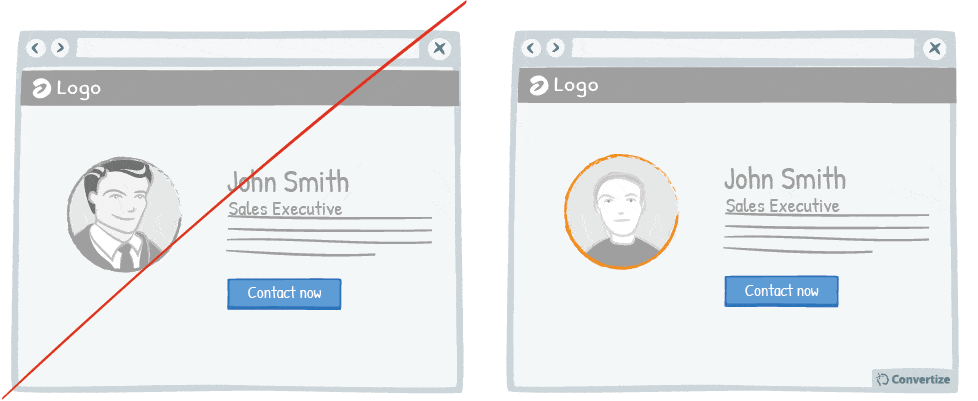
Obviously you want your site to look professional, but using photos taken from a database showing suited and booted workers with sparkling white smiles will ring as untrue to most customers.
Instead, simply take real photos of the real people who work in your office so that customers can see the person with whom they are communicating.
This will add a level of intimacy and likability that will increase your customer’s positive feelings towards your company.
Underlying principles
- Social Proof (Sherif, 1935; Asch, 1956) – Persuasive technique 2
- Picture Superiority Effect (Paivio, 1971; Hockey, 2008) – Persuasive technique 80
If you read this… you made it (even if you skipped some sections :)) Congratulations.
Still hungry?
If you want to incorporate not only persuasive techniques, but also other CRO best practices on your site, hop over to this epic post by Brian Dean from Backlinko on CRO!
Want to read the best SaaS articles published during the last year? Hiten Shah took the time to make the best of SaaS selection for you.
You like the sketches and you want even more conversion uplifting User Interface hypotheses to test? Then GoodUI is for you!
Speak German? Then definitely subscribe to André Morys’ blog Konversionskraft. André is running the biggest CRO agency in Europe and his focus is, after more than 20 years in this business: consumer psychology, behavioral economics and neuromarketing. He cannot be wrong.
So we’ve covered SaaS – what about eCommerce? Check out this essential post on 7 powerful strategies to improve your eCommerce site from Dharma Merchant Services.
Read this: 100+ proven ways to increase sour SaaS conversion rate (backed by psychology)Click to tweet
by Jochen Grünbeck
Jochen is co-author of "Smart Persuasion - How Elite Marketers Influence Consumers (and Persuade Them to Take Action)". After an MBA at INSEAD, he began his career at Airbus. Then, he moved on into Management Consulting, focusing on purchasing and negotiation strategy as well as cost optimisation projects for bluechip and midsize companies in France and Germany. His experiences led him to specialise in persuasion psychology, behavioural economics and conversion rate optimisation.